 What you'll learn:
• Designing in a newsletter format.
• Setting up a grid (column guides).
• Choosing and placing stories.
• Dealing with illustrations.
• Using drop caps, text wraps.
COMM 313: Editorial Processes
Editing exercise using computerized pagination: newsletter.
What you'll learn:
• Designing in a newsletter format.
• Setting up a grid (column guides).
• Choosing and placing stories.
• Dealing with illustrations.
• Using drop caps, text wraps.
To begin: copy all documents below, paste stories into Word files, edit, save into a new folder you've set up for this newsletter. To set up a new folder, see instructions in the travel exercise.
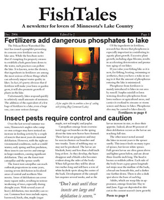
Sample at right: A former student's newsletter, page one. It has a few flaws, including pull quote at bottom (should be under headline), inconsistent placement of jumps, and not enough space above each headline. But it's generally not bad.
Stories
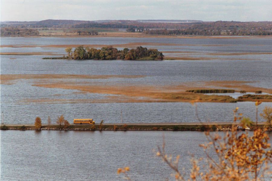
See bus photo below, to accompany story.
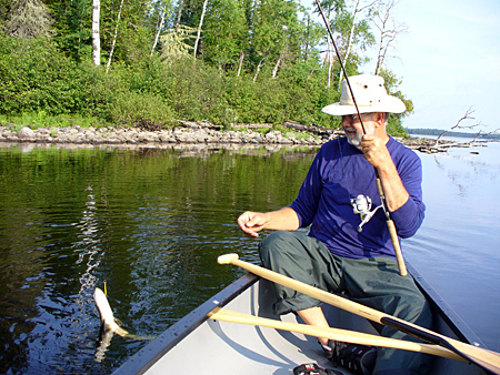
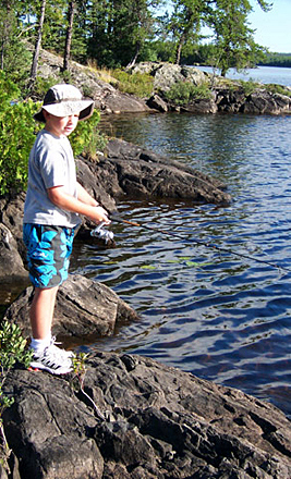
Illustrations (See cutlines below; except for bus story, these stand-alone photos can be used as necessary, or to illlustrate stories, if possible.):
Work from these copies.
1. Open New document, letter (8 1/2 by 11) size, vertical. Number of Pages:
4. Columns: 3, 2p gutter. Facing Pages: on. Margins: 4p all around, except inside:
3p6, and bottom, 4p6. Note that if you get these wrong, you can still make adjustments
once your document is open. Choose Document Setup from the File pull-down, or
Margins and Columns from the Layout pull-down.
2. Set Preferences (from InDesign pulldown menu), if necessary: Units and Increments
in picas both horizontal and vertical, and typographer's quotes.
3. Define Styles:
Body Text: 10 pt garamond, baskerville, palatino, or another (vaguely) old style serif typeface (NOT times, please) 12 pt leading (10/12), track Optical, Align left, Indent first line 1p.
Headlines: 18 or 24pt arial, helvetica, or another sans serif typeface, bf, Auto Leading, Track Optical, Align left, No indent. You may wish to change the size of head after styling, as design dictates. General rule: one type face (font) for body text, one type face for headlines, each from a different type family. For variety you can choose bf or ital, but try not to mix several type faces in a single document.
Note: Don't use verdana or georgia. These fonts are designed for the web. Don't use courier, chicago, monaco, or generally any font named after a city. These are monospaced fonts, designed to look like a typewriter, or as screen fonts.
4. Set up flag (nameplate) at top of page one, title: "FishTales" (no
quotes); Deck: "A newsletter for lovers of Minnesota's Lake Country"
(no quotes). Use date and year, and "Edited By..." with your name(s).
You may style the flag in any typeface you think looks appropriate for "lake
country." Standard is about 72 pt for head, centered, Deck underneath,
about 18 pts, centered, date, your name, etc. between two rules under that.
5. Edit stories from your folder in Word, Save. They'll need some
editing, based on material we studied earlier in class, and some of the leads need work (Note: you can also check spelling in InDesign. With your text
cursor anywhere in the document, choose Edit, and Check Spelling.)
6. Place (or Copy and Paste) stories in your newsletter. Try to begin at least two stories on page one, and include a photo. Delete slugs (space between grafs) Note: you don't have to use every story. Choose those you think work best.
a. Photo resolution should be at least 100 ppi; 200 is standard.
b. In Photoshop, adjust resolutions and scale to size. Size to fit one or two columns, or "float" (sized between column widths) and wrap text around photo.
7. Write headlines, and style both using the styles you already defined. Size headline as you think looks best, depending on story size and importance. Jump stories to pages 2, 3 or 4 as necessary: don't forget jumps and jump heads. Be sure to spell check headlines.
Designer's Notes:
• Leave a pica or so at least of space between heds and body text. Leave a bit more space between the end of one story and the headline for the next, a pica and a half, or two picas. White space makes a publication more readable, so don't squish things together.
• Try to avoid filling an entire page with just copy. Very grey and unreadable. Add a photo, an illustration or, if not possible, try incorporating a deck, kicker, border (box) or pull quote. You should try at least one pull quote: to find a quote, read through the story. Copy a likely sentence or phrase, paste in text box you've made for it. Then make it a text wrap, and drag into the story. Break up those dull pages!
8. Crop illustrations if you want using the Solid Arrow tool, top left. Note that the scale tool (make illustrations smaller or bigger) is in center right of the toolbox (hover cursor over to identify). Hold down Shift key while dragging with the scale tool to avoid distorting photo.
Photo cutlines: copy and paste the cutlines below, but don't forget to spell check/proofread. Note also they should be written in standard cutline style.
Bus: Most of Minnesotas lakes offer good walleye and northern populations, but a few suffer from algae blooms based on high nutrient runoff, as evident in these lakes.
Sailboat: A few anglers like to combine a love of sailing with fishing (Big Cormerant Lake).Fishing Man: Irving Nern pulled in a catch from his canoe (Big Sugar Bush Lake).
Fishing Kid: "Its fun, but I let Dad clean them," said Irving Nern Jr., as he cast from a bank on the shores of Deadwood Lake.
9. Enhance design with drop caps, rules, borders, pull quotes, etc. for stories as you feel necessary, for attractive design. Look at other magazines and newsletters for ideas. At least one story must include one of these features.
Note: do not put borders around every headline, cutline, etc. It looks unattractive. If InDesign is doing this by default, choose the text frame with the arrow tool, and in the stroke palette, choose 0 for weight.
10. Check again to make sure you don't cram material in: leave at least 1 p between
stories, and at least 6 pts between headlines and stories. When in doubt, better
to add white space.
11. Print and carefully proof copy. In-class students hand in signed
final version. On-line students: attach PDF version and send by email attachment. Reminder: to make PDF in InDesign: