• Designing in a newsletter format.
• Setting up a grid (column guides).
• Choosing and placing stories.
• Dealing with illustrations.
• Using drop caps, text wraps.
COMM 313: Editorial Processes
Instructor: Ross Collins
Capstone editing exercise using computerized pagination: newsletter
(InDesign CS5 for Macintosh)
What you'll learn:
• Designing in a newsletter format.
• Setting up a grid (column guides).
• Choosing and placing stories.
• Dealing with illustrations.
• Using drop caps, text wraps.
To begin: Create a folder for your newsletter. Save all documents to that folder. (To set up a new folder, see instructions for the travel broadsheet.) Download all stories to the folder. Copy edit carefully based on principles presented earlier this semester, as well as textbook chapters.
Download photos as needed; you don't need to download all photos.
Stories.
Download as needed. Note: If you think you can find better photos, feel free to substitute, but they must be royalty- and fee-free. That means you can't just use Google Images and see what comes up. Try Creative Commons. Each photo still needs a cutline.
Proecedure.
1. Create New document, letter (8 1/2 by 11-inch) size, vertical. Number of Pages:
4. Columns: 2 or 3 (your choice), 2p gutter. Facing Pages: on. Margins: 3p6 all around, except inside:
3, and bottom, 4. Orientation: portrait. Note that if you get these wrong, you can still make adjustments
once your document is open. Choose Document Setup from the File pull-down, or Margins and Columns from the Layout pull-down.
2. Set Preferences (from InDesign pulldown menu), if necessary: Units and Increments
in picas both horizontal and vertical, and typographer's quotes.
3. Define Styles:
Body Text: 10 pt garamond, baskerville, palatino, or another (vaguely) old style serif typeface (NOT times or cambria, please) 12 pt leading (10/12), track Optical, Align left, Indent first line 1p. Do not leave InDesign's default, 12 pt Minion.
Headlines: 18 or 24 pt arial, helvetica, futura, or another sans serif typeface, bf, Auto Leading, Track Optical, Align left, No indent. You will wish to change the size of head after styling, as design dictates. General rule: one type face (font) for body text, one type face for headlines, each from a different type family. For variety you can choose bf or ital, but try not to mix several typefaces in a single document.
Note: Don't use verdana or georgia. These fonts are designed for the Web. Don't use courier, chicago, monaco, or generally any font named after a city. These are monospaced fonts, designed to look like a typewriter, or as screen fonts.
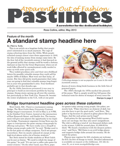
4. Set up flag (nameplate) at top of page one, title: "Apparently Out of Fashion Pastimes" (no
quotes); deck: "A newsletter for the dedicated hobbyist"
(no quotes). Use date and year, and "Edited By..." with your name.
You may style the flag in any typeface you think looks appropriate. Standard is about 72 pt for flag, centered, deck underneath,
about 18 pts, date, your name, etc. between two rules under that. See thumbnail at top for reference.
5. Edit stories in Word, if you haven't already. These stories contain a number of errors based on material covered during the copy editing portion of this class. Some of the leads clearly need work. Be sure to spell check. (Note: you can also check spelling in InDesign. With your text
cursor anywhere in the document, choose Edit, and Check Spelling.) Spell check headlines as well as copy in InDesign, just to make sure.
6. Place (or Copy and Paste) stories in your newsletter. Begin at least two stories on page one, and include at least one photo. Delete slug lines at top. Delete space between paragraphs, if necessary. Note: you probably won't use every story. Use your editorial judgment regarding quality of writing and likely interest of your readers.
Note: You need to fill at least four pages. If you wish, you can expand your newsletter to add one or two more pages; to add pages, go to Pages panel, and from flyout menu at upper right, choose Insert Pages. Don't add more than two pages, however.
Place photos as necessary to accompany stories. Most pages should have at least one photo.
A word on getting started.
Many editors begin by choosing a photo to accompany the story, placing that first, and then placing the story around it. It's easier to work around a photo than to place a story, than adjust it to accommodate a photo. Be sure to leave room for headlines.
Notes on photos:
Photo resolution Normally photos should be at least 100 ppi; 150 is standard, higher for magazines (see image resolution). For this practice newsletter, however, you can leave resolution as is. To edit photos, open in Photoshop. Crop, if necessary. Scale to size, based on the space (in columns) you wish the photo to fit.
7. Write headlines, spell check, and style using the styles you already defined. Size headline as you think looks best, depending on story size and importance. Don't use only one size; variation adds contrast and interest to a page. Jump stories to pages 2, 3 or 4 as necessary: don't forget jump lines and jump heads. Note: Never jump backwards, such as from page 3 to page 2. Confuses readers.
Designer's notes:
• Leave a pica or so at least of space between heds and body text. Leave a bit more space between the bottom of one story and the headline for the next, a pica and a half or so. White space makes a publication more readable, so don't cram things together!
• Avoid filling an entire page with just copy. Grey and unreadable! Add a photo, an illustration or, if not possible, try incorporating a deck, kicker, border (box) or pull quote. You should try at least one pull quote: to find a quote, read through the story. Copy a likely sentence or phrase, paste in text box you've made for it. Then make it a text wrap, and drag into the story. Break up those dull pages!
8. You can crop photos in InDesign if you want using the Solid Arrow tool, top left. Note that the scale tool (makes illustrations smaller or bigger) is in center right of the toolbox (it might be under the Free Transform or another tool). Hold down Shift key while dragging with the scale tool to avoid distorting photo. Note that while you can make minor scale adjustments in InDesign, this changes the resolution. If you need to make big adjustments in size, it's better to do it in Photoshop, because you can control resolution.
Photo cutlines.
All photos must have cutlines. Copy and paste cutlines as necessary from the cutline Word document. Be sure to copy edit cutlines.
Cutline styling: Cutlines should contrast from body text. Typically they are bf, ital, or one point smaller than text font. Avoid making them larger than text. Paste them in a small text frame under photo, and measure to leave a consistent amount of space between cutlines and photos, about 6 pts. You may wish to draw a six-point line (stroke) as a spacer. Pull the line just under the photo, pull the cutline text frame up to touch the line, and remove the line, for consistent spacing.
9. Add interest to your newsletter with drop caps, rules, borders, pull quotes, etc. Look at other magazines and newsletters for ideas. At least one story must include one of these features.
Note: do not put borders around every headline, cutline, etc. It looks unattractive. If InDesign is doing this by default, choose the text frame with the arrow tool, and in the stroke panel, choose 0 for weight.
10. Check again to make sure you don't cram material in: leave at least 1 p between
stories, and at least 6 pts between headlines and stories. When in doubt, better
to add white space.
11. Carefully proof the document. You may wish to print a copy for easier proofing.
12. Submit document to class Blackboard site as pdf for grading. To export as pdf: