Return to editorial processes resources.
Dummy sheets and copy control
(Based on a lecture by Ross Collins, professor of communication, North Dakota State University)
We all know that the concept of placing photos, illustrations and stories on a page is important, and more than just a mechanical process. The way articles are displayed, their size, and their headlines tell readers the importance you are giving to each story. Bigger, more prominently placed equals more important. Smaller, less prominently placed equals less important. Who has not at times looked at a publication and said, "of course, they put that story on page 18Z at the bottom--they are biased against that topic." Or "of course that's a big story, and a big headline, right on the cover, because they are obsessed with that topic."
That's why the process of placing elements on a page involves decisions made by editors. Normally editors are responsible for certain sections of a large publication. In a newspaper, for instance, a "wire editor" may be responsible for choice and placement of national and international news, which comes over the wire (well, now computer) news services. A sports editor will be responsible for sport pages. An editorial page editor will be responsible for editorial pages, etc.
This involves important choices, as well as a knowledge of the mechanical way a publication gets made, and the operation of the publication that makes sure everything gets done correctly, and on time. Most publications of any size have a standardized, routinized, never-vary set of guidelines for the mechanical process of placing elements on a page. Why? Well, for the same reasons that a pilot has a chart of routine checks before taking off, which must be followed in order, and must never vary. It guarantees you won't forget something important.
In the publication business, a haphazard operation will likely mean all kinds of embarrassing mistakes creep into a publication: stories published twice, photos mislabeled, headlines under wrong stories, parts of stories cut off, wrong dates, missing page numbers, big blocks of white space, etc. The process publications use to place elements on a page is called page make-up (usually based on an overall design). The process editors use to guide the placement, however, is often called dummying. That is, on many larger publications, an editor will guide placement of stories, but someone else, often called a compositor, or perhaps graphic designer, will actually put the stories on the pages.
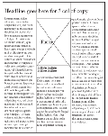
How does the editor do this? By making a sort of chart to show what he or she wants to put on each page. On that chart, or "dummy sheet," the editor indicates where each article, headline, photo, graphic etc. should be placed, and how much room each will take up.
Dummy sheets are usually small versions of an entire page, although they may be full-size versions of a small publication, such as a magazine. The sheet is divided by grid lines. What is a grid? Simply a set of non-printing lines that help editors and designers guide placement of elements. We talked about column widths already, writing headlines to fit one column, two columns, etc., or a photo to fit such widths. What we are talking about, actually, are guides, standard sizes of columns for a publication.
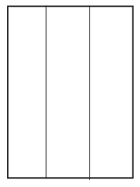
For instance, many magazines and newsletters publish on eight-and-one-half-by-eleven-inch paper, and have a three-column grid.
Your elements fit across one or more of these column divisions, and your copy goes down the divisions, column by column
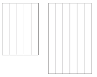
Tabloid-sized newspapers often use 5-col grids; broadsheet newspapers often use 6-col grids.
Your choice of grid usually already has been made for you, as editor, by a designer for your publication, to fit an overall design concept. Generally grids are chosen for ease of readability; wider columns are considered easier to read than narrow columns, but not too wide. (13-15 picas is common). Also they are chosen for flexibility in placing elements like pictures and graphics on a page. Furthermore, they are chosen to suggest "genre"--what the publication is supposed to be. Newspapers, magazines, newsletters, etc. have a certain look that suggests their format. The grid is part of that. For instance, a 3-col grid on a tabloid size would tend to remind readers more of a magazine or advertising circular, perhaps not the image the publication hopes to portray.
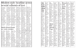
Grids even reflect fashion. As cars and clothing change with the times, so do publications. You only have to page through newspapers and magazines from the '60s, or the '30s, to realize how much design changes with the times. For instance, 8-col broadsheet newspapers used to be standard. Now columns tend to be wider, five or six to a page. Also common today is the concept of "modular design": stories are placed to give a horizontal feel to a page, and rounded off into rectangles. Old style design emphasized "vertical make-up": headlines were often 1-col, and stories ran down the page vertically. Modern design emphasizes "horizontal make-up": headlines are multi-column, and stories seem to stretch horizontally across the page.
Editors dummying pages need to realize design ideals of their publication when working with dummy sheets. The modular system considers L-shaped stories unattractive. "Tombstoning" headlines, that is, butting single or double-column heds across a page, is also considered unattractive in large-format make-up, such as newspapers.
Editors who choose headline sizes to indicate the importance of a story are often not the same people as those who actually dummy in stories to dummy sheets. Similarly, editors who actually write headlines are not always the same as those who choose sizes. It depends on the publication. Often editors working with dummy sheets are given two things: a list of stories needing placement, together with headlines sizes, photos, graphics, etc., and a set of dummy sheets to be filled. Sometimes they are given actual stories, and have to calculate how much space they will take (usually done automatically on computers). Other times they are given stories already calculated for them, in column inches. A column inch is one inch high by one column wide. (Display advertising is also sold in column inches.)
As for the dummy pages, they don't come from some other editor. They come from the advertising department. Pages arrive at an editor's desk with the ads already laid in. Editors are expected to fill the space left over after the ads--and often editors don't know from issue to issue how much space they'll have to work with. We mentioned that space available for editorial content is based on a ratio of ads to non-ad (editorial) space, designed to assure a profit for the publication. If, for instance, on a daily newspaper, the ad staff didn't sell as many ads on any given day, the space left in the dummy sheets may be smaller. If they sell lots, space, and number of pages, may be larger. So it doesn't usually matter how much copy an editor has (okay, unless terrorists attack New York): he has to fill the space given him or her.
As you might imagine, it's better for an editor to have extra copy left over than to come up short, because you can always hold copy for later, or perhaps "spike" it (throw it away). It's hard to fill big blanks when you have no copy. You can make available photos larger, make headlines bigger, but this only works to a point without looking obvious. This also explains, of course, why stories do not get into print--there's usually just not enough space for all of them.
Make-up editors keep careful track of the material they dummy into pages, identifying each by "slug," that is, a short title for the story, page number, length of story, and headline size. This is so that other editors, or perhaps the same editor, don't actually run the same story more than once on another page, or forget an important story altogether. You may think it easy to keep track of five stories and two pages. But when you have 40 stories and 10 pages, it gets confusing.
You keep track using a standard "copy control sheet." The sheet you use to place the stories is called a " dummy sheet." Some publications have moved the copy control and dummying process to computers but the principles are the same.
Let's see how a typical process works. Though the actual process in any publication may vary, it's commonly built around this formula. As a news editor for the Weekly Blabola, you look at what you have available for your next issue. You're in charge of pages 3, 4, and 5 and 6. You have a lot of stories that you've read and perhaps edited (or someone else has), such as these slugs
City Council, 15 col in (column inches)
County Board, 10 col in
Ag Comm report, 18 col in.
Hospital, 25 col in , plus one 8 x 10 photo, vertical format
United Way meeting, 5 col in
You get your pages from the advertising staff, and the first one looks like this. Advertising is laid in using designations beginning with number of columns, then number of inches. So the Penney's 3 x 6 is 3 columns wide by 6 inches deep. Penney's is therefore paying for a total of 18 col in.
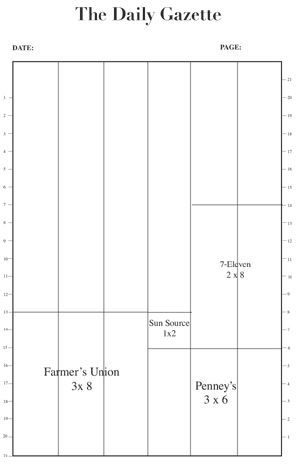
Your job is to fill the space around the ads. If you count the tick marks from the top, you'll find the available space totals 54 col in. How much space do your available stories take? Well, 71 col in. Will they all fit? Obviously not. And then there's the photo to consider--and you need to include space for headlines. Consider that a 72-pt headline takes up one inch of space, per line. So if you run that headline across 4 cols, how much space will it take up? One inch times four equals four col in. If it's a multi-line hed, double that for each line.
For instance, let's begin by laying in the city council story. Remembering the modular make-up (rectangles) approach, you could divide that story over several columns. Fifteen col in divided by five columns is 3 inches per column. Add a 60-pt hed, also of course having to run over five columns (headlines must be above all columns of a story), and you have a total amount of space the story will take up on your page: 15 plus about 4 col in for the hed equals 19. (A 60-pt hed is about 3/4 inches high, times 5 col, or 3 3/4 inches. You can round off to 4.) It looks like this.
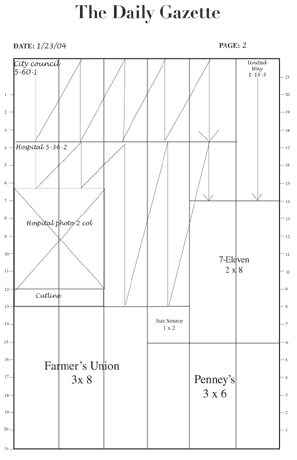
Okay, now that you have that story laid in, you write on your copy control sheet: Slug: city council. Page #: 2. Hed: 5-60-1. Col in: 19. Continue in that manner until the page is filled.
How to proportion photos
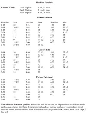 Photos are laid in using column widths. The widths used to be calculated using a proportion scale, but now generally are done using Photoshop software. You have to know how much space in depth a photo will take to dummy it in on the page. For instance, the 8 x 10 vertical photo, reduced to 2 col, will take up 5 3/16 inches of space vertically, 52 percent of original size. (See lesson on using the proportion scale to calculate this.) Of course, you need to know how wide 2 col is for your publication--the dummy sheet is merely a map, a facsimile, so you can't just measure that. Most editors know width of their columns, but for our practice, you can find it at the top of the hed sked (headline schedule, see illustration at right). You'll see 2 col is 25 picas. The proportion scale is in inches, however, so you'll have to calculate in inches, 6 p to one inch. Or you can just look at your pica rule, inches on one side, picas on the other. In this case, 2 col is 4 1/8 inches.
Lay in your photo first, with room for a cutline, then work your story around it. You'll notice in this layout that a 5-36-2 takes up five column inches of space (2 times 36 pt=72pt=1 inch x 5 col=5 col in). Add that to the 25 col in of the story for a total of 30. As laid in, you only have 27 col in of space for that. What to do? You could jump the story to another page, but 3 col in isn't really enough for a jump. You could shorten another story. You could crop the photo. You could make the photo smaller. You could put the story on another page. Lots of possibilities. Or, as I did in this case, you can cut three inches from the story to make it fit.
On your copy control sheet write: Slug: hospital. Page #: 2. Hed: 5-36-2; Col in: cut to 27. For the photo you'll write: Hospital photo, 2 col.
As you can see, you don't have much space left on this page--7 col in, to be exact. That blank area above the numbers? Not useable space, because that's where the page number, date, etc. (called the folio) go. What can you put in 7 col in? Well, the United Way story is 5. Write a 1-18-3, takes up about 1 col in, for a total of 6. Close enough for dummy sheets. Don't forget to add this story to your copy control sheet. This page is now done.
As a general rule, run a photo directly under headline, with copy (if the photo goes with a story) flowing around it. A photo not tied to a particular story should be boxed to indicate that it's separate.
Facility at quickly dummying pages takes some practice. But you'd be surprised at how quickly you get a feel for what fits where, and what size headline works best.