Return to Editorial Processes resources.
Using type
(Based on a lecture by Ross Collins, professor of communication, North Dakota State University)
We're now going to move into the editor's role in page design, including use of copy and illustrations. Concerning use of words in design, the most basic consideration an editor has to make is choice of typography. In the olden days, editors for the most part really did not concern themselves with the look of their publication, determined by the typeface they used, the illustrations, page design, etc. The main thing was to get the words in there, and the more words, the better, to give people as much "meat on the bones" as possible. For instance, in 1885, the average newspaper front page had 12,000 words. The size of the type was small--6 or 7 pt was not uncommon. Today that type would be used for classified ads. And editors had few opportunities to use illustrations, graphs, charts, photos and other tools to grab a reader's attention.
Today the average newspaper front page has about 4,400 words. Type is bigger. In the 1950s it reached about 8 pts on average. Today that looks small. We expect 9 or 10 pt nowadays, sometimes larger, and with a large x-height, explained below.
This seems to indicate a change of philosophy of how a published page should be presented to an audience. It is based, most obviously, on the visual demands of television, but also on our ability today to put color and illustrations into print more easily and quickly than in the past. Whether or not you believe that's better than the long stories of the past, I suppose, depends on the kind of publication you like--the long stories in Atlantic Monthly, or the short cuts in People magazine? The reality is, of course, that the mass audience goes for the short stuff. And usually we're editing for that big general audience.
Along with this shift to the visual the editor has had to become more and more a designer. The idea of "designing" a page, instead of just throwing type into columns, has grown in our new century to require most publications of any size to include art-trained graphic designers working with editors. Editors are expected to know this visual world, to recognize good design, to choose strong photos and illustrations. Knowing the words is no longer enough. Perhaps Carr Van Anda wouldn't do so well in today's editing environment.
Despite the revolution in computer and printing technology, designers still realize their basic tool is as it has been for five hundred years: words. Even in today's profusely illustrated publications, type usually dominates. And the typeface one chooses can profoundly affect the design of a publication.
Design of words, that is, type design, goes back to the beginning of language itself. In ancient times the first type was basically little pictures of a thing signified. That is, they were called "pictographs." So writing and drawing were pretty much the same thing. A pictograph is an icon, that is, an abstraction representing the thing pictured. For instance, in ancient Sumeria, an ox was drawn as a sort of V with line through the top. This looked somewhat like the head of an ox.
From this idea, additional meaning was attached to the pictograph. An ox also came to mean, in general, food. Thse were what we call "ideograms." In written Chinese today, some 10,000 of these ideograms mean different things.
In the West, however, this style of alphabet continued to evolve until the icons no longer resembled the physical objects they represented. Still, however, the person who wanted to be literate was stuck with learning hundreds of different characters constituting an alphabet, requiring years of memorization.
The ancient Phoenicians apparently realized this cumbersome system would really make it hard to design decent word processing programs, so they came up with a revolutionary new way of looking at written language. Instead of a large alphabet representing objects or ideas, they designed an alphabet representing sounds of the spoken language. This happened around 1600-1000 B.C., as far as we can tell. The idea, then, was that an alphabet would have no relationship with the object at all, but would be a purely arbitrary design. COW does not look like a cow. But it sounds like one, based on the spoken language.
Ancient Greeks and Romans refined the Phoenician system, added vowels and a few more consonants, and the alphabet we have today is really not much different from the Roman alphabet of 2000 years ago. It's worked that well. But we did lose intimate connection between pictures and words. Today, unlike the past, many people can write the alphabet. A lot fewer can draw.
Just because we use an alphabet much like the Romans doesn't mean we haven't tinkered quite a bit with design of the letters. Thousands of styles have been designed, called typefaces. We can classify most of them into a few families, however.
First an anatomy lesson. Consider the type below:
The typeface is palatino, a common face resident in many publishing programs. The small lines at the ends of letters are called serifs. The ancient Romans relied on serif type; we are not sure why, but possibly it kept ends of letters from cracking in the stone carvings Romans were so fond of. Today readability experts believe serif type is slightly more readable as body text, one reason it's become the standard for most publications. Type without serifs is called sans serif, or sans for short.
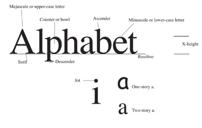
The large A is, of course, a capital letter, sometimes called the majuscule. Editors often call it an upper case letter, harking to the time when pieces of type were made of lead alloy and kept in cases. The upper case, of course, held capital letters, the lower case, small letters. The space in the middle of the p or b is called a bowl, or counter. The height of a small letter is called x-height--obviously taken from the height of a lower-case x. Areas reaching up from the x-height, such as part of the l or p, are called ascenders or descenders. The type sits on an imaginary line called a baseline. Italic type usually is designed differently, and not just a slanted version of a serif face. Oblique type, however, the term for slanted sans serif, usually is just a slanted version of a the same face.
Type is measured in points; 12 pts=1 pica, 6 p=1 inch. Note that the x-height is not necessarily the point size of type. Designers originally working in metal designed type so that ascenders and descenders wouldn't touch when set line below line. They had to leave some metal at top or bottom. Hence the point size of type would be the x-height plus the extra space left by a designer. The means some typefaces may have more or less space, so, for instance, a 12-pt serif face may look bigger or smaller than a 12-pt sans face.
The amount of space between each line of type is called leading, pronounced "ledding." It comes from the old "hot type" days, when space really was added by inserting strips of lead. It's still measured in points. The amount of leading is designated by using two numbers: the point size of a type face, and that point size plus the line of leading beneath. So "10/13," read "ten on thirteen," is 10 pt type with 3 pts leading between each line (a common choice). A type without leading, say, 9/9, is said to be "set solid." Does that mean there's no space between each line? No--the designer, we recall, designed each letter to rest on a certain amount of space.
Nowadays, of course, you can crunch computer-generated lines of type together by using negative leading, an impossibility in hot type days (until about the 1970s).
We commonly call a typeface a "font," but that's not quite accurate. Strictly speaking, a font is one size, one style, say, 12 pt times bold, sort of like the old-fashioned typewriter. The reality today, of course, is that with computerized pagination we can make any font whatever we want it to be, so we commonly say font, meaning one design of type in any permutation: light, bold, condensed, expanded, italic/oblique, etc.
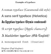 Most type can be divided into five families:
Full-page illustration of type families (PDF).
The first is the oldest, and yet today still the most popular. The roman family, a serif style, dates from, well, Roman times. But it also was used in incunabula, that is, the earliest books printed with moveable type (1450-1500). It is so important today that it's divided into three styles:
Styles overlap, but basic differences concern the look of the serifs, and the slant of the "thicks and thins," that is, the fat and skinny areas of the letter as they relate to calligraphy. Closest to calligraphy, that is, letters written by hand with a reed pen, is old style. Old style is characterized by bracketed serifs--the little curve where the serif attaches to the letter, as would be made by a read pen. Other characteristics are a slant between thick and thin areas, and less difference between thicks and thins, again, reflecting a calligrapher's hand. (See the type family PDF file for examples.) Traditional styles represent designs of the 1700s, when type designers were moving from old to modern.
Just because old style is old doesn't mean we don't use it anymore. It gives a feeling of nostalgia, tradition, informality, simplicity. Modern is formal, crisp, technical, dressy. It depends on your publication. Some contemporary type faces include characteristics of both styles. Common roman faces include times, garamond, bookman and palatino.
The second family of type, sans serif, is popular for headlines, informal publications, material that needs to be plain and easily readable--such as road signs. It reflects twentieth century values of simplicity and limited ornamentation. Note sans serifs has no serifs; common examples include helvetica, futura, arial.
Egyptian, or slab serif, family was the rage in the nineteenth century, because people thought the design reflected the newly-translated hieroglyphics. The serifs are squared off instead of tapered. Exaggerate this family and you have those old west "Wanted!" posters. Today it's often used for headlines and ads because it seems to SHOUT for attention. I also think it also makes attractive and unusual body text.
Script mimics handwriting. It's seldom used in editorial content, but frequently in ads and, of course, wedding invitations.
Blackletter is a style designed shortly after the invention of printing, patterned after medieval calligraphy. As body text it was abandoned centuries ago in most Western countries, but Germanic and Scandinavian nations kept this family alive until the twentieth century. In fact if your ancestors come from these parts of Europe, perhaps your family Bible is in a blackletter typeface. Today it's seldom used, mostly in ads, or occasionally newspaper nameplates such as the New York Times. It looks traditional and trustworthy.
A sixth family is not really a category at all. "Miscellaneous" is what we call all the faces that don't fit anywhere else, mostly novelty styles such as type resembling the Stars and Stripes, bamboo sticks, machine parts, or whatever. "Pi" typefaces are actually decorative flourishes such as arrows, check marks, pointing hands, stars, etc. Editors call these dingbats. Really.
When you choose a typeface for your publication, the general rule is: don't mix styles within body type, and choose from a different family for headline type. For instance, you can choose helvetica, a common sans face, for headlines, and times, a common body face, for text (but don't choose these--they're so overused they're like a typographical cliché.) If you want variety, you can choose variations within the type face. For instance, heds can be written in helvetica light, regular, bold, extra-bold, condensed, expanded, or oblique, and still keep the underlying design that gives unity to your publications.
Learn more: 10 common typographic pitfalls.
Includes keystroke combinations for quote, dash, and other substitutions.