 COMM 313: Editorial Processes
COMM 313: Editorial Processes
Instructor: Ross Collins
Beginning exercise: flyer (using InDesign CS5 pagination software for Macintosh)
In this exercise you'll learn:
Note: if you don't have the typefaces indicated below, choose another you think matches the sample at right.
For a video demonstration (MP4 files) of the flyer exercise, choose from the 5-minute tutorials below:
1. Choose New and Document from the File pulldown. In the specifications dialogue box, toggle off Facing Pages, Choose vertical orientation, One column, Margins 4p6 (four picas, six points) all around. Leave the rest as default.
Note: You can quickly move between dialogue box options by pressing the Tab key.
2. Check Preferences (InDesign pulldown ) and Type to make sure Typographer's
Quotes is toggled on. Try Previous and Next in that dialogue box to investigate other
preferences (most can be left on defaults).
 3. Draw a one-point border (box) on the page margins. To do so, choose the Rectangle tool from Toolbox (see left). The Rectangle tool might be under the Ellipse tool; hold the mouse button on the tool to show other options. Begin at upper left, drag a border. Don't worry if it's not
quite right; choose the Selection (solid arrow) tool from toolbox, and drag at square "handlebars" to change size.
3. Draw a one-point border (box) on the page margins. To do so, choose the Rectangle tool from Toolbox (see left). The Rectangle tool might be under the Ellipse tool; hold the mouse button on the tool to show other options. Begin at upper left, drag a border. Don't worry if it's not
quite right; choose the Selection (solid arrow) tool from toolbox, and drag at square "handlebars" to change size.
Note: to identify tools in your toolbox, hover over them with the cursor. After a moment a pop-up will identify.
4. Choose Stroke from the Window pulldown to bring up that panel, or choose from right edge of screen (if not already showing). With your border still chosen (handlebars showing), select a 1-pt rule ("stroke") weight. Alternatively, skip the Stroke panel and, presuming the box is still chosen, the contextual menu at top of screen should give you the same options.
Note: You can also create a border around a text frame by using the basic guide instructions for text wraps. I think this is more difficult, but hey, you need options.
5. Draw a text frame in the pasteboard (area surrounding your document), or in the document if you like. It's often good idea to creating elements in the pasteboard, and bringing them into your document afterwards. To draw a text frame, choose the Type tool from the Toolbox (Big T), and drag a frame. This constrains the "window shades" around your document. Don't worry if it's too small; you can change it by dragging the handlebars with the Selection tool.
Note: Unlike Word, to type in InDesign, you need to draw a text frame first, unless you Place text with a "filled" cursor.
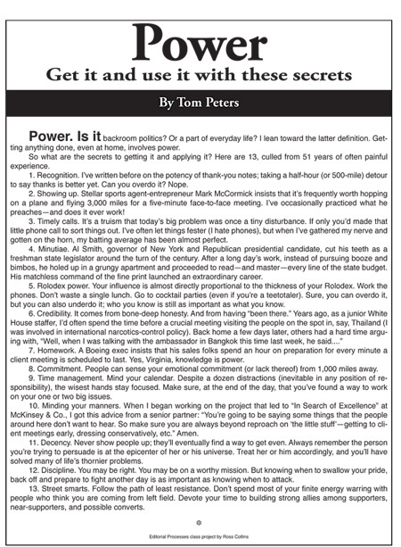
Now type: Power. (See illustration at top.)
6. a. Drag over word to highlight, or choose Select All from Edit pulldown (Keystroke combination Command + a).
b. From the contextual menu bar at top or the Character panel at right (if not showing, Choose Type and Tables from Window pulldown, and Character), choose 72 pt garamond, caslon, goudy, or other old style serif face, boldface (bf) and tracking Optical. Generally, larger point sizes look better with Optical tracking (also called kerning), which sets the amount of automatic spacing between each letter. Choose center alignment.
c. Choose Selection (arrow) tool. Drag text frame onto document. Drag handlebars on sides to adjust text frame so that it touches left and right side of margins. This centers the text.
7. Make another text frame reaching across the page, and stopping at margin lines. Note: do not type out to trim line, that is, edge of page. Stop at margins.
Type: Get it and use it with these secrets.
Style: 24 pt same serif face you choose above, bf, centered, horizontal scale 120%. Using Arrow tool, drag into place under headline.
Scale control is found in the Character panel or top contextual menu. The icon looks like a fat T. Wider type is called expanded; narrower is condensed.
8. Draw another rectangle 3p deep across the page, as shown above. Create a reverse (white or light text, dark or black background):
a. With the rectangle still chosen, click to roll out the Color panel from the dock at right (If not showing, choose Color from Window pulldown).
b. Click on the black area of the Color panel tint ramp ( lower righ)t to fill box with black.
Note: It's best practice to create reverses and other elements in the pasteboard, Group them into a single element (drag with arrow tool, choose Group from Object pulldown), then drag into the document. This puts your element on the top layer.
A word about layers: InDesign sets elements on your document in layers. This means one layer, say, a text frame, may be under another layer, and you'll find you can't choose it with the arrow tool. You can work around this by holding down the Command Key (Macintosh) while clicking to catch an element underneath another. Alternatively, you can change the layer stack by clicking on an element and from the Object pulldown choose Arrange, and move to front or back.
Note: you can also create a screen (tint a color) by sliding the opacity back to gray. To check that, make your the CMYK color space is chosen (upper right flyout menu of Color panel), and slide down the K (black) icon. A standard background screen is 10 to 15 percent for readability.
About the Fill and Stroke Boxes (upper left corner of Color panel or bottom of Toolbox): the upper left box ("fill" box) will fill type, boxes, or other items with a color or gradient. The lower right box ("stroke" box) will color lines and, in the case of type, outlines of letters. When you drag over type, the fill box should automatically come forward, allowing you to color the text (choose color options from the flyout menu in the Color panel). If you make choices from the stroke box, it will color outlines.
9. In the pasteboard, write: By Tom Peters. Style: 18 pt bf, same serif typeface as before, centered. Drag over text with Type tool to choose it (highlight). With the letters
still chosen, and fill box still highlighted in the Color panel, on the tint
ramp click on the little white rectangle at upper right (cursor turns into eyedropper
tool). The letters will seem to disappear, but actually will be white, same
color as pasteboard. With arrow tool, drag the letters into the reversed
rectangle. Center it vertically. You can also measure using guidelines,
but sometimes graphic designers are able to "eyeball it" for centering. It's faster.
10. Copy and paste this text from class website. Spell check. Note: Normally editors Place Word documents instead of using the copy/paste function, but this copy pasted into a Word document will not keep consistent formatting in InDesign CS6. So for now, copy and paste works best.
Best practices:
11. With Text tool's I-beam somewhere in the text, choose Select All from the Edit menu (or Apple + a, keystroke shortcut). Style text: 10 pt helvetica , helvetica neue, arial, futura, or another sans serif typeface, normal, Align justified (left line aligned left), leading Auto. Adjust text frame to center.
a. It's usually unattractive to let blocks of text touch rules and borders. To avoid this, drag the handlebars on both sides of text in to bring the edges about a half pica from the margin lines.
b. Indent 2p for each numbered paragraph. To do that, don't use the tabs. Instead select the text (highlight), and choose First Line Left Indent from top contextual menu or Paragraphs panel. Set at 2p0.
12. Drag to highlight first three words of text. From the top menu or Character panel,
choose, 18pt bold or semibold. From either menu, also choose
Small Caps, if desired.
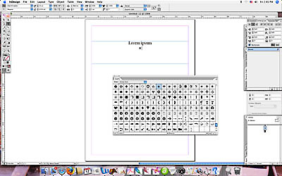 13. In the pasteboard, draw a text frame for the dingbat, the little typographical flourish at the end of the Tom Peters copy. InDesign calls them glyphs. Bullets • are dingbats most familiar to us (usually available on the Mac at keyboard shortcut Option-8). You can choose from a variety of more interesting dingbats. Some are available in standard fonts. For more, choose a special dignbat font, such as Webdings, Wingdings or Zapf Dingbats fonts (Hermann Zapf is a famous 20th-century type designer). To make a choice:
a. Draw a small text frame.
b. Choose Glyphs from the Type pulldown to bring up dialogue box.(Left: the glyphs dialogue box.)
c. Choose a glyph font from the menu bar at top (or type into bottom left of dialogue box).
d. Scroll to see all glyphs available.
e. Double-click on a chosen glyph to transfer to your text frame.
f. Center this text frame under text. Size as you think appropriate.
14. In another text frame, type Editorial Processes class project by [Your Name.] Style: 6 pt helvetica, helvetica neue, futura, or another sans serif font (easier to read in small point sizes) normal; align center. Center at bottom under margin.
15. Proofread carefully for errors.
16. Export as pdf:
a. Choose Export from InDesign pulldown.
b. Choose Adobe pdf print.
c. Leave rest as default. Save.
17. Upload this pdf to class Blackboard site for grading.