

")


ON THE COVER
kent kapplinger
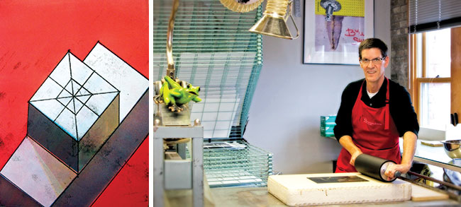
segment i
monotype, 11" x 15"
artist statement
My work addresses socio-environmental issues and focuses on balance, order, and regeneration initiating dialogue on the quality of life. I consider my work collaborative in nature, inspired by authors, reporters and researchers of environmental and cultural issues interpreted through my own rural-based background.
about the artist
Kent Kapplinger is a professor of art at NDSU, where he's taught printmaking and drawing since 1992. He also is director/master printer of the Printmaking, Education and Research Studio, or PEARS, institute in Fargo, N.D. He earned his MFA in printmaking from the University of Iowa and BA from Augustana College in Sioux Falls, S.D. Kapplinger's work has been shown in more than 230 individual and group exhibitions, most recently the FL3TCH3R Exhibition: Social & Politically Engaged Art, Tipton Gallery, in Johnson City, Tennessee, and Americas 2000: Best of the Best Centennial Invitational showing in Minot, N.D. He has participated in nearly 30 exchange portfolios, including East/West: Contemporary American Printmakers,Trace + Gesture, 50 Places, and Frogman Press & Paper. He has co-coordinated numerous student print exchanges including Quad 2010 and Oil and Water 2013. Kapplinger's work is included in more than 40 public and corporate collections, including McMaster University at Hamilton in Ontario, Canada; Special Collections Department and Rare Books Room at the University of Colorado, The Paul and Lulu Hilliard University Art Museum in the University of Louisiana at Lafayette, Museum of Texas Tech University, Northern Illinois University Art Museum, and Proyecto 'ace, Buenos Aires, Argentina. Kapplinger's work is available at Uptown Gallery in Fargo and online at www.kentkapplinger.com
on working with new town students (see story on page 10) I've learned from previous high school visits that students aren't satisfied with simply observing a demonstration but prefer experiencing the process themselves, getting their hands into it to see what the technique can do for them. My goal for the workshop with New Town, N.D., students was that they learn about printmaking, work in a collaborative environment, and interact with NDSU Art/PEARS residents while developing personal imagery and printing it themselves. I determined an appropriate print medium for the workshop would need to be executed rapidly and could produce multi-colored imagery. I had studio residents demonstrate water-based monotype and photo-screen printing methods so that students would better understand required steps and visualize how the process might be used with their own imagery.
In monotype an artist makes a one-of-a-kind printed image or unique impression. The word comes from the Greek "monos," meaning single, and "type," meaning model. The process involves drawing or painting on a flat surface and then transferring the image by means of pressure onto a sheet of paper. The process requires artists to draw a design in mirror image, so when transferred, it will read correctly. Monotypes date back to the mid-17th century when Italian artist Giovanni Castiglione rolled a thin film of oil-based etching ink onto a clean copper plate, then wiped areas away with rags or brushes and created linear effects with a pointed stick. The process was used by William Blake, Edgar Degas, and Paul Gauguin in the 18th and 19th centuries and more recently by Michael Mazur, Nathan Oliveira, Ruth Weisberg, Michelle Martin, Jaune Quick-to-See Smith, and Ron Pokrasso to name a few.
Each New Town student sketched their images onto newsprint. Then a piece of frosted Mylar was placed over top and drawn again in water-soluble materials rather than oil-based inks. They picked from various colors, layering them to achieve rich complexity throughout. Once drawings were completed, they were placed on an etching press, covered with damp paper and etching blankets, then pressed by press rollers. Moist paper liquefied the drawing material and press pressure transferred the image onto the paper. Some did a second printing without redrawing that produced a lighter impression called a ghost impression. Many artists relish the spontaneity of monotype but Degas was known for using pastel over ghost impressions.
artwork and collaboration
'Segment I' differs from the student work because several press runs of transparent ink were used on each impression to build luminous and unique color. The black lines were done as a trace monotype where the impression was placed on an inked surface then traced on the backside for a frayed string-like quality. There are several (segments) or sections in the image and one can see parts into which the object (whole) is divided. The piece was a collaboration with my father during one of his visits to Fargo. Though he was a dreamer and designer, he shied away from fine art. Yet he often made plans and schematics for projects to enhance our family farm. Things like bin sites, building remodels, and machinery innovation. When he came to the print studio I asked that he draw something and after some coaxing he did the basic isometric design you see. The printing and color aspects of the piece simply became play for me. The piece was the only artwork we did together so it remains very special to me.
 Contents
|
Email us
|
PDF version (Requires Adobe Acrobat Reader)
Contents
|
Email us
|
PDF version (Requires Adobe Acrobat Reader)

")


