 Most of what people use on the web is text, as we noted before. Readability, however, is more difficult on computer monitors. We need to consider carefully how to style text for easy readability and attractiveness.
COMM 260, Principles of Internet Web-Based Design
Instructor: Ross Collins
Lecture Synopsis Eleven: Text for the web.
Most of what people use on the web is text, as we noted before. Readability, however, is more difficult on computer monitors. We need to consider carefully how to style text for easy readability and attractiveness.
Web-based text may be written in two ways: HTML-generated text and graphic (GIF) text. About 90 percent of the web is HTML-generated text. It loads quickly and is easy to edit. But HTML-generated text does have its drawbacks:
Can appear in a variety of styles or sizes, depending on a user's browser defaults.
May appear in a variety of styles or sizes, even if the designer chooses the <font> tag to override browser defaults.
The <font> tag helps a designer reclaim control from a browser default, but although a font may be specified, the user's computer must have that font for it to appear. Size can still be overridden, although choosing relative font sizes will at least leave the page looking somewhat as the designer intended.
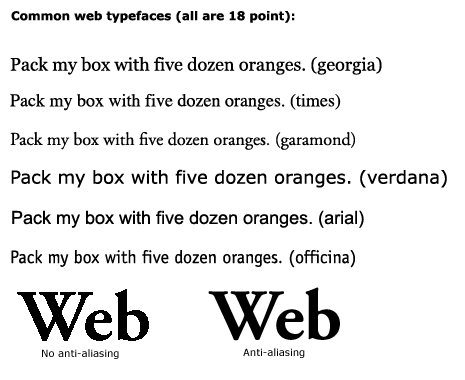
Designers choose from two basic font categories, serif and sans serif.
Serif fonts include small horizontal strokes at the ends of letters. The design is based on Roman type of antiquity. Research has shown that on paper it's more readable, although that's not necessarily true on the web. This paragraph is set in georgia, a popular font designed for easy web readability.
Sans serif dispenses with the little lines, for a more contemporary look. It's popular in printed material for headlines, but more popular for body text on web pages. This paragraph is set in verdana, a popular font designed for easy web readability.
HTML-generated text may be sized in absolute sizes or relative sizes. The HTML system sets up sizes 1 to 7, 7 being largest. Size 3 is default base size. Relative sizes are based on the base size. Designers who use style sheets (CSS) to simplify text specifications on a web page or entire site may use traditional measurements of points and picas. Twelve points equals one pica; six picas in an inch. Of course, what this actually looks like also depends on the screen resolution set on a user's computer.
Graphic text, sometimes called GIF text because it's usually a GIF file, isn't "live" text at all. That is, you can't change it using HTML. It's actually an image, built in Photoshop or another image-manipulation program. Graphic text gives you precise control over type face. It appears the same no matter what browser is used, or what defaults are set. But it's disadvantages are several:
can't be easily revised, must re-make the graphic;
longer download times;
won't show up on browser with images turned off; "alt" text is less reliable;
text cannot be indexed or searched;
not accessible to handicapped with text readers; alt tag more limited.
Graphic text often is used for headings, indexes and other small items.
An advantage of graphic text is anti-aliasing. HTML-generated text is not anti-aliased, that is, it is black type against white page, leaving hard-to-read glare. Anti-aliasing softens the edges by generating a gradient around the letter. Photoshop does this automatically.
More resources on type design.
Copyright 2004 by Ross F. Collins <www.ndsu.edu/communication/collins>