Comm 313 and Comm 362: Editorial Processes and Design for Media
Instructor: Ross F. Collins, professor of communication, North Dakota State University
Getting started with
![]()
(Version CC2020 for the Macintosh)
Need a pagination demo by video podcast? Check out Ross's InDesign videos. Choose from the five-minute video tutorials (MP4) below. (If the links won't open, copy and paste the URL on a new browser tab.)
InDesign is the powerful (and expensive) layout program Adobe hopes will replace QuarkXPress, the dominant program of the newspaper business. Its integration with Illustrator and Photoshop offers designers a suite of the world's favorite publishing software. If you learn InDesign--and the learning curve is admittedly somewhat steep--you'll be able to adapt fairly easily to QuarkXPress, and with only a few more stumbles to PageMaker, Aldus's original "desktop publishing" program that began the revolution in the late 1980s--although you're unlikely to encounter PageMaker anymore. Gone but not forgotten.
This is the "could-be-published as a Dummies Guide" introduction, which we all probably need, whether we're computer-smug or not. However, it's a bare-bones introduction for the class. If you want to learn more (and you ought to!), either get one of the many really good InDesign guides availabe on Amazon, enroll in COMM 362 Design for Media, or do both! (My presumption is that you already have basic computer skills. I can't imagine how you'd be able to operate at a university without them.)
Note: If you're using a PC instead of a Macintosh, no problem. InDesign works almost the same. A bit different terminology with folders/directories, launching the program, etc., but otherwise, not much difference. Sometimes the Macintosh control + click shortcuts are sometimes the equivalent of the PC right mouse click.
InDesign is able to manipulate
three graphic elements:
• type.
• line.
• shape, usually circles and rectangles.
It's not set up to draw very well, or manipulate photos--although CC2020 does offer some fairly handy tools to do a little of that without having to access Photoshop or Illustrator. Generally, though, most professionals work in those programs and then import illustrations and
photos from other applications into their document.
Many commands described below can be found under a pulldown menu at the top of the screen, called the menu bar, but InDesign also encourages us to work with its panels, as described below. After you become used to using common commands, you'll work faster (and look more professional!) by memorizing keystrokes combinations to shortcut pulldown menus. Look at the menu item to see its corresponding keystroke command.
Note on terminology
InDesign calls palettes panels, although sometimes you hear the older term. Panels anchor in the dock at the right side of the workspace. The toolbox is at the left, a single row. (You can change it to double by clicking on the double arrow at top) Click on panel icons to pull them open from the dock. Click on horizontal line icon at top right to see more options. Click on double arrows at top right to close, or click on new panel to automatically close other one. This all is pretty intuitive, really.
Adobe tries to integrate all software in its suite. That includes just about everything you're going to want to use for design. The dock/panel system looks similar, whether you're in InDesign, Photoshop or Illustrator, and some of the pulldown menus at top have similar names. The Macinstosh version also includes some options under the far-left pulldown with the name of the software. Preferences are included there.
Right-clicking the mouse is generally similar to Command-click (at left bottom on the Macintosh, or Control key on a PC), if you don't have a multibutton mouse.
To Begin
Insert your flash drive into an empty USB port. Just a handy first rule to remember, because you MUST save your work to your own disk if you work in a student cluster.
If you save it on the student desktop folder on the Hard Drive (the internal
disk in the computer), someone is liable to come by later and throw it out.
Make it a habit to SAVE OFTEN (memorize the Command key+s keyboard shortcut);
if the system goes down, you won't lose all your hard work. And while you're
at it, you could spring for a NEW flash drive from the bookstore. You'd be surprised at
what some students try popping into a computer directly from--what?--the cat
box? Yuk.
More and more common alternatives: email your work to yourself as an attachment, save to Blackboard workspace, or use save to your space on "the cloud," that is, somebody else's computer.
Assuming you've logged into the system (using your e-mail name and password),
double-click on the hard drive icon (or Start, all programs, and Adobe folder on a PC). If necessary, the Applications folder by
double-clicking, the printing and graphics folder, then InDesign... you get
the idea? Macintosh calls subdirectories folders, a metaphor for what I have
too many of in my file cabinets. (When is that paperless society everyone talks about going to be here?)
New note: NDSU's ITS has established a new (and onerous) procedure to log into Adobe Suite applications. We'll cover it in class.
Let's get started
The InDesign application icon will appear on the Macintosh dock at the bottom of the screen. You can multi-task, that is, move between programs, by single-clicking
on them from the dock. You know what program is active by looking at the name on top left of menu bar.
You can also move windows
around to see what's behind them. Drag your cursor on the bars at the top of
a window. The toggles at upper left minimize, maximize, or close your document.
You can also drag on the lower right corner to change the window's size, or
at the top bar to move it around the screen. If you're not used to the way windows
work in the Macintosh system, experiment before moving on, or you'll spend pointless
time in frustration trying to create something in InDesign when it's not active.
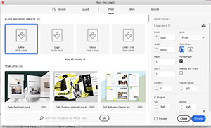
CC2020 offers you a splash screen on opening from which you can Create New document, or Open an already-created one, with suggestions as icons. Let's close that, however, (red dot at top left) and create a new document after setting Preferences.
Preferences
You can set some default choices before opening a new document. This is handy,
because then you won't have to re-set each time you start something new. Working
in InDesign, from the InDesign pull-down menu (Macintosh) at left, choose
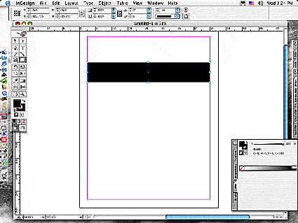
Preferences, and General or Text. Toggle on "typographer's quotes," if not chosen
by default, see illustration at right. (A toggled choice goes on and off at each mouse click.)
Almost all published and pdf documents should be prepared using professional ("curly-cue") quote marks, and not the "rabbit ear" straight marks a typewriter would use. (I know this document uses rabbit ear quotes, but I can't help it: it's web text.) Under Units and Increments, choose Picas for vertical and horizontal rulers. Graphic designers and printers usually work in picas, not inches or centimeters, for obscure historic reasons. Who are we to argue with tradition? (Well, okay, we've dumped most every other tradition in publishing this past few years, but measurement systems change slowly. Hey. The United States is the only country stubborn enough to still rely on inches, gallons and pounds.)
Note that if you don't like the shade of gray surrounding your document, you can change from the Preferences pulldown, Interface, and Appearance.
 Choose the File pull-down menu, and hold the button down to highlight choices.
This is called dragging, doncha' know. To keep the pull-down menu open, click
on it instead of dragging. (Choices in grayed-out type are not current options.)
Drag the arrow to choose New and Document. (Open opens a document you've previously saved
in InDesign.) (You also can open a new document from InDesign's splash screen, if showing.) Or as a shortcut, skip the menu and use keystroke command Command+n.
Try to memorize some of the keystroke alternatives that accompany pull-down choices.
They save lots of time, and you'll look oh, so professional.
Choose the File pull-down menu, and hold the button down to highlight choices.
This is called dragging, doncha' know. To keep the pull-down menu open, click
on it instead of dragging. (Choices in grayed-out type are not current options.)
Drag the arrow to choose New and Document. (Open opens a document you've previously saved
in InDesign.) (You also can open a new document from InDesign's splash screen, if showing.) Or as a shortcut, skip the menu and use keystroke command Command+n.
Try to memorize some of the keystroke alternatives that accompany pull-down choices.
They save lots of time, and you'll look oh, so professional.
Defaults and Documents
You'll first be asked what page setup you'd like. Normally the default setup
is U.S. paper size, called letter, (eight and one-half inches by eleven inches or 51 by 66 picas). CC2020 has expanded its template choices and has moved them to separate tabs at top: see Recent, Saved, Print, Web and Mobile. Otherwise you can create a document yourself. That includes setting margins and columns and bleeds and slugs. You may also double click to highlight the box, then just
type in the new information. To move from box to box, you can shortcut with
the Tab key (Shift-Tab to move backwards), or click with the mouse. Any menu
command followed by three dots (ellipses) opens to a Dialogue Box like the one
described above. This allows you to make choices regarding your document.
After opening a new document, decide which View (pull-down menu) you'll be working in, that is, how big your
document shows on the screen. Or try the Zoom Tool at bottom right of toolbox
(looks like a lollipop). The + sign zooms in; hold down the Option key and the
- sign zooms out. Often you'll work in Actual Size view so that you can easily
read the type. Fit Page in Window gives you the overall view. Entire Pasteboard gives you a view with workspace around it--sort of like a real desktop.
If you wish to change document specifications, from the File pulldown choose Document Setup, or from the Layout pulldown choose Margins and Columns. Margins sets up white space around your page, Columns sets up your grid, and Gutters sets up the amount of space between columns.
Moving from page to page, and adding pages: If you're setting up a multi-page document, move from page to page by double-clicking on the Pages panel at top right. Or choose a page number from the bottom menu bar. Or drag on the right-side scroll bar. Or..., well, InDesign gives you way too many ways to do most everything. To add more pages (or delete some), choose the Insert Page option from the Pages flyout menu, available at the right arrow of the Pages panel.
The Undo Command
Oops. In the real world we can't turn back time, much as we'd like to. You'll
never undo the shame of giving a subscription to Sports Illustrated to your mom for Mother's Day. But in the digital world of InDesign, you need
only to press Command-z. Or choose the Undo option from the Edit menu. Keep undoing
as far as you want. If you always kinda' liked amusing
yourself running video backwards, press and hold down Apple-z. All your work
comes undone. Don't worry. You can choose Redo from the Edit menu to take it
all back again.
Your Pasteboard and
Toolbox
Try moving around your document. Use the scroll bars on the sides of the screen. Or choose the cute li'l hand tool; drag around the document. Tlhe area outside the document edges (called trim lines) is the pasteboard. In InDesign, use the pasteboard to write headlines, draw boxes,
or experiment with elements before dragging them into your document.
Geezer alert: Graphic artists used to work on a real pasteboard to ready elements for pasting into a document. Inevitably we'd drop them on the floor, where they'd get covered with dust, which would invariably show up in print.
And now a word from the toolbox (left side):
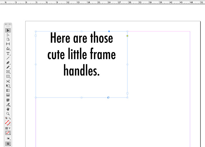
The selection (solid arrow) tool (top or upper left) chooses objects or frames in a document.
When you choose a block of type by clicking on it, the frame "handles" will
appear around the type. You can move the entire block, or draw on a handle corner
to make the column wider or narrower. Try typing your name with the text tool
described below, then experimenting with this feature. The direct selection (hollow arrow) tool selects paths in vector graphics or drawings you make yourself. Paths are lines that make up a shape. It also selects parts of objects you have grouped.
 The "T," type tool; it changes the arrow to an "I-beam." InDesign requires you to drag a text frame before submitting copy to
it, so you just can't click the I-beam anywhere in a new document and start
typing--much to the great consternation of all us old PageMaker or word processing
software users out there. Drag the I-beam in the document to draw a frame. Doesn't
matter what size--you can resize it later with the Selection (arrow) tool, as noted above.
The "T," type tool; it changes the arrow to an "I-beam." InDesign requires you to drag a text frame before submitting copy to
it, so you just can't click the I-beam anywhere in a new document and start
typing--much to the great consternation of all us old PageMaker or word processing
software users out there. Drag the I-beam in the document to draw a frame. Doesn't
matter what size--you can resize it later with the Selection (arrow) tool, as noted above.
To move a block of text, you need to drag the selection tool in the center of the chosen block; dragging along the handles changes the size of the block.
General note: before moving any object, you need to choose it first with the
Selection tool. Before changing text attributes, you need to highlight the text
with the text tool, or click the text tool anywhere in the text and choose Select
All (Command + a) from the Edit menu. Experiment with the I-beam.
Again: before styling text you need to highlight it by dragging across it with
the I-beam. Before moving type as a block, however, or moving any other element,
Other tools draw lines or shapes, and manipulate elements. Experiment.
After drawing a shape, choose the Selection tool, and click on the shape. You'll
see handles appear, looking like tiny boxes. You can drag in the center to move
the shape, or drag on the boxes to change dimensions.
Any shape tool object can become a text frame, a shape you can insert text into. The shapes in the toolbox with the X drawn in them are designed to be text frames, but nowadays that's a bit redundant. I just use the regular shape tools.
Guide Lines
InDesign sets up documents on a grid. You normally work with non-printing guide
lines to center elements on the page. To explore this feature, choose your selection
tool, and move into the measurement rulers at the top or left of the document.
From the rulers, drag guide lines into the document. (Use View, Grids and Guides, and and Show Guides
if you don't see 'em.) From the View menu, click on Snap to Guides (if not already
chosen by default); elements on the page will automatically snap to a nearby
guide for accuracy. These and many other menu choices are toggled. To turn them
off, click on them again.
To delete a guide, click on it with Selection tool and Delete key.
Reminder: to set up default guidelines for columns, go to the Layout pulldown, and choose Margins & Columns.
Panels and the contextual menu bar
You can access most of InDesign's features, from text styling to stroke size (InDesign calls lines strokes, although a lot of graphic artists call them rules) through panels. They dock on the right side of the window. To access, choose the Window pulldown and the panel you want to see. Alternatively, many of us like to work from the contextual menu bar at the top. It will change depending on which tool you choose from the toolbox, with many options for that tool. If you do not see the contextual menu bar choose the Windows pulldown and Control.
About text
You'll often need to bring in a story composed in a word-processing program,
such as Microsoft Word, called placing in InDesign. Choose Place (or Command+d) from
the File pull-down menu. Find the story by rummaging through the folders in the dialogue box: if it's on your harddisk, click on the
Desktop button, find your disk by name, and click to open it.
The Selection tool will turn into a little page icon; this is called a loaded
cursor. Place it where you want the type, and click. The type will flow
into the space; a text frame is automatically built to house it. Alternatively, draw
a frame first by dragging the loaded cursor, or click with the Selection tool to choose a frame already drawn.
Want to place some real text? Download the lorem ipsum practice Word document, save to desktop or your disk. (To download web text or photos on Macintosh with single-button mice, hold down the Control key (lower left) and then hold down mouse button on the document you want to download.) Yes, you can copy and paste this lorem text, but most editors prefer to work with the Place command.
Alternatively InDesign now also include its own Lorem Ipsum text for placeholding. Make a text frame. Then from the Type pull-down, choose Fill with Placeholder Text.
Nerdy history note: Lorem ipsum text has been a favorite specimen text file for at least 500 years.
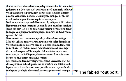 A tiny inverted red plus sign at the bottom right of the type block (the "out
port") shows you have "overset" text--still more of the story
to place (see out port in illustration at right). You can click on that plus sign to load the cursor again, and place
the next column. Or you can drag the frame larger to hold more type. At the
top left of your text frame is the in port. A plus sign here shows you have
placed above the copy you see.
A tiny inverted red plus sign at the bottom right of the type block (the "out
port") shows you have "overset" text--still more of the story
to place (see out port in illustration at right). You can click on that plus sign to load the cursor again, and place
the next column. Or you can drag the frame larger to hold more type. At the
top left of your text frame is the in port. A plus sign here shows you have
placed above the copy you see.
Drag handlebars to change the size of the frame, or drag the whole frame in
the middle to move the text block. For you anal types out there, the cursor
arrow keys will "nudge" selected text frame one point. Or 10 points
if you hold the Shift key down.
Oops! Decide you don't want to Place after all? Click in the arrow tool again in the toolbox,
and the "loaded cursor" will disappear. Or just choose Undo from Edit pulldown (Keyboard shortcut to memorize: Command-z).
Checking spelling; Find and Change
InDesign includes a simple word-processing like function to edit stories. With the story selected, choose Edit in Story Editor from the Edit pulldown. Or if you don't want that nuisance stuff, just edit on the document. You can still spell-check text:
choose Spelling... from the Edit menu.
Stories sometimes will have problems you'll need to fix: extra space between paragraphs, extra tabs (we don't use tabs for spacing in InDesign), two hyphens instead of an em-dash, or two spaces after each sentence, typewriter style. (Why people still type two spaces between paragraphs some 35 years after typewriters became obsolete I cannot explain.) Instead of laboriously making each change manually, use the Find/Change dialogue box:
To delete extra space between paragraphs:
1. With the Type Tool cursor in the text you want to fix, choose Edit puldown.
2. Choose Find/Change dialogue box
3. Find What box: choose Special Characters icon, Break Character: Standard Carriage Return.
4. Change To box: leave blank.
5. Find and change (delete) extra spaces as needed.
To delete extra space after each sentence:
1. Find/Change.
2. Find What: type two spaces using space bar.
3. Change To: type one space.
4. Find and change (delete), or change all.
To change two hyphens to em-dash:
1. Find/Change.
2. Find What: type two hyphens.
3. Change To: Special Characters icon, Hyphens and Dashes: em dash.
4. Find and change, or change all.
Printing a copy
You have to print to a PostScript laser printer capable of handling InDesign
documents. Fortunately, your tech fee supports some excellent cluster laser
printers, and they're (sorta) free (to a limit). You don't get that at many other schools, so appreciate
another of those wonderful services brought to you by your great land-grant university (for a tech fee and activity fee).
To print, choose that command from the File menu. We'll cover some of the dialogue
box options later. You may have to choose a printer type from that window (PSPrinter),
if one is not already chosen. The cluster printer may include special instructions.
After you're done working, you can leave InDesign by choosing Quit from the
InDesign menu, far left on the menu bar. So, to recap:
1. Open InDesign.
2. Set Preferences.
3. Open New Document.
4. Choose Type Tool (big T).
5. Draw text frame.
6. Choose Select Tool (solid arrow).
7. Select text frame (if necessary); adjust size by pulling on handlebars.
8. Click in text block with Type Tool. Type in some words.
9. Practice placing text: Download lorem ipsum Word file, save to your disk or hard drive, or copy the lorem text and paste it into an InDesign text frame (Or use InDesign's placeholder text.)
A note on PDF files
Most printers are asking editors and designers to submit Adobe PDF (Portable Document Format) files instead of "live" InDesign files, because pdfs include fonts and illustrations. More and more these pdfs never actually become ink on paper, but are distributed in digital form. Files may be attached to email messages, and are smaller than live files (with the .indd file extension), so easier to mail or upload to a web space. To export your file as PDF in InDesign:
1. From File pull-down menu, choose Export.
2. At bottom of dialogue box, choose Adobe PDF Format (if not default); Save.
3. Leave the rest of the defaults as is, choose Export.
Beginning InDesign: Continuing On
Master Pages
Most of the time you'll want to set up a multi-page document, with certain features
common to all pages. These may include a common grid, headers, footers, page
numbers, etc. Instead of setting up each page separately, Master Pages offers
you the opportunity to set up common elements.
1. Open a new document of at least two pages, Facing Pages toggled off. Facing pages sets up a document using left (verso) and right (recto) pages as a spread, book or other multipage publication.
2. Open the Pages panel (if not showing), and choose the "A-Master" icon. Set up columns by choosing Margins and Columns from the
Layout menu. Try two columns, 2 picas between each column (gutter). From the flyout menu at right, choose Apply Master to Pages... And All Pages.
Return to page one. Note column guides are transferred, as is any text or other elements.
3. Don't forget to move out of Master Pages when you place elements on individual
pages. Otherwise all placements will be repeated throughout the document.
Note you can go from page to page by clicking on a Page panel icon,
clicking the arrows at the bottom, scrolling, or probably a few other ways.
More about InDesign
Text
Usually editors and graphic artists bring text into InDesign from a word processing program,
using the Place command. If you want the text block wider or narrower, you need
to drag the edges of text frame handles with the Selection tool. Lengthen or shorten the block by dragging on top
or bottom window shades. Remember, the red plus sign at bottom right out
port indicates that you have more text left to place. With the pointer
tool, click on the plus sign to load your cursor again, and drag a frame to place in the next column, or
move to the next page to place. When no more text is left to place, the plus
sign disappears. If it is replaced by an arrow sign, that means threaded, but is placed elsewhere in the document.
Threaded Text
InDesign automatically keeps text together, in order, no matter how you place
it. This handy feature keeps your text from turning to word mush as you manipulate it. Again,
note that if you wish to shorten, say, the first column of two in threaded text,
you drag the window shade shorter, and the text is pushed to the next column,
and vice versa. To see how your text is threaded, choose Show Text Threads from
the View menu. Unthread a block of text: click on the out port of the original
text frame, and the "unthread icon" appears. Click again in the original.
Do this only for good reason, as unthreaded text quickly becomes confusing to manipulate.
Copying
For many future exercises, you'll need to repeat blocks of text or shapes. No
need to place or draw more than once. For text, drag to highlight or Select All, and choose Copy (Edit
menu). For elements, click with Selection tool to choose and then Copy. This places the copied material
on an invisible Clipboard. You can Paste it from the Clipboard as many times
as you need to. The Clipboard holds your material as long as you want--even
if you leave InDesign and move to another application, such as Word.
The Clipboard only has one "page," however: if you copy something
else, the material copied previously is deleted. Warning: you can copy photos
and illustrations from another application into InDesign, but what you get are low-resolution copies. To assure high-res copies will be produced when your document is printed, you need to Place your photos.
Styles, the huge time-saver
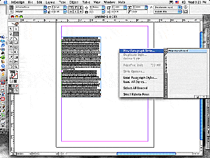 I think the easiest way to set up a style for repeated text in a document is to Place a block of text, style it as you wish and, with the text highlighted, choose the Paragraph Style panel from the dock (or from the Window pulldown, Styles, and Paragraph Style). Choose the flyout menu (tiny page icon on right of panel) to choose New Paragraph Style (see illustration at right). Name the style as you wish, and okay. The text you highlighted will become that style. To change other attributes, choose Options from left window. Now when you Place text, you merely Select All of it, or with the arrow tool select the frame, and choose your prepared style from the Paragraph panel.
You also can set up a style by choosing New Paragraph Style from the Paragraph flyout menu, working through the choices. Note: New Character Style (Character Style panel) will also set up your type, but for indentations and other paragraph changes you still have to bring up the Paragraph panel (so why not just use the Paragraph panel to begin with? I dunno either.) Character styles of imported Word documents may override your style choices. If so, Select All again, and while clicking on your prepared style, hold down the Option key.
Reverses, Fills, Wraps and Scaling
Geezer Note: Editors and graphic artists who learned with X-Acto knives and light tables (like me) found Text Wrap to be one of the most exciting features of computerized pagination. In the old days, wrapping text around an illustration or box could be a genuine pain in the whatever. InDesign made it as simple as water flowing around a rock in a stream--and metaphorically, that's what the wrap feature does.
Wraps
Succeeding exercises may ask you to wrap text around text, photo or shape. You can wrape around the bounding box added to a photo or shape, or wrap around a text frame. Text frame wrap instructions:
a. Draw a text frame about the size you need for a pull quote or other text-based object. You can always change the size later. Type, copy and paste, or Place your text into the frame. You'll wrap this text around your element, such as a photo or pull quote.
b. With Selection tool (solid arrow), chose the text fram or other element (photo, shape) you want to text wrap around (handlebars showing). Open the Text Wrap panel from the Window pulldown.
c. Select the second (square box) text wrap icon. This wraps around a square shape. For a circle or other curved shape, choose the third wrap icon.
d. Choose the stand-off (how close surrounding text is to the box) for all four sides. Try about 3 pts to start.
e. Create a border (box), around a text frame, if you want: with the text box chosen,
select a rule from the Stroke panel.
Note: The stroke is added under the blue frame line. To see the stroke, choose Hide Frame Edges from the Windows pull-down.
f. If wrapping around a bordered text frame, from the Text Frame Options dialogue box (under Object pulldown menu), choose Align Vertical and/or adjust the Inset Spacing so that the type doesn’t touch your border. Toggle on Preview to see what the changes will look like.
g. Drag your element into your copy. The copy will flow around the element.
Important note: should you decide to put copy later inside a wrapped shape (such as a cutline), you need to change the wrap specifications to make it possible. Choose the text you wish to appear in the wrapped shape; choose Text Frame Options as above, and toggle on Ignore Text Wrap. Now drag the text inside the wrapped box.
An update on scaling and cropping photos (that is, making them bigger or smaller). CC 2020 offers a scaling option that includes a frame for your photo or illustration similar to that of a text frame. You can scale the photo, realizing that as you do you are changing the resolution. Making it bigger will lower resolution, so while it's okay to tweak the size in InDesign, if you wish to make a big change, it's better to do it in Photoshop and then Place it.
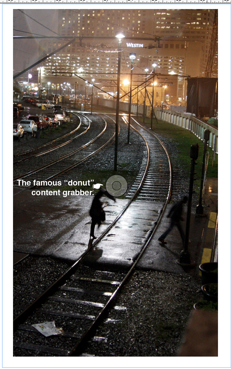 To scale a photo or illlustration:
a. Click on photo with Selection tool to bring up text frame.
b. Click one time on the Content Grabber, which graphic artists nickname the donut.
c. Drag corner of photo to scale; hold down shift key to constrain scaling--you want to avoid distorting your photo, looks unprofessional.
d. To crop a photo, double-click on the Content Grabbe (see illustration on right). Drag text frame.
e. To move the photo drag outside of the donut. Dragging on the donut moves it around the frame.
Reverses and fills
A reverse turns a background black or a dark color, and the type, the color of the paper or a light color. You reverse type out
of a filled object, such as a black or darkly-colored square or circle. One way to do
so:
a. Working in the pasteboard, drag over text you'd like to reverse using the text tool to highlight, or choose Select All.
b. Bring up the Color panel (Windows pulldown, and Color, if not shown on the dock). The fill box is the small box at upper left (hover your cursor over to identify). The fill box should already be chosen (appear in front of the stroke box, at lower right) if you've dragged over your type. If not, click to choose.
 c.Choose the eyedropper and click in the white box, upper left
of bottom color ramp. Or, to choose an actual color, open a the flyout menu
at right, using CMYK color (for publication) and choose a color from the ramp.
c.Choose the eyedropper and click in the white box, upper left
of bottom color ramp. Or, to choose an actual color, open a the flyout menu
at right, using CMYK color (for publication) and choose a color from the ramp.
Alternative: Choose black or a color from the Swatches panel.
d. The text will seem to disappear, because it's now white on white. But you'll fix that.
e. Draw a box with the Shape tool. Again from the Color panel, choose black. Drag the white text into the black box.
f. If it does not appear, from the Object pulldown, choose Arrange, and Bring to Front. InDesign places elements in (virtual) layers, so sometimes you have to move those layers around using this command.
g. Drag with Selection tool to choose both elements. From the Object pulldown, choose Group. This combines elements to make dragging into your document more accurate.
i. Shortcut: You can also do a similar reverse by choose the text box instead of drawing a separate shape, but it takes a little more manipulation to get space around the text as you think it looks best.
* A word on the little boxes at the bottom of your toolbox or top left of the Swatches panel: The upper left box will fill type, boxes, or other items with a color or gradient. The lower right box ("stroke" box) will color lines and, in the case of type, outlines of letters. When you drag over type, the fill box should automatically come forward, allowing you to color the text (choose color options from the flyout menu in the color panel). If you change to the stroke box, it will color outlines.
One more reminder: As noted above, you may have a problem choosing the element, or the type. This is because InDesign places text and elements as if they were layers on a page. If one element, say a type block, is in front of the object, you will be able only to select the block. To bring other elements up or send them back, from the Object menu select Arrange, and Send to Back or Bring to Front.
Drop caps
Used to be hard to do this; with computerized pagination, it's absurdly easy.
A drop or stick-up capital letter offers readers a "point of entry" or staring point to story, and a graphical flourish. Usually they are used at
the beginning of a story, that large capital letter hanging into the paragraph
(drop cap) or sticking up above (stick-up cap). To do a stick-up cap you need
to create the letter in its own little text frame, delete the original first
letter, add first-line space (Paragraph panel), and drag the new cap into
it.
To create a drop cap, try the automatic drop cap feature, accessible from the Paragraph panel. Place your Text tool cursor anywhere in the paragraph you want the drop cap to appear in. Choose Drop Cap option at lower left, number of lines you want it to drop, and just the right of this option, number of characters affected. Sooooo easy.
More on Grouping
If you choose to create the reverse in the pasteboard, you'll find you can't
drag elements in as a whole: the type won't move when you drag the object, and
vice versa. To group elements as a whole, drag a dotted line (marquee) around
them with the arrow tool. Choose Group from the Object menu. (Alternatively, you can temporarily group objects and drag together by marqueeing them as a whole with arrow tool.) Note you can later ungroup.
A Final Note
Learning to manipulate elements in any computerized pagination program is a
skill; anyone can do it with a guidebook and practice. The skill is only the beginning,
however. Just as a photographer begins by learning how to adjust a camera, or
a musician by learning the fingerings, an editor or designer learns the software as just
another tool to reach his or her creative goals. A powerful one, true,
but still only a tool. Without knowledge of design and makeup fundamentals, and without
the creative spark that goes beyond classroom learning, what you'll get out
of the machine won't communicate very well. It's easy to find evidence of that
in a good share of publications produced today by any office with a computer
and a laser printer.
What's more, tools change. Especially if they are run by computers. The InDesign software you use today has already gone through several versions, and that's likely to continue. Of course, some shops don't use InDesign at all. While it is becoming a software of choice for designers, many publications, especially newspapers, use QuarkXpress. The venerable PageMaker, first computerized pagination software, is still around (I think?). Other shops don't use Macintosh, but Windows. You won't be afraid of change if you know fundamentals. But if you know only "desktop publishing" (a phrase coined by Aldus Corp.), using InDesign CS6, you may be inclined to resist changes that could make your knowledge obsolete. This is the value of learning history, philosophy and theory. This is the value of university education.
A
Beginning Project
Create your own certificate or flyer(example at right)! Way kewl. The point of this exercise is
to help you learn to style text and place simple elements accurately on a page.
Note to editing students: choose this flyer project instead of the certificate below.
Create a certificate
 1. Create a New Document (File menu). Choose Orientation: wide (horizontal,
second icon). Click off Facing Pages, used for multi-page spreads.
1. Create a New Document (File menu). Choose Orientation: wide (horizontal,
second icon). Click off Facing Pages, used for multi-page spreads.
2. Specify six
pica (one-inch) margins on all sides; one column.
3. Under Preferences, choose Picas for both vertical and horizontal in the Units
and Increments option boxes and, from the Preferences and Text option box, Typographer's
Quotes. Leave the other Preferences at their default settings.
4. Choose Fit in Window (under View) or another view that allows you to see
the entire document.
5. Bring in rules to guide your text placement. Bring in horizontal guides at
15 picas, 20 picas, 28 picas and 38 picas, dragging them from the measuring
scale at top.
6. Save your document, named certificate or, if you'll possibly want to later open it on a PC, certificate.indd.
7. Create a border. Choose the square box tool ("Rectangle Frame") from your toolbox (fourth down
on the right), and drag a box around the document borders. Choose the arrow
tool to adjust the size later if you need to. (Alternatively you can create
a border around a text box, using the basic guide instructions for
text wrap.)
At the bottom of the tool box are the fill and stroke boxes: fill is upper left,
stroke (line or rule) is bottom right. Choose stroke box (if not already). Then choose color
button, bottom left. It will be black by default. Now from the Stroke panel
choose 5 pt, and type: thick-thin-thick. To better see the effect of your work,
temporarily choose Grids and Guides, and Hide Guides from the View pulldown.
8. Add type. Using text tool, drag a frame beginning at the baseline
of the first rule (15 pica). Don't worry if it's not exactly the right size;
you can adjust it later. With the text tool still chosen, from the Character
panel, choose Choose a serif font such as Garamond bold (boldface, or bf), New Century Schoolbook bold, or
Century Schoolbook, bold. Size: 36 pts. Leading: 36 pts. (set solid). Case: Small Caps. Kerning Optical, Align Center. (These choices can be made from the contextual menu bar at top or character panel at right. If panel is not showing, choose Window pulldown, Type & Tables, and Character.)
Note about fonts: InDesign offers only styles available for a particular font.
That means some display fonts will include only Regular, with no Bold or Italic
options.
9. Type: Certificate of Merit. (Note: alternatively, you can type first, drag
over type to highlight, and choose make changes.)
Draw frames on guides and keyboard in the rest of the type, laying each on the
guide you already drew. Change Type Specs to 18 pt, 18 pt leading, no bf,all caps, no
small caps. Make a text frame for each block of type (see sample illlustration above for reference):
The NDSU Department of Communication
Commends
[space for your name]
For
Enrolling in Its Design for Print (or Editorial Processes) Course
10. Add a 1 pt. rule (line) for your signature (under Commends). To do so, choose
the Stroke tool from your toolbox. With the line selected (little boxes or "handlebars" on the ends, choose the size from the contextual menu bar or Stroke panel (1 pt is default, unless
you changed the defaults).
11. To help center the line, bring in vertical guidelines after the second letter
in "Certificate" and before the second-to-last letter in "Merit." Or just "eyeball it."
12. Create a seal. Choose the ellipse (circle) tool. It may be behind the rectagle
tool; to find it, click and hold the rectangle tool until the flyout menu appears,
and drag the pointer to the correct tool. Note that all tools that include tiny
arrows at the bottom right have other tools hidden in flyout menus.
In the pasteboard, hold down the Shift key and drag the crossbar on the ellipse
tool to make a circle about 15 picas in diameter. The Shift key constrains the
tool to draw a circle instead of an oval. (If it still looks like an oval, choose
and drag with pointer tool as necessary to adjust.) In the Stroke palette change
Solid to the same thick-thin-thick line you used for the border, and thickness
to about 5pt.
13. With the Circle still selected, choose the Color panel, or work from the contextual menu bar. Click on the "Fill" icon to choose (you can hover over icons to see names pop up). Then choose black from the color ramp. Change that to a 10 percent tint: in the Color panel use the
slider to screen the color to 10 percent. (Printers call a "tint"
a "screen.") With the Selection tool, the circle onto the bottom center of the certificate at the bottom guideline.
Make sure it's perfectly centered; attention to detail is critical in quality
publication design. You can zoom out "eyeball" it for center, or measure.
14. In the pasteboard, create a small text frame using the text tool. Type NDSU.
Drag the I-beam over to highlight, and choose about 18 pt.; change font as you think
looks formal enough for this document, bf (boldface) if you like. Align to center.
15. Using the Selection tool, click to select this type frame. Drag the type onto
the seal. (Alternatively, write your type into the seal, instead of the pasteboard.
But it's helpful to get used to working up objects in the pasteboard, and then
dragging them into a document.
16. Review your work: is everything straight? Centered? Correct type style?
Spelled correctly?
17. Add your name to the line. Print or submit to Blackboard as pdf. Congratulations!