Return to Editorial Processes resources.
Writing headlines for print
(Based on a lecture by Ross Collins, professor of communication, North Dakota State University)
The title above a story in a newspaper, magazine ornewsletter is called a headline, or "hed" ("head") in print journalism, or a "heading" in online pages. It has the same function in mass media writing as a lead, to call attention to the story, to snare people in. I often say mass media publications rely on four objects to entice readers into a story, in this order:
- photo or illustration, to catch the reader's attention;
- headline;
- deck, pull quote, or other descriptive block;
- lead.
If you can get the reader through the lead, chances are fairly good he or she will read the rest of the story. Headlines writers who are good at what they do have something in common, I think, with advertising copy writers. They must be accurate, entertaining, pithy and, if possible, clever--all in limited space. What seems unfair is that neither one can put his or her byline on the work.
Headlines need to be accurate, first, and to fairly reflect the theme of the story. Most readers don't realize that those who write stories, the reporters, seldom write their own headlines. They may suggest headlines, but more often space needs or other considerations force an editor to fashion something different.
What's more, headlines are too often inaccurate, or biased. When a story is inaccurate, the reporter gets blamed, and takes the complaints. As he should. When a headline is inaccurate, most people assume the reporter wrote it. So again, the writer gets the complaints, unfairly. Ethical editors (who also don't want those whiny reporters on their case) take care with their headlines. So if you have the choice between being lively and being accurate, well, accuracy has to come first.
Headlines fall into two categories: standard and label.
Standard headlines are the kind of heads we're used to from a lifetime of exposure to print media. It's really odd that we're so accepting of this approach, as it's not at all conversational. You see a car accident. You tell a friend: "Car hits two pedestrians today." No you don't. You say, "Wow, I saw a car hit two pedestrians outside the mini-mall today!" Nevertheless, head-speak is different. A standard headline:
- uses subject-verb-direct object format, or occasionally passive voice. Think action verb.
- eliminates articles (a, an, the).
- includes verbs in the present tense (or sometimes future tense).
Even if it happened in the past, we emphasize present tense, perhaps because in the media business we want to emphasize NOW, not old stuff that already happened. It sounds more fresh to write "Mayor supports zoning proposal" than "Mayor supported zoning proposal at meeting." A standard head in active voice, then, could be something like "Twins win 2 in opener." "President supports tax cut bill." "Senator vows to fight sugar proposal." You can use passive voice, perhaps because it fits the space better, but it's not as lively: "Tax cut bill supported." Note that AP style doesn't apply to heads--numerals are okay, abbreviations, but avoid unfamiliar references. You might recognize that "NRA proposal draws criticism" refers to National Rifle Association, but "AEJMC meets in Minneapolis" would likely be familiar only to types like me (who belong to the Association for Education in Journalism and Mass Communication).
Editors usually stick to serious heads for serious news stories. Lighter fare or feature stories might call for different treatment. That's when good headline writers can prove that they could make a lot more money writing advertising copy, should they wish to stoop so low. "From hell to high honor." (Grand Forks Herald wins Pulitzer Prize.) "Carolers ring in Christmas season." (Feature on high school group.) "Poet Nash, first name Ogden; he is gone but not forgogden." (Obituary in the style of the famous poet.)
A second general category of head is the label head, or title. Even though we're familiar with these as book titles, for some reason editing students seem to have a harder time with them. A label headline:
- has no verb;
- may have articles.
Let's turn some of the standard head examples above into label heads. "The Twins' opener." "A presidential tax cut." "This year's Pulitzer awards." "A season of Christmas carols." Note: no verbs, like a book title.
Why would you want to use label heads in mass media style publications? Magazines sometimes use them because they sound more literary, less like the newspaper. Newspapers, too, will sometimes use them, particularly on editorial pages. That's because the label head contains no verb, so does not suggest an approach. Just what you might want for opinion pieces. In a letter to the editor, for instance, to use a verb suggests an interpretation of the letter-writer's viewpoint. And that can be misinterpreted. A label head is more neutral. Example: "Governor's veto shows ignorance, arrogance" can be neutralized with a label: "The governor's veto."
Writing a headline
It's usually best to read the entire story first. That way you can get a good idea of the theme, and you're more likely to reflect it accurately in your head. It's true, however, that many editors under deadline simply read the first couple grafs, and base their head on that. I usually find it easiest to begin with a lively verb that accurately suggests the story's content, and build around it. Emphasize people doing things--a basic rule of all mass media content. For instance, if a story is about, say, a city council meeting, I'd think, what did the council DO? Well, perhaps they raised liquor license fees. I can build on that: raises. Or perhaps a more sprightly verb? Bumps. Boosts. Jacks up. Gooses. Cranks. Pumps. (Well, some of those are more appropriate than others.) Now let's build: "Boosts." "City council boosts liquor fees."
Next I see how many lines the head is supposed to be, and separate it as best I can: three-line head.
City council
boosts
liquor fees
Of course, if the head is too short (or too long), you'll need to rewrite. And you can't hyphenate words in a headline, such as
City council
boosts li-
quor fees
Sorry, but boy, wouldn't that make an editor's job easier! Generally, heads are written "sentence-style," that is, first letter capitalized, and the rest "down" (lower case) except for proper names. Other tips:
- Abbreviations and numerals, okay;
- Be specific: "Governor proposal draws reaction" is not as beguiling as "Teachers denounce pay cuts."
- Use punctuation, except for the period at the end.
- Use single quote marks:
Senator calls
farm bill
'hopelessly flawed'
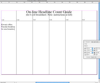
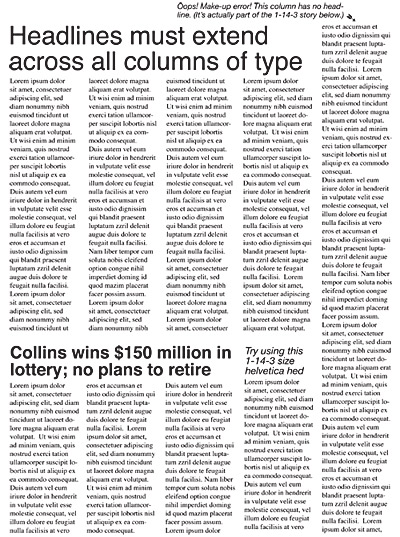 Headlines must fit the space an editor has left for a story. For instance, if you have a three-column (3-col) story, the headline must run across all three columns of type--or at least half way across the last column. All columns of type must have a headline above (see example at left).Normally on larger publications, one editor determines head size, and another editor actually writes the head. The two will communicate using a shorthand of three numbers, such as 2-36-3, a "two thirty-six three." (If no third number is listed, say 2-36, it usually assumes a one-line head.) That means a two-column, 36 point (pt), three-line head. Head shorthand is always written this way: number of columns, type size, number of lines. Design principles for attractive headlines mean certain sizes of heads can't be used above certain sizes of stories. How do you know? You consult the publication's headline schedule, "hed sked" for short.
Let's say you'd like to do a 3-14 (3 col, 14 pts). You consult your hed sked to find this is not listed. That means you can't use it--because the publication's designers or senior editors have determined that type this small across three columns is not attractive in your publication (it's also hard to write the head). A headline's type size in height is measured in points, while the width of columns is measured in picas.
About points and picas
This arcane way of measuring type goes back to 1700s France, and "hot type" days when letters were cast from a lead-tin alloy (we moved to offset in the 1970s). A pica (p) contains 12 pts. Six picas equals one inch (about). So how many points in an inch? Of course it's 72.
Type sizes are standardized. Anything smaller than about 12 pt is considered "body text," and not used for heads. Bigger than that is "display type" for heads. Standard display sizes: 14, 18, 24, 30, 36, 48, 60, 72, 84, etc. So how big is, say, a 36-pt head? I'll let you figure out that one. Type about 5 pt is sometimes called "agate," used for fine print. Smaller than that you can't read without a magnifying class.
The hed sked also gives you an idea of how much space in width a headline will use. Note that type in a publication is not usually monospaced, that is, each character taking up the same amount of space, typewriter style. Instead type designers set up proportional spacing. Fatter letters, such as m and w, take up more space. Thinner letters, such as i and l, take up less space. How much more? How much less? The hed sked shows this with a column of "maximum units."
A unit is the amount of space the majority of characters needs. That is, lower case a, b, c, d, e, etc. Generally they are counted as one unit each. Exceptions are the lower-case thin letters f, i, j, l, t, one-half unit, and fat letters m and w, one and one-half units. Capital letters take up one and one-half units, with the exception of the I, one unit, and portly M and W, two units. Spaces and punctuation take up one-half unit, except the colon, 1 unit. Numbers are one unit.
We used to determine head width by consulting the hed sked while counting units thusly:
Mayor praises tax cut.
2+1+1+1+1+1/2+1+1+1+1/2+1+1+1+1/2+1/2+1+1+1/2+1+1+1/2=19 units. Would this headline fit a 1-18 space, according to the hed sked? Yes. Would it fit as a 1-36? No.
Luckily for you we don't count heds like this anymore--a computer does it for us. If you have InDesign or PageMaker software(almost antique by now, I'll admit) you can practice with this by downloading an online count guide below.
InDesign online count guide (or build your own in InDesign, directions below):
If you'd like a step-by-step demonstration using InDesign, take a look at these tutorials (Flash files):
How to build an online count guide using InDesign:
1. Choose New and Document from the File pulldown.
2. In the dialogue box, toggle off Facing Pages. Change the orientation to the second (landscape) icon. Set the margins at 0.
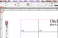
3. After the page opens choose Preferences from the pulldown (InDesign pulldown using Macintosh). Choose Units and Increments. Change the ruler units from inches to picas for both vertical and horizontal.
4. From the File pulldown, choose Document Setup. For Width choose 76 picas. For height choose 40 picas.
5. After the page opens, choose the Solid Arrow tool from toolbox at top. Check to see that the 0 mark on the ruler is at the edge of the page. If it isn't, bring the arrow tool to the crosshairs at upper left of document window at the end of the rulers. Drag on crosshairs so that the 0 mark on both rulers begins at the end of the page.
6. From that zero mark, drag in the vertical ruler to bring guidelines to these measurements: 12 picas; 25 p; 38 p; 51 p; 64 p. These will represent your columns. Now you are ready to write your headlines.
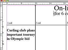 To measure a headline, choose the Text Tool (small T). Drag a text frame the column width of your headline. Start typing, change the point size as necessary from the menu bar at top. For example, to write a 2-36-2, drag a text frame to the second line (25 p). Type your headline in that frame, making the headline two lines. Drag over to highlight, choose 36 pt. Does it fit? If not, you need to rewrite until it does. At left is a simple 1-18-3 head for the story we copy edited in Section One, using the InDesign count guide.
 To write a multi-column head, your count guide might look something like this. Note that in this sample I've entered a 2-36-2, that is, 2 cols, 36 pt, 2 lines. Does it fit? Yes--each line goes almost, but not over, the 3-col line.
General instructions if you are not using InDesign:
For a standard 6-col broadsheet (full size) newspaper represented by my hed sked, set up a custom horizontal (landscape) page 76 picas wide by about 40 picas deep (how many inches is that? Recall: 6 p=1 inch). Now draw vertical lines at these intervals: 12 picas; 25 p; 38 p; 51, p; 64 p;. This represents columns of the newspaper. Note that two columns, or 25 p, is not just two times one column (12 pica). Why? Because you have to leave a gutter (space) between each column.
To gauge the size of a head, then, simply begin typing it at the left side, making sure the size is as indicated. For example, in the head above, I typed it on the guide starting at the left as 24 pt. Will it fit two columns? Yes--although it's a bit short. Heads should go at least half way across the last column.
If you don't have a pagination program, you can to do headline exercises counting the likely size of the heads using the unit count above, and the hed sked for maximum units. Goal is to get as close to the maximum as you can, per line, without going over the maximum.
Editors sometimes try to attract more readers to a story by adding kickers (also called eyebrows) and decks. A kicker is a second head about half the size of the main head, located above a story, such as:
Calls price supports 'inadequate'
Heitkamp denounces farm bill
Note the traditional kicker does not repeat the subject, but begins with the verb.
A deck is a second smaller headline below the first It may include a period. Example:
Heitkamp denounces farm bill
Senator claims bill will 'drag more small farmers into bankruptcy'