COMM 362:Design for Print
Instructor: Ross Collins
Designing a Photo Page
Goals of this assignment:
You are the editor/graphic artist of a weekly tabloid-sized newspaper, which
emphasizes photo-features. For next week's issue you plan a full-page (no ads)
photo story on travel and nature. Your photographer, Irving Nern, has taken
quite a few photos, wonderful destinations and natural things, and you also
have a small story on the theme, in addition to cutlines for the photos. (By
the way: Irving gets really cranky if you forget to byline his work....)
Proceed as described below.
1. Open up a new document in InDesign, tabloid size, facing
pages off, five column grid, two picas between each column, margins set at 5
p all around, except the bottom margin, 6 p. Note: be sure you have a TABLOID-SIZED
document before you begin work!
2. Working on page 1, begin by Placing your copy block (outside.ascii, class
partition, or copy and paste this). Don't forget to
delete "slug" (identifying words at top), and edit for typographer's
quotes, apostrophes, double hypens, or other problems that may have crept into
the text. As this is a separate feature page, you're going to have some flexibility
to choose typefaces as your think best fits your outdoor-travel theme. Choose
Character Styles and define new style. (See Exercise
Three if you've forgotten how to do this.)
You'll need to choose:
3. Next choose your headline typeface. It must either be a different family
from your body text, or at least look very different from your body text. What
size? Centered or flush left? Bf? Ital? Condensed? Expanded? You'se the designer....
Note: In the kerning box, choose Optical; looks better for headlines.
4. Now choose style for cutlines: must be different from body text. Usually
it's just a variation of body text, however, say, italic or bold. Might be a
point or so smaller. Also while you're at it, choose a typeface for the photographer's
byline. Usually small (6-8 pt).
5. Write a headline you think reflects the photos you have, and place it as
you think best, along with the copy block. Keep the copy to grid, if you can.
Headline can be at the top, but that's a bit blah, isn't it? How about a dominant
photo above? Perhaps a hed in two columns at the right, instead of across the
page? Take a look at some sample newspapers for ideas.
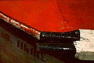
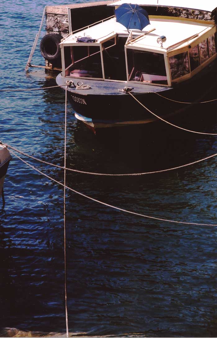
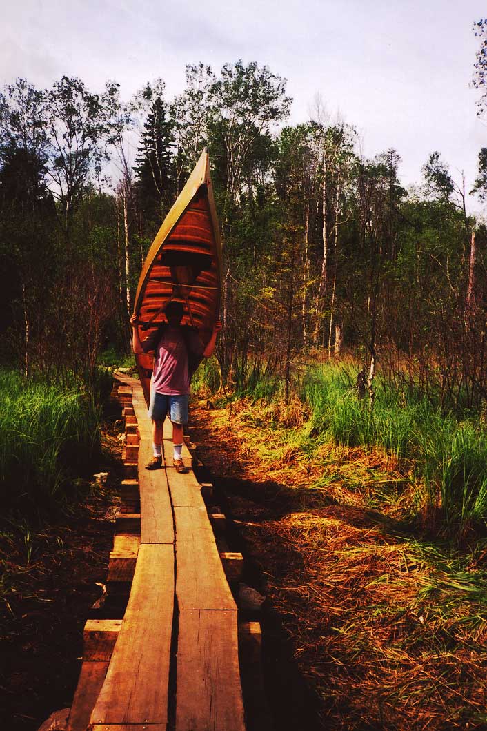
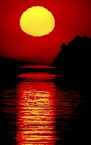
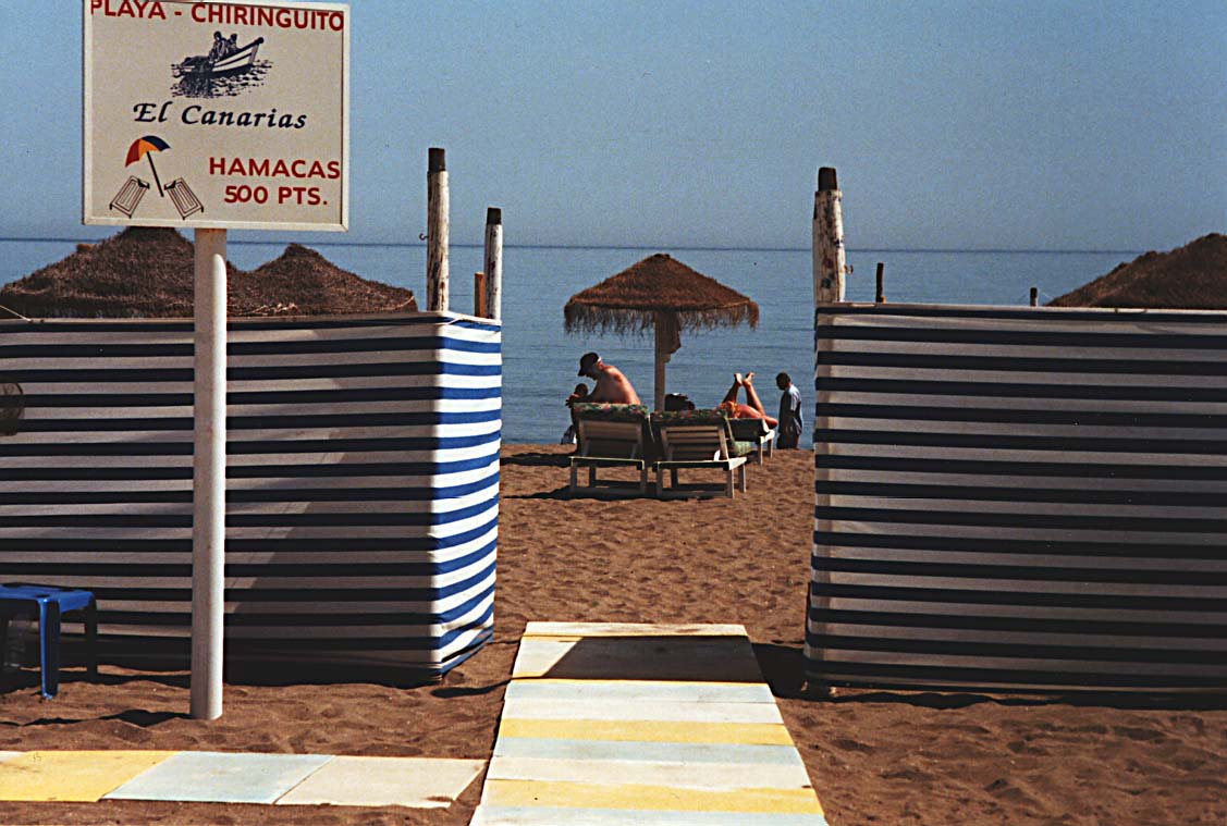
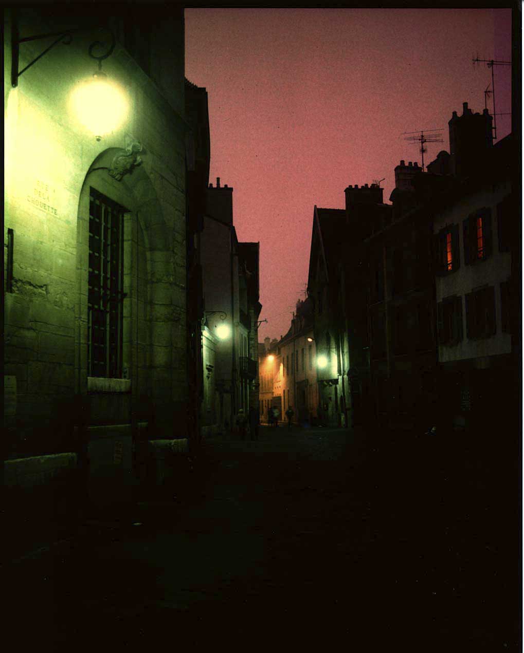
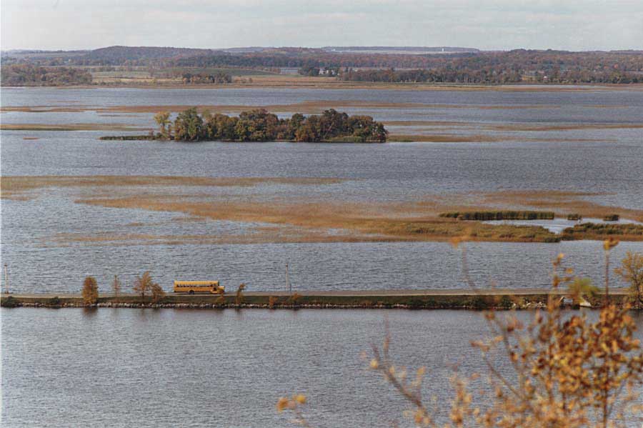
6. Choose from these photos for downloads:
(Note that these are low-res jpgs, for practice. Graphic artists normally work with higher resolution tif files, but these multi-meg files take up too much of my web space, and download more slowly.)
7. Bring each photo into Photoshop, for cropping and correction. For each,
go through the PS checklist, such as:
a. Crop, if necessary. Note: Look for a "poster effect": simple, bold
images. Many small details in an image don't reproduce well in publications,
especially newspapers.
b. Use Curves (or Levels) to adjust exposure.
c. Fix dust spots with Stamp (clone) Tool.
d. Make other adjustments, as needed.
e. Adjust color balance.
f. Just before saving, sharpen with Unsharp Mask.
g. Save photos to a folder you've created for this job, labeled something like
"Last exercise."
8. Choose from the photos, at least four, and use the Place command to place
them on your page. As you're choosing, Things to keep in mind:
a. A dominant shot. Which photo in your mind best sums up the theme of the photo
page, based on the copy? Make that one largest.
b. A variety of medium and close-up shots. Big and little sizes.
c. Avoid out of focus, badly composed, or badly exposed photos. Use only the
best.
e. Avoid making photographic cliches dominate. Such as sunsets.
9. Choose a spot color, for headlines, rules, borders, screened boxes, or whatever you think needs a little color.
Reminder: choosing a spot color in InDesign
a. Bring up the Swatch palette from the Window pull-down menu. In the flyout
menu to the right, choose New Color Swatch).
b. Under Color Type, choose Spot. Under Color Mode choose Pantone Solid Uncoated. (Uncoated stock, that is, for newspapers and the like. Coated for magazines, etc.)
c. Select from the swatch possibilities the colors you think you'll need. Select more colors using the same procedure; they'll be transferred to the Color palette.
d. Be sure to write down your spot color PMS number for the printer. (Unless you submit a digital mechanical containing this information.)
e. Remember the two little boxes in the color palette (and bottom of toolbox);
the one on top left fills objects and text with color. The one at the bottom
right applies color to a stroke (rule or line). See Exercise
Four, gradients, for review. Choose either to highlight.
10. Arrange the photos to group and control use of white space, to include a
variety of sizes, both horizontal and verticals, to line up common edges, and
generally to give unity to the page, instead of a collage or photo album look.
You don't have to keep to grid when designing a full photo page, but it's usually
easier. You may wish to scratch out a few thumbnail drawings on paper to help
decide where to put the photos. Choose at least one photo, or other design element,
as a bleed.
Bleeds
Bleeds are elements, usually spot colors and photos, that extend to
the edge of the page (trim line). Our laser printers won't print to the edge
of a page: to do that you have to take your work to a "real" printing
press, so that printers can actually trim the paper to the bleed. However, you
can indicate a bleed, for practice.
a. Drag your photo or other element to about one-fourth inch past the trim line. A little bit of the element will actually be off the paper, and will end up being trimmed away, so make sure it's not important.
b. When printing, in the Print dialogue box, choose the Marks and Bleeds option,
and toggle on Bleeds. Note other marks in this box refer to registration marks
the printers need to print spot and process color.
11 . If you haven't already, proportion the photos to fit the page (choose the
Scale Tool (fifth from top on the right) and drag on corner, holding down the
Shift key to constrain proportions). Note: these photos have been saved in Photoshop
at a certain size. It's okay to make them smaller. But if you make them bigger,
you lower the photo resolution: you can't add more pixels in InDesign, so by
enlarging you make them bigger to fit the larger size. At some point the lower
resolution becomes noticeable, even "pixellated," those tell-tale
jagged lines. So as a general rule: scan photos as large as you think you'll
need, and reduce if necessary, and/or scan at a high resolution. For instance,
if you scan at 1000 dpi, you can enlarge down to 100 dpi, and it will still
look okay in newsprint. (Yes, there are questions of file size and slow laser
printing with this technique, but that's beyond the scope of this assignment.)
12 . Cutlines: In this case, you'll have to pretend, by using a couple lines
of lorem ipsum type. Place each cutline under, or beside a photo, as dictated
by your design. Keep uniform amount of space between photos and cutlines, probably
a pica or so.
13. Add byline, either before the story, after the story, or elsewhere: Photos
by Irving Nern. Design by [your name(s)].
14. Make a pull quote, by copying a bit of the text. Pull quotes should be at least 14 pt, type styled normally to headline face. Add pull quote somewhere so that it looks attractive. Watch out for "trapped" white space! Refer to professionally-designed newspapers for ideas.
15. Choose a Gradient (gradient tool) to make the pull quote box more interesting.
Forgotten how? See Exercise Number Four.
16. Printing: We don't have a laser printer in the classroom capable of printing
tabloid sized-pages. However, you can print a "miniature" (thumbnail)
of the tabloid on an 8 1/2 x 11 page, to proof. To do so, select Print, and
Scale and Fit, and under Scale, toggle on "Scale to Fit." OR you can
print the full-sized page as Tiles, and paste together, described below.
14. Preflighting. Run a preflight check to ascertain the status of links to the file. To do this, choose File and Preflight. After a moment, you'll have a report on the status of your links. Problems will be indicated by yellow triangles. (Remember the basic shapes? Triangle for tension?)
About Preflight problems:
If you've stored your photos in the same folder as your InDesign file, you shouldn't
see any problems. To see reports of specific elements, click at left of dialogue
box. Missing fonts particularly pop up when you've moved your file from one
machine to another--you have to install the font in your computer, or change
it in the file. Links and images must include links to high-resolution images
because, even if you can see the image in your InDesign file, what you're seeing
is a low-res copy. Without the link, that low-res copy will print out. You won't
like the look of that. You can choose not to link high-res images, but to embed
them in your files. However, several multi-meg photos will slow down your ability
to work with the file in InDesign.
InDesign offers a handy way to collect up all your files and fonts for a printer, called Packaging. Choosing that option (from the Preflight dialogue box, or the File pull-down menu) will gather up everything a printer needs into a new folder. However, submitting a PDF file is perhaps an even more reliable alternative, see below.
15. Printed a thumbnail for proofing? To do so, choose Print, Setup, and Scale to Fit. (You can print multiple pages on one, if you had multiple pages, using the Thumbnail option.) Ready to hand in for grading? Then save your design as a PDF File.
Generating a PDF
PDF (Portable Document Format) is an Adobe invention based on PostScript
language that offers a complete "snapshot" of your document. Commercial
printers can use PDF files or, even more handy, they can be added to web pages
for download. Adobe Acrobat Reader is necessary to read these files, but it's
a free download,
or bundled with web browsers. And InDesign makes it super-easy to save PDF files:
a. Choose Export from the File menu.
b. Under Name, choose your last name (so I can identify it), and add a PDF file extension (Such as: collins.pdf). You don't have to add the extension, but it's good to tell the world of various platforms and browsers that this is indeed a PDF file.
c. Save to your own folder.
d. In the options dialogue box, leave all defaults, unless you really want to change something for a good reason. Choose Export.
e. From the Finder (Macintosh platform), double click on your new PDF file
to make sure it opens. Adobe Acrobat should open automatically. If it doesn't,
probably your computer somehow lost the program. Download it again from Adobe
or, if you're working in a cluster, forget it and move to another machine. Cripes,
it's not up to you to keep all these clusters in working condition. Okay, so
you could report malfunctions to the ever-doughty Help
Desk Folk.
16. For grading, e-mail your PDF file to
me as an attachment. Be sure you have your name on it somewhere, if not
as the actual file name, as I recommended above.
To print Tiles:
Choose Print, the Setup option, and Tile Auto.