COMM 362, Design for Print
Instructor: Ross Collins
Exercise Eight: design a brochure for communication department’s undergraduate program.
Here is a practical project that ought to offer helpful exerience for real-world design. Everybody needs a brochure, right?
Job: create a brochure promoting the department of communication’s undergraduate program. Format: 8 1/2 x 11 tri-fold; needs
to fit into a standard business-sized envelope for mailing.
How to proceed
Begin by dividing your team tasks. I won't designate tasks this time, but choose a different person for each job from those who worked on the last exercise, so that everyone has a chance to get a variety of experiences.
- Team member one: content expert to gather and possibly rewrite text for the brochure. Base text on material you pull off the department's web site undergraduate link. Obviously, the person chosen to do this will
have had some background in mass communication writing.
- Team member two: InDesign expert doing actual work on the computer based on direction and suggestions from other committee members.
- Team member three: Design director and Photoshop expert. Responsible for preparing photos, coordinating text and design, writing headlines and proofreading, along with helping the rest of the team with ideas and InDesign techniques.
The whole team should brainstorm together for design possibilities. Begin by taking a
look at other brochures for ideas. You’ll want to use photos or graphics, presumably.
Photos of what? How about snapping your own digital photos of things going on in communications--classes, instructors, groups, etc! Or if you must, use part or all of my lame possibility (definitely needs work in Photoshop first). Find clip art if you like, but it should look professional and academic-related.
Photo Resolution: 266 ppi preferred, but for this practice project I'll accept 150 minimum.
Note: No low-res photos or copyrighted work downloaded from the web! If I catch you downloading copyrighted work, no credit for this assignment until you substitute those images with something usable. You might as well get into the habit now of using only legally reproducible work, because in the real world you get into big trouble borrowing copyrighted stuff!
General steps:
1. Sketch a few thumbnails to help you come up with ideas. This time you don't have to submit them for grading, but do them to build your own creative energy.
2. Consider choice of typeface, headline type, grid, margins, illustrations,
spot color, a logo (use this logo designed a few years ago by
NDSU student Nicole Nicolai), etc. Consider using drawings; below are basic instructions on how to draw in Indesign.
3. Consider how your brochure will fold. Look at an actual brochure, or print this template (pdf) for reference, if necessary.
Note: a tri-fold brochure does not fold at exact thirds. The first panel is a little larger to overlap slighly, making it easier to open the brochure.
4. After completing your design, analyze your work as a team using the principles below (5 pts).
- Emphasis
- Contast
- Balance
- Alignment
- Repetition
- Flow
5. Export as pdf, attach to email, send to me.
Drawing with InDesign CS3
 You already know how to draw basic squares, circles or polygons using those tools from the toolbox. You also know you can turn any shape into a text frame by clicking the text tool in the shape and typing. You also (I hope) remember that you can constrain the tools to draw perfect squares or circles by holding down the shift key as you drag.
But you can also alter these shapes using the Transform panel:
1. Draw a square or circle. Choose with Solid Arrow tool.
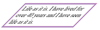
 2. From the contextual menu bar at top, or Transform panel, you can shear or rotate. In the illustration I sheared a box, added text, pulled the text down from the top to center using the Text Frame Options dialogue box (Object pulldown), and added a spot color to the border (stroke), PMS 241 to be exact, screened to 75 percent. That blah times font looks way more interesting in sheared form! Not that you'd necessarily want to do this for the brochure above, but know it exists.
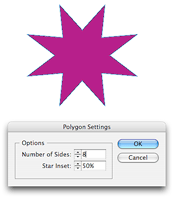
You can create stars by choosing the Polygon tool. After choosing, double click in the Polygon icon in the toolbox to bring up the star dialogue box. In this example I chose an eight-point star with 50% inset.
CS3 offers some new effects that you used to have to do in Photoshop or Illustrator. These include drop shadows, emboss and bevel, and others. To use them, choose a shape, and then choose Effects from the Object pulldown. You also can change outlines by choosing Corner Options from the same pulldown, or from the Pathfinder panel.
In the illustration below, I chose several possibilities: Drop Shadow, Fancy Corner Option, and Bevel and Emboss. The type is garamond bf, small caps, centered using Text Frame Options from the Object pulldown.
Try drawing freehand using the Pencil tool. It's easy to use, but drawing with a mouse I find as challenging as drawing with, say, a potato?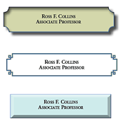
You can also add these effects to photos. Why not try some of these in your brochure exercise?