 2.Create a New InDesign document ( if splash screen is not showing, select New and Document under the File pulldown, or keyboard shortcut Apple key + n). Page setup:
 Comm 362, Design For Media
Instructor: Ross Collins
Introduction to InDesign pagination software (Macintosh Indesign 2020)
Exercise Two, a flyer to practice type styling, coloring, and manipulating
This exercise offers you the opportunity to practice type family recognition and styling, and
to improve your InDesign basic navigation skills.
1. Create a new folder for your document assets. Download to that folder this text and save as a Word file.
2.Create a New InDesign document ( if splash screen is not showing, select New and Document under the File pulldown, or keyboard shortcut Apple key + n). Page setup:
letter size (default; 8 1/2 inch by 11 inch);
orientation portrait;
toggle off Facing Pages;
margins at 4p6 (four and one-half picas) on all sides. Columns: 2; Gutter: 2 picas (space between each column).
Reminder: You can always change these later using the Document Setup (File pulldown) or Margins and Columns (Layout pulldown).
3. If your measurement default is set to inches, not picas, change it. Under Preferences,
Units and Measurements, change Horizontal and Vertical to Picas. Also check
under Preferences Text to see if "Use Typographer's Quotes" is toggled
on. You always want to use these unless you're designing for the web, which
doesn't recognize "curly-cue" quotes without special coding.
4. Drag a text frame. Place (under File pulldown, or Command + d keystroke) or paste the text file into separate text frames three times into each of the two columns (that is, six times total). Or you can Place only once, then with the text tool somewhere
in the block, Select All (edit pulldown, or Command + a), Copy the block, and Paste it into five new frames.
5. Style each column with typefaces as indicated below. (0 tracking in all cases. Tracking is the space between letters in body text.) Font family is indicated. To find a font in this family, study samples from the font choice in the Type pulldown. You may have to type a few letters of each for a better look. Refresh your knowledge of type families by studying these samples.
a. A roman old style serif font 10 pt with 1 pt leading (10/11, "10 on 11"), Align rag right (flush left). Choose from Garamond, Goudy, Caslon, or another old-style roman typeface.
b. A sans serif font, 10/9, (negative leading), align justified (Note: choose the first justification icon from panel, last line left). Choose from Helvetica, Arial, Futura, or another sans typeface.
c. An Egyptian or slab serif font, 10 pt set solid (10/10), justified. Choose from Rockwell, Clarendon (or "Superclarendon"), or another slab-serif typeface.
d. A script font, 10/12, rag right; Choose from Apple Chancery, Brush, Noteworthy, or another script typeface.
e. A blackletter font, 10/13 centered. Choose Old English, Lucida blackletter or another blackletter typeface; if blackletter is not available on your version of InDesign, choose a roman modern typeface such as Bodoni or Didot.
f. A novelty font of your choice, 10/12 or other leading as you think looks attractive, alignment as you think looks attractive.
6. Adjust text frames to fit around text. Align text blocks horizontally in three sets of two. Drawing separate text frames, in 12-pt Helvetica bf (boldface) or Arial bf, Label each text block with short headlines indicating each typeface chosen, align center. Drag three horizontal guidelines as baselines for the headline text. Move the small headlines to the guideline, and copy blocks underneath, all the same distance for consistency.
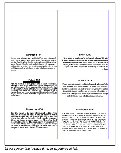 Suggestion: As a shortcut to measure consistent spacing, draw a spacer line in the pasteboard of the size you need between headline and text. Drag the guideline to just touch the bottom of the head; drag the copy to just touch the bottom of the line. Pull the line out. Use the same line for the other copy blocks. No need to measure!
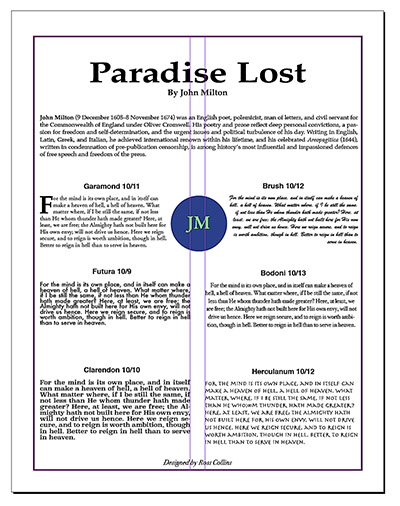
7. Turn attention to the main headline. In 48-point Palatino or Bookman, set this type: Paradise Lost. Drag to highlight, and
in the Type panel or contextual menu at top choose Horizontal Scale (fat T with horizontal line under it).
Expand the text width to 150%. Change tracking to Optical. Center and move text a little below the
top of page (see illustration above). Underneath in a separate text frame type By John Milton. Palatino or Bookman, bf, centered, 14 pt.
Designer's note: Some graphic designers do not think expanded or condensed type done in this manner looks attractive, as it changes the type designer's choice of proportional letterspacing.
8. Copy and paste under the byline the copy block below. Style to Palatino or Bookman 10/12, justified. Bf the name "John Milton" and italicize "Aeropagitica."
John Milton (9 December 1608–8 November 1674) was an English poet, polemicist, man of letters, and civil servant for the Commonwealth of England under Oliver Cromwell. His poetry and prose reflect deep personal convictions, a passion for freedom and self-determination, and the urgent issues and political turbulence of his day. Writing in English, Latin, Greek, and Italian, he achieved international renown within his lifetime, and his celebrated Areopagitica (1644), written in condemnation of pre-publication censorship, is among history’s most influential and impassioned defences of free speech and freedom of the press.
If not done already, check kerning for the headline (the amount of space between letters in headlines). With the text tool in the block, choose Optical kerning (A/V icon with arrows.) Or try kerning yourself: Place text tool cursor between letters you'd like to kern, and type in a value, or choose from the presets.
Note that kerning is used mostly for headlines, because some typefaces in a larger scale appear to have too much or too little space between some letter pairs, and so look unattractive. Careful graphic designers pay attention to these small details.
9. At the bottom drag a text frame and type in an italic or oblique styled font of your choice: Designed
by [your name]. Size:
12/12, centered. Note some fonts don't have an italic/oblique option.
10. Create a drop cap. With your type tool cursor in the first type block, choose
the drop cap icon in the menu bar, and 3 lines for the Drop Cap option. (You can also choose Drop Cap from the Paragraphs panel.) You
might have to adjust the drop cap so it doesn't touch the text, considered unattractive.
Drag over the drop cap to highlight. Increase the
space using the Letterspace option (A/V with arrow under).
11. Drag over that capital letter, and from the Type panel choose
display font you think matches the personality of the excerpt. Must be different
from the font of the rest of the type block.
12. Draw a 2-pt border (box) around the page margins. Left and right sides of copy should not touch the borders, so you will have to narrow the text frames slightly (choose with Arrow
Tool, then pull on the handles).
13. Draw a reversed seal. In the pasteboard, draw a circle about 8 p in diameter, and choose
black or a dark color from the Swatches or Color panel to fill. Shortcut: Choose Apply Color from Fill icon, second from bottom of Toolbox (hold down mouse button to display options. If you wish, delete the stroke (border around the circle) by choosing Stroke Weight, and 0 from the stroke panel.
Note: to constrain the Ellipse tool to draw a perfect circle, hold down shift key before beginning to draw. Same procedure if you want a square instead of a rectangle.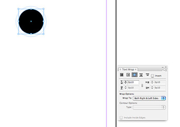
14. Under that make a small text frame and type JM. Style the two letters to Garamond or other old style serif font, bf, centered, about 30 pt. With the letters highlighted, choose a text color. You can do this by chooing the Color panel, then choosing the fill box (upper right corner icon). If the black-and-white ramp does not turn into a color ramp, from the flyout menu at right choose colors, RGB (for the web) or CMYK (for printing). Choose the color you wish, then from the Stroke panel choose a weight of 0 to delete the outline around the text.
Alternatively, choose a color using the instructions below.
15. Group the elements by dragging a frame with the Selection tool, and choosing Group from the Object pulldown.
16. With the seal chosen, Open the text wrap panel from the Windows pulldown. Choose the second wrap icon. You may have to change the offset (boundary around wrap) at bottom of panel to wrap closer to the seal. Drag the seal into the text, and center.
17. Save. Proofread. Everything perfect? Export to PDF, submit for grading.
You have several options for choosing spot color in InDesign. But for graphic artists it's best to get used to the option printers prefer, by choosing color by number in the swatches panel. These correspond to ink mixing systems printers use to reproduce accurately your chosen color. Most United States graphic artists use the Pantone Matching System (PMS). To choose and load PMS colors for your objects, follow these steps:
Highlight the text or choose the object you want colored. if you choose a shape, you can color either the border (stroke box, at the bottom of toolbox or top left of Swatches panel) or fill (fill box). This also applies to type; stroke box will outline letters in color (presuming you've chosen first to outline them in the stroke panel), fill box will fill them. (See illustration below left.)
a. Open the Swatches panel.
b. Choose New Color Swatch from the flyout menu at upper right corner. A dialogue box appears.
c. Choose Spot (CMYK are process colors, used for printing color photos or multicolored art work).
d. Choose Color Mode, and Pantone Solid Uncoated.
f. From that library, scroll down and choose the color you want. Choose Add.
Note that the text or shape you choose now is in that color. The color also appears in the Swatches panel, so you can select it again later. To choose more colors, repeat this process, or choose Done.
Now that you have the PMS swatches loaded into your Swatches panel, you can just use the color for selected objects when necessary. Note that the color you see on the screen may not be absolutely accurate; printers recommend separate options (that cost money) from the Pantone company if you need perfect accuracy in choosing a color.
The tint option at top right gives you the ability to lighten a color (called a screen in printer termlnology). General rule is if you are going to put type in front of a screened color, the tint should be no more than 10-15 percent for readability. You also can use this option to lighten your reversed seal, if you wish.
Note about selecting objects: InDesign places objects in layers. Sometimes you want to select an object that's on a layer underneath another. To do this, you can choose Arrange from the Object pulldown and Send to Back (or Backward). Alternatively, You can hold the Command key (Alt on PC) down while selecting. It should select the object underneath.