Instructor: Ross Collins
Exercise Three: a two-column
COMM 362: Design for Print
Instructor: Ross Collins
Exercise Three: a two-column
![]()
(InDesign for Macintosh CC)
The project below will give you the opportunity to create a simple and attractive
newsletter--something you can expect to do often in many communication jobs.
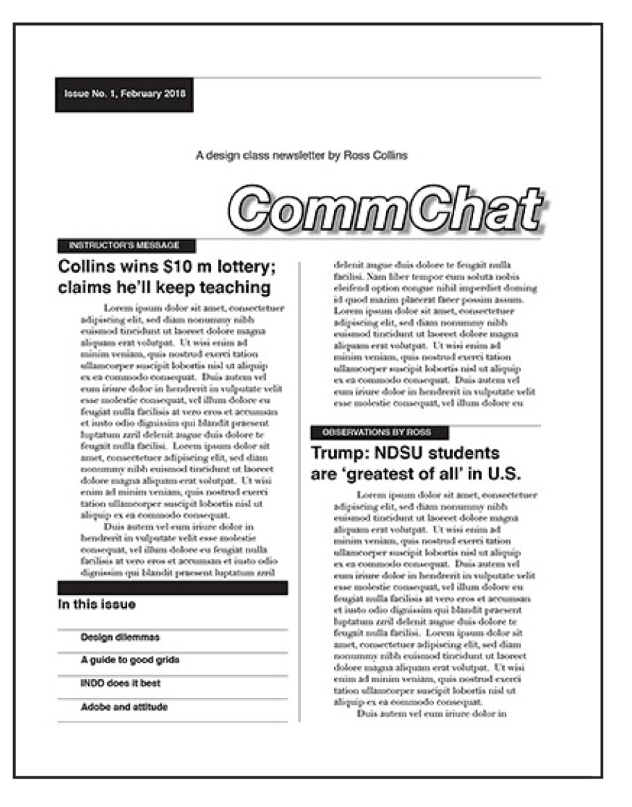
You'll learn how to create a style sheet, how to work within a grid, measurement, outline text, drop shadow, and other useful computerized pagination skills. See illustration at right for reference, or download sample pdf.
 Note: If you're a visual learner, you can work by copying the reference illustration instead of going through the instructions step by step. Refer to appropriate area of instructions for techniques you are confused about.
What you'll learn:
Note: p=pica; pt=points.
1. Open a New Document. Page set-up: standard letter (8 1/2 by 11), vertical orientation. Pages: two. You'd expand this for more newsletter pages. Facing pages: Off. We'll set up the margins and columns in the next step, to become familiar with that dialogue box, although note you can also toggle margins in this dialogue box and set up here. OK.
2. Set up a Master Page. In the Pages panel, double-click the default A-Master icon.
3. With your master pages showing (its icon on the Pages panel is highlighted), plan your general page geometry for the newsletter. Note:
About master pages.
Material you add to the A-Master is transferred by default to other pages of a document. This can be really time-saving if you do something over and over, like a newsletter. It's particularly useful to apply headers and footers or other design elements such as borders and rules (lines) to all pages. You may wish, however, to set up more master pages for design changes that won't apply to every page. Make another master from the upper right flyout menu in the Pages panel: Choose New Master. It will default to B-Master, but you can change that name in the dialogue box if you like. Make layout changes as necessary. Then from the flyout choose Apply Master to Pages and apply to pages as desired.
To design a master page for this newsletter:
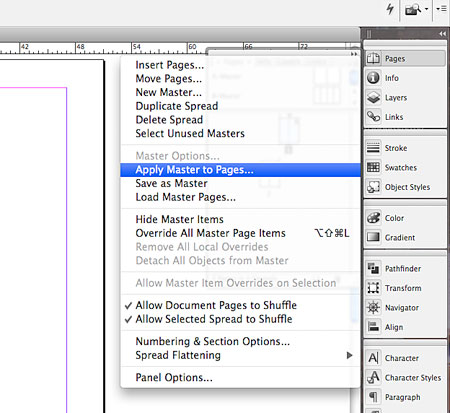 4. The elements should automatically apply from the A-Master to your document pages. If they don't, choose the A-Master. From the Pages flyout menu, choose Apply Master to Pages, and choose newsletter pages 1-2 (see illustration at left). Note that you can set up as many master pages
as you want, and apply them to pages you want.
4. The elements should automatically apply from the A-Master to your document pages. If they don't, choose the A-Master. From the Pages flyout menu, choose Apply Master to Pages, and choose newsletter pages 1-2 (see illustration at left). Note that you can set up as many master pages
as you want, and apply them to pages you want.
Leave the Master Page by double-clicking page 1 in the Pages panel. Remember: everything you put on the Master Pages is automatically transferred to every page of your document as you've indicated. So don't design your whole newsletter on a master page!
About Style sheets.Creating a Style sheet allows you to restyle entire stories without laboriously choosing each option, or even having to remember what you chose before. Saves huge amounts of time, and time is what graphic designers ain't never got enough of. (This ain't no grammar class either, eh?) What's more, if you decide to change a style, say, to make your body text a point larger, all you need to do is change the Style Sheet. Text will be replaced in all uses of that style.
 5. a. Open the Paragraph Styles panel by clicking it on the dock. (If it's not showing, go to the Window pulldown, Styles, and Paragraph Styles.)
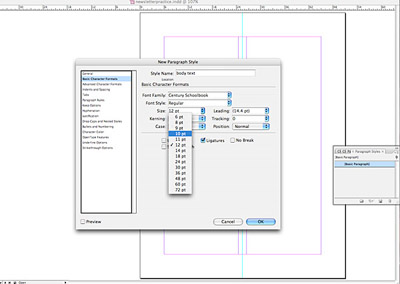
b. On the flyout menu choose New Paragraph Style. Style Name: newsletter body; Based on: No Paragraph Style.
c. Choose Basic Character Formats. Set the style: 10/12 Century Schoolbook, Adobe Garamond, or Didot. Under Indents and Spaces choose Alignment left; 24-pt (2 p) left indent; additional 20 pt (1 p 8 pts) first-line indent. This will allow copy to be narrower than headlines, for an attractive and unusual twist on the standard all-flush left style. See illustration.
d. Leave other options as default, OK.
Reminder on measurement: 24 pt, as in POINTS, not picas. What is that in picas?
(Two, of course; 12 pts in a pica) Also, what is 20 pts MORE than the first
24 pts? Need to get used to this point-pica thing....
Set up a second style for headlines: 18/18 ("set solid") helvetica or arial
bf, flush left, kerning optical. Now all you have to do is later apply these styles to text you place
or compose.
About masking.
You'll note that if you apply the A-Master to all pages of your newsletter, the rule (stroke) in the gutter will extend through the area at the top of page one--and so through your nameplate, CommChat. You can fix this in one of two ways. Way one: Set up a second master, with the rule stopping two-thirds of the way up the page. Apply that master to page one. Way two: mask the area you don't want to show with a white rectangle, stroke set to zero. Let's try the second option.
6. Mask the vertical rule between the columns to a depth of about 21 p from the top of the page.
To mask: draw a thin rectangle around area to be masked. Choose 0 for stroke, and white (upper right of color panel ramp, or swatch) for white fill. Choose Hide Guides to see the effect of this. This covers the rule between columns which you drew on your Master Page, to leave space for your nameplate.
7. Add a hairline rule (stroke .25 pt) for the folio number (date and page), across two columns at the top margin line of the page. Add a second hairline rule about 19 p from the top margin. Note: the top margin is NOT the edge of the page (trim line).
Note: to constrain the stroke tool to draw a perfectly straight line, hold down the shift key while dragging.
Reminder on measuring: Your horizontal and vertical rulers default to begin at 0 from the margin lines, top left. You can move that 0 to wherever you want, however, by dragging from the crosshair box, upper left.
![]() 8. Add the box for the folio, about 12 p by 3 p rectangle, solid (fill black), aligned
with top left margin. Draw a text frame in pasteboard: "Issue Number One" and today's date. Font is 9 pt helvetica bf or arial bf reverse (white text) centered, aligned about 1 p from the left edge
of the box, on a baseline about 6 pts from the bottom of the box. Drag into
black box. Refer to picture above, if necessary, for placement.
8. Add the box for the folio, about 12 p by 3 p rectangle, solid (fill black), aligned
with top left margin. Draw a text frame in pasteboard: "Issue Number One" and today's date. Font is 9 pt helvetica bf or arial bf reverse (white text) centered, aligned about 1 p from the left edge
of the box, on a baseline about 6 pts from the bottom of the box. Drag into
black box. Refer to picture above, if necessary, for placement.
Reminder: To reverse text, highlight and from the Swatches (or Color) panel make sure the Fill icon is highlighted. Then choose white. To remove the outline (if there is one), go to the Stroke panel and choose Line weight 0 pt.
Alternative: you can also make a text frame into a box.
- Draw a text frame (with the text tool) the size you need.
- Choose it with the solid arrow tool, and choose from the Stroke panel to put a border around it.
- Choose the type tool, type your text into the frame.
- Using the Paragraph (NOT Paragraph Style) panel, or top contextual menu bar, center text, set indents, etc., so that it looks the way you want.
- Choose Text Frame Options from the Object pulldown to add padding (space) between text and edges of box.
9. Draw a text frame, add the subhead, "A design class newsletter by [your name]. It's 12 pt helvetica or arial normal, on a baseline about 1 p 3 above the top of the newsletter title, aligned left with the right edge of the banner rectangle above it.
Note that the end of the reversed box with folio and beginning of the subhead are aligned; when you align loose elements on a page, aligning box edges helps to give structure to the design, suggesting a plan rather than helter-skelter placement of elements. This reflects the Gestalt principle of similiarity.
10. The flag or nameplate (newsletter title): "CommChat," 60 pt helvetica or arial, bf, oblique (slanted; see skew icon at top menu bar), aligned right, outlined.
Make outlined letters:
- Choose type with Text Tool.
- Choose Color Panel. Click on the stroke icon at upper left. Then choose Stroke panel. Choose a color from the ramp, if you wish.
- Choose a 2 pt stroke.
- Back in Color panel, choose the fill box.
- With Fill box highlighted, choose white from the color ramp or the white swatch or, if you wish, choose a color from Swatch panel. (To extend your list of swatch choices, from the flyout menu at top right of box, choose New Color Swatch, and when the list comes up, choose the palette labeled Pantone Uncoated, a standard choice.)
 Make a drop shadow:
Note: drop shadows seem to be a bit cliché nowadays, maybe a reason to avoid them. But they might work if not overdone, and so easy to do in Indesign.
See a YouTube tutorial on drop shadows.
Choose CommChat text with solid arrow tool (note: not highlighted).
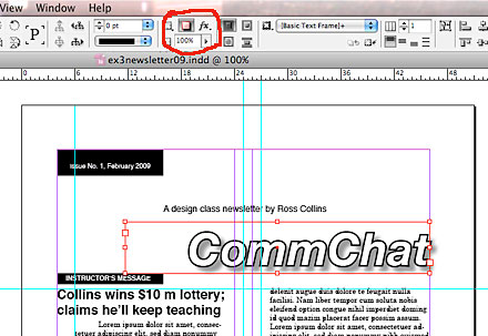
Choose Drop Shadow icon in contextual menu at top (see illustration at left, icon circled in red). Tah-dah!
But the drop shadow may not be precisely the way you'd like it. For instance, I would like the angle a bit lower, the shadow a bit lighter, the shadow a bit shorter, and a bit of noise (3-4 percent) to soften it. Fussy, fussy. Let's customize using the Drop Shadow dialogue box.
With the text still chosen with arrow tool, choose Special Effects (fx) icon from contextual menu at top, or from panel docked at right side.
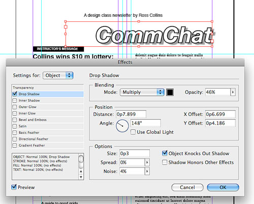 Choose the Drop Shadow option from the pulldown (see illustration below right). Be sure the Preview toggle at bottom left is selected to preview your changes as you make them. Okay, check out the wild variety of cool stuff you can do to your text, or stick with me:
Note: InDesign's default view is set to a lower quality so that you can work faster on screen. The disadvantage of this is that some elements look pixellated, such as drop shadows with added noise. Select a high quality view by choosing View Display Performance, and High Quality Display.
Drag flag about 1 p 6 above bottom horizontal hairline.
11. Place the table of contents. At the lower left of the page, draw a solid
(fill with black) rectangle, column width by about 1 p 6 deep. Place flush left, about 12 p
above the bottom page margin.
Note: as an easy alternative to drawing solid boxes, simply draw a rule (stroke) and change to a thick width, in this case about 20 p.
12. "In this issue" should be set in about 14-pt helvetica or arial bf (boldface), on a baseline
about 1 p 3 below the bottom of the rectangle you just drew.
13. Draw the first hairline rule about 4 p 3 below the bottom of the rectangle. Copy
and paste it at 2 p intervals: it's better to copy and paste repeated elements,
rather than drawing each one, for consistency. The last rule should be on the
bottom margin.
Note: Why painstakingly measure each interval? Instead draw a spacer box or fat stroke to the width of the measure. Drag each element to touch the measuring placeholder on each side. Then remove the spacer. (See illustration at right.)
14. The contents copy font is 10/24 helvetica or arial bold, on baselines about 9 pts above
the rules, align 2 p from left (see top illustration). Copy lines to set: Design dilemmas; A
guide to good grids; INDD does it best; Adobe and attitude.
15. Make banners for story headlines. The hairline rule is column width. The
banner (rectangle) is a solid box (or stroke) 12 p by about 1 p 3 deep, flush at the top and left with
the hairline rule.
Note: Consistency in these boxes helps emphasize the Gestalt principle of similiarity, and so pull our design together.
The space between the hairline rule and the baseline of the first line of the
headline below is 3 p. To make placement easier and more accurate, again, you can draw a spacer 3 p
box or stroke in the pasteboard, leave it there, and bring it in as necessary to place
headlines.
16. Banners: Instructor's Message and [your name] Observations
(or ruminations, or comments, or whatever you think matches your mood at this
particular moment....) Type should be 9 pt helvetica or arial bold reverse, small caps,
aligned left 1 p from left edge of the banner. Choose the small caps from the Character panel flyout menu.
Note: Make sure you are using a typopgrapher's apostrophe (curly-cue, not straight). If it defaults straight, Go to Preferences from the InDesign pulldown (Macintosh) and Type. Toggle typographer's quotes on, and retype the apostrophe.
17. Add headlines under banners, using the paragaraph style you defined above. Each headline
should be two lines long, and begin 2 p under the banner, but may be whatever
imaginative text you wish.
18. Copy type using lorem ipsum file (a sample file
used by designers for dummy pages) from the class website. Paste into text frames. Alternately, create text frame, and choose Fill With Placeholder Text from the bottom of the Type pulldown.
Place type about 6 pts under each headline's baseline.
Choose Select All from Edit pulldown (or Command + a) and click on your body text paragraph style. The text should be updated to the style you set up above.
Note: if this does not override the original placed text style, try again while holding down the Option key.
Still anther note: The lorem ipsum file is a handy way to show clients the style of type without distracting them with "for placement only" actual stories. People who can actually read Latin say the file means nothing.
 19. Move to page two by double-clicking on the Page panel, scrolling, or choosing the page from bottom left.
20. Bring in another rectangle and hairline as on page one. In this
case, however, do not add type to the rectangle. Instead, 2 p underneath the
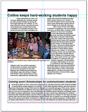
banner, type the headline: Collins keeps his hard-working students happy. Size as you think looks balanced. Draw another masking box and place at top of page so rule in gutter does not go over headline text.
Note: If your mask box goes over part of your headline, choose the box, and then Arrange from the Object pulldown, and Send to Back. Keep in mind InDesign places elements in layers. This is a way to change the layer order.
21.Place more lorem ipsum text to fill the page around the photo, or Copy and Paste the text you placed above. Begin about 1p below the headline.
22. Download this photo, save to the desktop. Place the photo.
Note: To download from the net on a Macintosh, hold down the Control key while clicking on the photo. Choose from the menu.
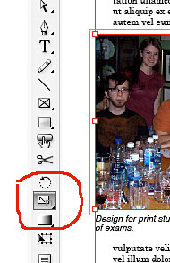 23. Using the scale tool (see illustration at left), Hold down shift key ot constrain proportions. Drag to reduce the photo to reach across about a column and a half of text.
Note: For best quality, photos should be scaled in Photoshop before Placing into InDesign. But reducing usually doesn't damage the quality as much as enlarging.
24. Wrap the text around the photo. With the photo selected, bring up the Text Wrap panel from the Window pulldown. Choose the third wrap option, and standoff of about 3 pts.
25. Write (or copy and paste) this cutline: "Design for print students and faculty hold a midterm party after a grueling round of exams." Style: helvetica oblique or arial oblique 9/9 (9 pt set solid). Drag text frame to same width as photo.
26. Choose cutline text frame with arrow tool, and choose Text Wrap from the panel, third option, set-off about 2 pts. Drag under photo.
27. Add a screened box: Draw a box across the bottom of the page, choose Color panel, black (reverse), and slide down to 10 percent. Border (stroke) 1 pt.
Note: A handy way to add interest to the page, screened or tinted boxes should be no more than 10 or 15 percent, for readability, unless you are using a light color. A box separates text from the rest of the page, so can be set at a different width, and even a different typeface. Boxes are often used for short features or sidebars.
28. Write a headline: "Coming soon! Scholarships for communication students." Style as you think fits, in helvetica or arial bf oblique.
29. Paste more lorem ipsum text, same typeface/leading as above. Drag to reach across page, but do not let text touch borders. With this text chosen (highlighted), turn off indents that you set for the rest of the newsletter using the Paragraph panel (or top menu bar). This lets the text reach to the end of the box.
30. Add a drop cap to the beginning of this story.
31. Print proof copy. Check for typos and design flaws.
Important: Proofread carefully before handing in. Small flaws or typos are very noticable, and can mar the quality of your work.
30. Export as pdf; submit on Blackboard for grading. Reminder: I can't open live InDesign files in Blackboard.