 In this project you'll learn:
COMM 362, Design for Print
Instructor: Ross Collins
Exercise Number Four: Flyer
(using InDesign CS 3)
In this project you'll learn:
Use the illustration at right for reference, or print a pdf.
1. Create New document, Orientation Portrait (vertical), Facing Pages off, margins
3p6 all the way around, 1 col.
2. Under Preferences, change measurement system to Picas (if not done already),
and choose Typographer's Quotes. Bring in a vertical guideline to divide the
page in half: you can change your rulers to put zero anywhere you want. Just
drag from the crosshairs at upper left.
3. Set your type style: Choose New Paragraph Style from the Paragraph panel
and set up this body text: Century Schoolbook (or Schoolbook) 12/14 Regular,
align left. The rest as default.
4. Draw the two large S's in the pasteboard: to do so, make a long text frame for
each, and style each Century Schoolbook, 102/Auto, Vertical Scale 60 percent (condensed). Scale is the fat T with the arrow under in the Character palette, or in the top menu bar.
Reminder on text frame sizes: if your letter seems to disappear when you scale
it up, note the red plus sign in the corner. That means more type is behind
the frame. Don't click on the red plus; you use that for "loading your
cursor" to place the text elsewhere. Instead, drag one of the frame handles
down and over to enlarge the frame and show the type.
5. Either in the pasteboard or at the top of the page, set the rest of the flag,
each word forming its own frame, so that you can move them around independently.
Style: Century Schoolbook, All Caps, 48/Auto, Set Width 70 percent. Note: the
set width condenses the type to give it sort of a "thin, slim" look
to match our theme.
Note: You could laboriously draw three text frames, type the copy, and make the style changes, one frame at at time. I find this a pain. So my shortcut is to make the changes once. Then copy the text, draw a new text frame, and paste. Then delete those letters, and type the letters you want. Voilà.
6. Drag these frames to fit flag design at top of page; refer to picture above for
placement (note picture may not precisely match your version). Align to top
margin.
7. Draw a rectangle, any size. You can adjust it later by pulling on the handles.
Stroke: none; Fill: gradient.
To apply a gradient:
Move into place, under headline left text ("Spring"), and adjust size to fit. Copy the box, paste another one, move to right part of headline ("Shape"), adjust box to fit.
8. Paste a third gradient rectangle. Change Style from Linear to Radial. Drag to middle of headline, above "Into."
Added notes on gradients:
Some low-resolution printers won't print them well, and often photocopies either
"band" them (objectionable lines), or drop the gradient if it's somewhat
light. But if you plan to take your document to a printer, they'll be able to
do it right.
Colored gradients
While we won't see them printed using the classroom laser printer, you can experiment with colors if you like.
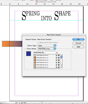 Add the colors you want for the gradient. To do that, choose from
the swatch libraries. These give you a variety of options depending on needs of your publication. But most graphic artists use the Pantone system. So to add those colors to your swatches palette
Add the colors you want for the gradient. To do that, choose from
the swatch libraries. These give you a variety of options depending on needs of your publication. But most graphic artists use the Pantone system. So to add those colors to your swatches palette
Note: you can also do this from the Swatches palette. Choose New Gradient Swatch.
9. Draw racing stripe under flag. Instructions:
a. In the pasteboard, draw a rule 6 pts wide, any length. Note: if you're planning
to group elements, it's easier to do it in the pasteboard, where you won't have
to avoid catching other elements in your bounding box you don't want part of
the group.
b. Choose Thick-Thick for stroke type. This gives you two thick-ish lines. You may have to choose a fatter rule to make this show.
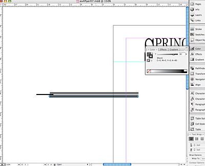 c. Create a spacer rule (stroke) 3 pts wide and butt against the bottom of the
line as a spacing guide. It's often easier to use a rule of a specified point
size as spacer than to painstakingly measure from the rulers. Bring the spacer
to touch the bottom of the double-line.
c. Create a spacer rule (stroke) 3 pts wide and butt against the bottom of the
line as a spacing guide. It's often easier to use a rule of a specified point
size as spacer than to painstakingly measure from the rulers. Bring the spacer
to touch the bottom of the double-line.
d. Now draw an 8 pt wide rule. Choose the Stroke panel. now bring up the Color palette. (If ramp does not show black and white, go back to Swatches panel and choose black.) Choose an 80 percent
screen by typing it in the percent box, or by dragging the slider down to 80
percent. Your 8 pt line should turn gray--80 percent gray, to be exact. Drag
this line up to touch the bottom of the spacing guide. Both fat lines should
now just touch the spacing guide, top and bottom.
Note: You must have the Stroke box (and not the fill box) activated for this to work. The stroke and fill boxes are small icons at top left of Color panel. They also are accessible at the bottom of the tool box.
e. Remove the spacer rule.
f. With the arrow tool, draw a bounding box around the rules to select them,
Choose Group from the Object menu. Now drag from the middle of the elements
(not the handlebars at the edges) to place stripe underneath the flag. As you
know from a previous exercise, grouping makes it possible to create complex
graphics in the scratch board and draw them onto the page without disturbing
placement.
g. Drag the grouped lines to the width of the margins, taking care to choose
the center handle on box so that the width of the stripe doesn't change.
10. Now you're ready to create those racy-looking diagonal edges. To do this,
you have to actually mask the ends of the stripe. We practiced masking in our
last exercise, you'll recall....
a. Create a diagonal rule (stroke) of about 20 pts and about 3p long, using the line
tool.
b. With stroke box (lower right in tool box or color palette) chosen, from color palette, choose
white. This of course is a "reverse," making your line seem to disappear.
c. Drag reversed diagonal to cover edges of racing stripe. Adjust as necessary
to neatly cover edges of stripe.
d. Copy this reversed masking line. Paste, and drag it to slant the right end
of the racing stripe to match the left end.
12. Now do the same thing all over again four times to create the shorter racing
stripes above each section heading. OMG, why would you want to? Part
of our goal is to save as much time as we can--what graphic designer isn't under
deadline pressure? Instead:
After drawing one of these as you want it, Group the elements (bounding box around all of them with Arrow tool, Group from Object pulldown). Then copy, and
past three more times. Drag into place, and adjust as necessary. You may have
to choose Arrange (Object pulldown) to bring elements up or back so that they don't block others.
13. The rule in the gutter (between columns) is 2 pt, 30 percent screen.
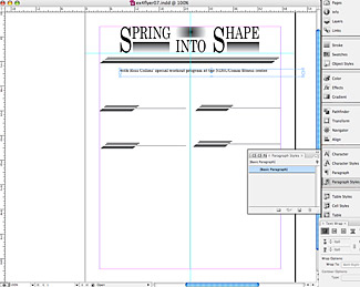 14. Under the flag (nameplate) and racing stripe, write the line of copy as
in the sample, changing the name to your own. Highlight, choose Body Text under
the Styles menu (remember, you already defined this style), and make the change.
Adjust the point size afterwards: 14 pt instead of 12.
14. Under the flag (nameplate) and racing stripe, write the line of copy as
in the sample, changing the name to your own. Highlight, choose Body Text under
the Styles menu (remember, you already defined this style), and make the change.
Adjust the point size afterwards: 14 pt instead of 12.
15. Copy the block below, and paste into a text frame under the line with your name(s):
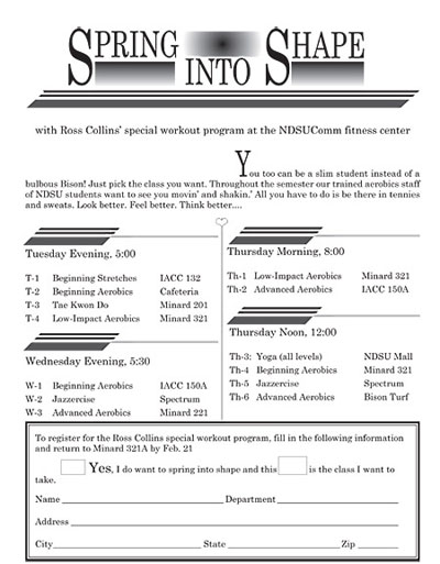
You too can be a slim student instead of a bulbous Bison! Just pick the class you want. Throughout the semester our trained aerobics staff of NDSU students and faculty wnat to see you movin’ and shakin.’ All you have to do is be there in tennies and sweats. Look better. Feel better. Think better....
16. Be sure to run a spell check (Edit pulldown, and spelling). Indent the text as shown (about 25 p) using the indent first line box in
the Paragraph panel. In the pasteboard make a stick-up cap, style: Century
Schoolbook, 60 pt, condensed to 60 percent. Delete "Y" in copy, and drag
in stick-up cap. You may need to draw a baseline guide to line up cap with text
baseline.
17. Copy and paste the four blocks of text below, in four separate text frames. Style
all to your standard body text, except the subheads, which should be 14 pt.
Tuesday Evening, 5:00
T-1 Beginning Stretches, IACC 116
T-2 Beginning Aerobics, Cafeteria
T-3 Tae Kwon Do, Minard 201
T-4 Kickboxing Aerobics, Minard 321
Wednesday Evening, 5:30
W-1 Beginning Aerobics, IACC 150A
W-2 Jazzercise, Spectrum Office
W-3 Intermediate Step, Minard 221
Thursday Morning, 8:00
Th-1 Low-Impact Aerobics, Minard 321
Th-2 Advanced Aerobics, IACC 116
18. Create a 6 pt "thick and thin" border (box) for coupon. It would look
snazzier to create the coupon box with racing stripes and diagonal edges, but
this makes this project more time-consuming than it already is. However, if
you want to have a go....
19. Copy and paste introductory copy below for coupon, substituting your name as appropriate. Draw check boxes, adding space as needed to make them fit. Probably you'll need to paste copy in more than one text frame.
To register for the Ross Collins' special workout program, fill out the following information and return to Minard 321 by Oct. 15.
Yes I want to spring into shape,
and these are the classes I want to take.
20. With the Text Tool draw a text frame below this a little narrower than your
box. This is where your name and address form will go.
21. Create leadered tabs for name/address box. This offers you the great
opportunity to work with the Tabs dialogue box.With the cursor in the text frame you wish to tab, choose Tabs.. from the Type pulldown. You'll find the box pops up right over the frame you just drew.
Note: Yes, you can laboriously draw text frames and lines for each item in a form, but it's time-consuming and the possibility for crooked forms is high.
Leadered tabs
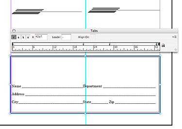 The tabs ruler allows you to click anywhere to set tabs, which will correspond
to the area of the text frame below the dialogue box. The little arrows on upper
left are, in order, left justified tab, center justified tab, right justified
tab, and decimal justified tab. You also can choose tab locations by measurement,
in the X box. Default tabs are set every 3 p, but when you set a new tab, all
tabs to the left of it automatically clear. At the left edge of the ruler are
two sort of triangles. The top one sets the first line indent; the second sets
the left indent. Of course, you can also set this through the Paragraph panel.
The tabs ruler allows you to click anywhere to set tabs, which will correspond
to the area of the text frame below the dialogue box. The little arrows on upper
left are, in order, left justified tab, center justified tab, right justified
tab, and decimal justified tab. You also can choose tab locations by measurement,
in the X box. Default tabs are set every 3 p, but when you set a new tab, all
tabs to the left of it automatically clear. At the left edge of the ruler are
two sort of triangles. The top one sets the first line indent; the second sets
the left indent. Of course, you can also set this through the Paragraph panel.
The leader box allows you to draw lines or dots between copy, called (of course) leadered tabs. Mostly you do this when you want to create tables of contents or columns of numbers, with those dots between, but today we're going to create a line. Here's the procedure:
Creating dingbats
22. As a last gesture to this healthy program, create a dingbat (small picture). These are called glyphs in InDesign CS. To 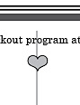 choose a glyph:
23. Print proof copy. Adjust and correct as necessary. Print final copy. You have just created a document
that probably two-thirds of those who say they "know desktop publishing"
would not be able to do. Congratulations!