A quick and simple flyer, advertisement or brochure: some general design rules
(Ross Collins, associate professor of communication)
Here is an example of a typical flyer. Not the worst, as the designer has used boldface and bullets to help bring some contrast to the page. But we are still missing quite a few opportunities to make this flyer more interesting and readable, as noted below, with examples.
Do not center all elements. This is boring and formal, appropriate for a graduate certificate or award, but not for most publication design.
Create a dominant element, to attract readers to where you wish them to begin. This might be a headline, an illustration or a photograph. Make other elements generally subordinate to that dominant element, so they don't compete and make the design look busy or cluttered.
Make restrained choice of typestyle. That means no more than three typefaces. Each typeface should be quite different, so adding contrast to the page; the most common choice is one sans serif face and one serif face.
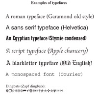 Avoid choosing overused or inappropriate typefaces. These include:
Times and times roman, the default Word font. Very boring.
Anything that is named after a city (Monoco, Geneva). These are monospaced fonts designed for computer screens.
Fonts designed for the net, specifically georgia and verdana, lucinda grande and arial.
Courier, a typewriter font.
Display fonts (script, blackletter, novelty), except for short headlines.
To add interest, choose variations within a typeface: bold, italic, outline, screened (grey), expanded or condensed.
Try to spread photos around the page so that they balance, but are not formally set up in a line.
Try to make elements line up with each other, vertically as well as horizontally, so they seem to be associated. For example, the edge of a photo can line up with the edge of type, or type can line up on the left ("ragged right") or right "ragged left") side.
Consider the Z-pattern to place elements on a page: people generally read a page beginning at the top left, and end at the bottom right, following an imaginary Z. Normally we want readers to remember our name, so put the logo at bottom right. Bottom left and top right tend to be less well read, so we put less important information there.
Avoid having type touch borders. Avoid using default leading (space between lines of type) in headlines. It is generally too wide. Subtract leading to bring lines of a headline closer together.
Avoid heavy rules around elements. One point is generally adequate.
Avoid wide spaces between headlines and text. Headlines should go with the text they announce. That means subtracting a little space between a headline and its copy, and adding a little space above the headline and elements above it.
An improved flyer relying on some of these techniques.
Return to Design for print resources page.