Learning ![]() Software (Adobe version 2020 for Macintosh)
Software (Adobe version 2020 for Macintosh)
A self-guided tutorial by Ross Collins, North Dakota State University
Lesson Five: Working with type
You can do so much with Photoshop to enhance your photos, website or publication, and we have so little time to cover it in this class. But here's one more technique you might find really handy: adding text to photos.
I. Working with text in Photoshop: creating text
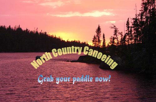
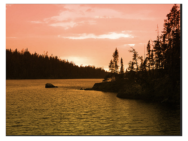
1. Download this relaxing wildnerness canoeing photo (or use one of your own) and open in Photoshop. You'll be annoying the original photographer by adding text to this nice sunset.
 2. Choose Window-Workspace-Esssentials, if not default. Choose the Horizontal Type Tool (big solid T) from the toolbox.
3. Click in your image where you wish to place text. Not that it actually matters; you can move it around later. Type away like a mad word processing freak (common at end-of-semester term paper time). You can bring up an InDesign-style character/paragraph panel by choosing the options from the Window pulldown (A coincidence as Adobe sells both Photoshop and InDesign?). Or just be content with the basics on the top contextual menu bar.
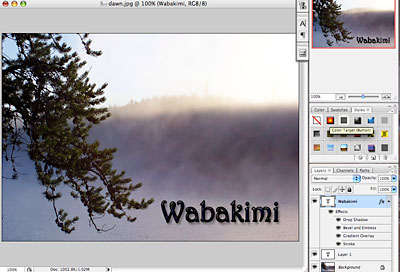
Drag over to highlight type and change style. Note that text has automatically set itself on a new layer (choose Layers from Window pulldown).
Geezer note: A layer is a metaphor going back to the days when graphic artists actually set up clear acetate sheets in layers over their art work, so that they could add color or other effects without changing the original image. Photoshop does the same thing in its inimitable pixellated way.
Change size, alignment, etc., from the contextual menu bar at top, or open the Paragraph or Character panel from the Window pulldown. Note the panels offer more options.
The opacity slider (or fill slider) in the Layers panel will allow the background layer to show through--cool effect for adding type to photos.
Don't like the color? Highlight the text as you'd do in Word. Now, with the foreground color box chosen in the Color panel (type is foreground, doncha' know), choose a color from that panel or the Swatches panel.(If Color panel is not showing, go to Window pulldown, toggle on Color). Alternatively, choose a color from the Swatches panel. If you need to see choices, select Legacy Colors from the flyout menu at top left of the panel.
Really important note: If you leave the type layer you've been working on, you have to go back to it to work on the text again. As well, you have to move to the background layer to use other Photoshop features.
Note: It's obvious that light colors won't show up well on light background, etc. The photo you can download from step one above is helpful because it has some really dark areas to make text stand out.
 4. Choose an appropriate font and type size and type "North Country Canoeing."
5. As the type pops onto its own layer, you can move it around independently. Choose the Move tool, and drag around. You can even drag over the text and edit; choose Copy, Paste, check spelling, etc., from the Edit pull-down, and do those noble deeds.
![]() Try one of Photoshop's Preset special effects. Choose a layer you want to change. Choose fx (Add a Layer Style) icno from bottom of Layers panel. For other options, choose Styles panel (see illustration on right), and give something a try. Works best with larger sizes and fatter fonts.The styles are designed to automatically make changes that would be time-consuming to do by hand, so if you're looking for something snazzy (and possibly even gaudy), here's your panel.
Try one of Photoshop's Preset special effects. Choose a layer you want to change. Choose fx (Add a Layer Style) icno from bottom of Layers panel. For other options, choose Styles panel (see illustration on right), and give something a try. Works best with larger sizes and fatter fonts.The styles are designed to automatically make changes that would be time-consuming to do by hand, so if you're looking for something snazzy (and possibly even gaudy), here's your panel.
Note on size: While 72 points = 1 inch in the paper world, it is not necessarily an inch in Photoshop's world. It depends on resolution, expressed in fractions of the whole. If you have a photo saved at a resolution of, say, 400 ppi (pixels per inch), that means 36 pts. (half inch) is 200 pixels tall. However, if it's saved at 100 ppi, the type is only 50 pixels tall. If the default top size of 72 pts isn't big enough, you can drag over the number in the window and change as necessary.
Note: Anti-aliasing can be set to crisp (sharper), strong (fatter), or smooth (what do you think?). There's also a sharp option, but I can't see the difference from crisp.
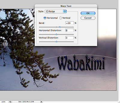
6. Check out the text warp feature. With the text tool and text layer chosen, click the Create Warped Text icon at top (crooked T). Choose options from the dialogue box as your frivolous nature dictates.
Transform from the Edit pulldown also allows you to scale or warp text by dragging. Works pretty much the same way as text warp, another example of Photoshop redundancy. But it does give you more precise control, as you choose adjustments from the contextual menu at top..
 7. Decide you don't want some text? You can delete letters, but sometimes better to just delete that layer. From the Layers panel, drag it to the little trash can icon at the bottom right. The pointing finger will turn into a cute li'l closed hand when you hover over the trash can. Aren't all these little icons just adorable?
II. Working with text in Photoshop: rasterizing
You can turn type from vector-based to bitmapped (Photoshop) pictures by rasterizing the type. Vector graphics are resolution-independent. That means their quality will not change no matter how big or small they are made. Type (and some clip art) are vector graphics.
Rasterized text is resolution-dependent, like photos, so lose quality as they get bigger. But rasterized text is open to changes in a way the fuddy vector-based text just can't be. To rasterize, choose the type layer you want to rasterize, and then Rasterize from the Layer pulldown. Why rasterize? Now you can paint, sharpen, smudge, erase, or whatever with your type, mucking about just like with the rest of your photo.
Note: Once you rasterize, the type options (size, font, etc.) are no longer available. But you can always go back from the History panel.
7. Working from the background layer again, type "Grab your paddle now!" (or another less corny phrase), style to about 60 pt Impact, Helvetica Neue bf (boldface), or another fatter sans serif font. Center, color, as desired.
8. On the new type layer, choose another tool (not the Type Tool). From the Layer pulldown, choose Rasterize type. Now you can add a gradient. (Although I admit you can do some pretty cool effects using the Styles panel. But we need choices.)
9. Choose the letters with the Magic Wand tool; hold down the Shift key while clicking to add each letter. OR take the shortcut: In the Layers panel, with your cursor over the Layer Thumbnail of the layer your working in (left side), hold down the Command Key (lower left) and click. The text will be selected automatically. Photoshop just knocks itself out to accommodate our every whim. To select foreground and background colors:
 1. Choose the foreground and background icon as described above from the Colors panel. (Note that you need to click on the foreground or background boxes to make them active before choosing colors; default is foreground.) Or click in the toolbox foreground/background icons to choose the Color Picker.
I prefer choosing from the Swatches panel. Choose a foreground and a background color.
An interesting alternative to harmonize your colors is to sample colors from the photo. Choose the Eyedropper tool from the toolbox; sample foreground and background colors.
Gradients.
Photoshop 2020 has dramatically changed the way we choose gradients. Here is a basic procedure:
 10. Work from the background layer. Choose the Gradients panel from the tab at right, or if not showing, the Window pulldown. Note Photoshop 2020 has added a variety of cool preset combinations. Alternatively, set up your own gradient:
a. Choose the Create New Group icon at bottom of Gradients panel. Name it something like My Cool Gradients.
b. Choose the + sign next to it to Create New Gradient.
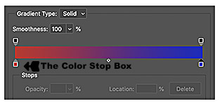
c. In the panel that pops up, choose the lower left color stop box from ramp toward bottom. Double click to bring up the Color Picker, go to the Swatches panel to choose a color, or choose a color from the image.
d.
Go to the lower right color stop box to choose a second color. Slide to balance, if you wish.
e. Choose New, the group folder you set up, and return. Your selection is now available for you. Choose the Type layer and the gradient.
11.Gradients as fill layer. New & cool in 2020. Drag a selected gradient to a photo. It blocks the image. Not so helpful. But then go to the layer blending mode dropdown and choose a blending mode. Try Color (at bottom) for starters. Dial down the opacity to allow more or less of the photo to show through. (Photo on right is made with an orange/yellow gradient at 80% opacity.)
12. Save as jpg. (Or save as separate files, one a .psd, if you want to keep layers for later work.)
III. Working with text in Photoshop: making photo type.
I know you're ready for for a restroom break, but this exercise is so exciting yet so easy that you'll completely forget about your mundane physical needs. Ever seen those retro letters that look like they're cut out of a photo? Used to be a toughie. With Photoshop it's the big easy (and I'm sure people do this a lot in New Orleans). Here's what we're looking for. (Note: the following instructions are based on a Photoshop tip from Lorna Olsen at ITS, so thank her if you see her.)
1. Open a New document in photoshop, size about 15 inches by 10 inches horizontal orientation, resolution about 100 ppi. (You can always crop later.)
2. With Text tool chosen, type some short headline (color doesn't matter). Style this to a large (about 100 pt), fat font. Here I chose Arial black, expanded to 125% using the Character panel; other possibilites are Impact or Bragadoccio. Experiment, but note that thin fonts really don't display the effect very well. Also, All Caps seems to work well for narrower fonts. Save the file.
 3. Still with that text file open, open the saved photo you want to appear as background. I'll include this one for starters, or you can choose your own photo. Selection is important, though; not all photos work used this way.
4. With the marquee tool (second in toolbox), Choose the part of the photo you want behind your type. Copy.
5. Go back to your new type file. Working on the type layer (not background layer), Hold down the command key, click at left icon and choose Select Pixels, as you did above to create the gradient. Type should be marqueed (those "marching ants").
6. From the Edit pulldown, choose Paste, Special, and Paste Into.
7. Click on left layer thumbnail in Layers panel (the photo thumbnail). Use the Move tool (top of toolbox) to drag the image about until it appears behind the letters as you think looks best.
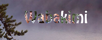 8. Note: you may have to readjust image size of your photo or text so that proportions look right. You can do this before pasting, or after pasting: choose the image thumbnail, Edit pulldown, Transform, and Scale. Of course, you can also Paste a photo into text written into another photo.
9. Yes, you're excused to use the facilities.
10. Submit for grading (jpgs, please!): Image with syled and/or gradient type; image with photo type. (You may include both techiques in one photo.)