COMM 260, Principles of Internet Web-Based Design
Instructor: Ross Collins
Photoshop Basics (for the Macintosh, Version CS2)
Lesson Two: General photo improvement
So far we've glanced at the Tool Box and Palettes, experimented with image size, cropping, and file formats. Now we begin working to make our pathetically inadequate images snap to attention and help win design awards.
I. Levels
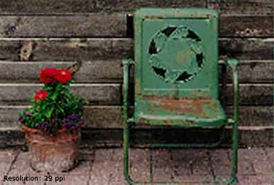
1. Scan your own print. (Or input your digital image). You can scan in the main Mac cluster, or in the Reineke Fine Arts Center cluster. Unfortunately, you can't do it in the classroom: we have no scanner here. But it's easy. Really. Ask for help. Save the photo to a CD (or flash drive). On the other hand, you could download one of my own precious images I threw on the Design for Print class web site resource page. On the third hand, if you're an octopus, upload a digital image from your camera. Open Photoshop. In Photoshop choose Open, find your photo, and Okay. Hm. Not bad, but it could use a little work. (Couldn't we all?)
2. Crop as necessary (see lesson one). If you end up cropping so radically that you're left with a teeny-weeny photo (what, your zoom lens failed?), if scanned, it's better to scan the photo again in approximately the final cropped form, rather than enlarging to pixelated purgatory.
3. Your photo is likely too light or too dark, too contrasty or too flat. Jeez, aren't they always? But not necessarily the photographer's fault; the digitalizing process isn't as faithful to an original as one would often like. No matter. What do you think Photoshop was invented for? (Besides to make scads of dough for Adobe, that is.)
You need to control contrast: Lighten. Darken. Quicken. (Wait, that's accounting software.)
4. First save your image, if you've downloaded from the class samples. Choose Save As from the File menu, and save as a separate file such as: XXXOO.psd. The PSD file extension means it's a Photoshop file, and is added automatically, as you can see. It's best practice to work in Photoshop before saving, finally, a new file in a format you need for the net.
5. Under Image pull-down choose Adjustments and Auto Levels. Ta-da! Sometimes (more often than I'd like to admit, anyway) Photoshop really is smarter than we are and just knows what we want. Or maybe not. You're looking for snappy blacks and strong whites, with detail (ability to see textures and objects) in almost every area of the scene. To understand what this means takes practice, but you've got to start somewhere. If Auto Levels doesn't suit you, as it often won't, be a sport: do it yourself. Choose Undo from the Edit menu, and immediately memorize the Undo keystroke command: Command + z. You'll need this a whole lot.
6. Choose Image/Adjustments again, but this time choose Levels. Aaak! What's that lump of black--FargoDome in silhouette? More wondrous: it's a histogram (not a medical term) of colors as they are distributed in your image. Under the histogram the sliders to the left make the darkest shades black, and to the right, the lightest shades white. Check it out: it's the best way to understand what Levels does to your image. More important than these, however, is that middle slider, the "gamma point" (brightness). Slide it to lighten or darken the middle tones of your image. Slide as you like, and Okay it.
Note: Monitor differences. Photos manipulated on a Macintosh look dark on a PC monitor. Photos manipulated on a PC look washed out on a Mac. I don't know of a really easy way around this, but considering about 90 percent of the world uses PCs, you might want to leave your photo a bit light if you're working on a Mac. Supposedly the PNG format can sense and adjust for monitor gamma (brightness).
7. Using Levels on color photos sometimes de-saturates those wonderful colors you need to make your photo stand out. To adjust them under the Image menu choose Adjustments and Variations. Pow! Twelve images fill your screen, a fly's-eye view of life (with Photoshop, who needs hallucinogenics?). Selected the Saturation "radio button" at upper right. Seven images vaporize, and you are left with choices for color saturation alone. Click once or more on the labeled preview to increase or decrease saturation. Start over by clicking on the original at top. For more drastic or gradual changes, drag the top right slider to fine or coarse. Those odd-colored pixels that sometimes show up mean the colors won't print (called "clipping"). Not to worry unless they begin to creep into half your image.
8. Now select the Midtones button to adjust color casts. One of the most difficult jobs of the old color darkroom technician was to precisely adjust color casts: it takes a trained eye to notice a subtle color cast, so look carefully at your original image, and click to try some options. Because a small change makes a big difference, it's usually wise to adjust sensitivity slider toward the fine side.
Alternative favored by the author: As Photoshop gives you as many confusing ways as possible to do most things, an alternative to levels is Curves. Choosing this option from the Adjustments menu gives you the possibility of clicking to add points to a flat color curve, then dragging the points to adjust the image. Why not give it a free trial?
Assignment one: print one example of your original "raw" scanned photo, and an example of the same photo cropped and adjusted for brightness and contrast using Levels or Curves (see below).
II. Dodging and Burning
You now have a better-cheddar photo facing you, that is, carefully cropped and color tuned. Nearly always, however, graphic artists also find smaller areas of an image which are too light or too dark. "Too" means: no detail. For instance, a "bald" sky, that is, pure white so it blends into the background. Or a black hole (no detail) behind a subject shot with flash on camera. While images on the web may not need the detail necessary for images on paper, you still should try to lighten or darken areas to bring "detail" into nearly every area, if possible. In Photoshop the most intuitive way to do that relies on the burn/dodge tools.
1. Click on the Dodge tool (the little paddle) in the Toolbox. This pretends to "hold back light" as you might do under a traditional darkroom enlarger, which no one seems to remember anymore. Wait! Don't start dragging it around your image yet. Choose Brush from the menu bar at top, and the size you want. Hardness will define how crisp the dodge. Exposure increases the effect of your dragging about. Range chooses the tone (value) affected. Adjust as preferred.
2. Now drag around to lighten the area. Arggh! Too much! Choose Undo (Cmd-z). Try it again. You need a delicate touch to avoid leaving noticeable marks. Actually, I think this is easier to do under an old-fashioned photo darkroom enlarger. Then, I've been doing it for 30 years. But enough geezer talk.
3. Same method for the burn tool, that arthritic hand in the flyout menu that's supposed to look like it's focusing light on an area that needs darkening. I realize these metaphors only make sense, really, if you have darkroom background. But like type terminology, we keep the metaphors long after we've dumped the technology that created them. Hm. There's a master's degree thesis in that, somewhere.
4. The third tool in that drawer, the Sponge tool, works on color images to decrease or increase saturation. Select Options from the menu bar to set it up.
5. It's darned hard to get the edges of burns and dodges just right, without that annoying line, especially when you're trying to leave a delicate touch while manipulating a potato. That's what using a mouse as an art tool feels like to me. Well, Photoshop gives you some options here. To soften a transition, use the Smudge Tool (index finger) or Blur Tool (water droplet). The Smudge Tool is harder to control, just like a 5-year-old finger painter on your kitchen table. The Blur Tool will give you a more precise transition. By the way, the Sharpen Tool (elongated triangle) does the opposite, but can add a grainy edge if you use it too much.
III. Dust and scratches (cloning)
Supposedly your picture to be scanned is perfectly clean and carefully kept in its own crisp envelope. So where did all those ugly dust spots come from? Back in the old days I had to learn to spot them out using a tiny brush and an inky substance called Spotone which never failed to spill and stain your clothes. Ha! You oughta' pay them dues, bub. Okay, I'll let you off, but I'll always know something you don't, nyah.
1. Under the Filter menu, choose Noise, and Dust and Scratches. In the upcoming dialogue box, choose a pixel radius (size of dust speck) of, say, 2, and a threshold color difference (what constitutes a speck) of 10. Note result in preview box. Cancel.
2. Probably you won't use this feature too often. It's fast, but I think it nearly always bullies detail out of your image, and may blur it as well.
3. Instead spot dust using the wondrous Clone Stamp Tool. This takes longer, but works oh-so-much better. Choose from Tool Box, fifth down on the left. Choose a smallish brush size from the menu bar. Try one of the harder edges.
4. Find an area roughly near a speck that matches its color. Holding down the Option key, click there to set the clone point. Move to the speck, and click. All gone now. To quickly remove a scratch, Option-click to select the clone site, click at one end of the scratch, and shift-click at the other. You may have to magnify to catch these details.
Note: Photoshop 7 added a new tool, the Healing Brush (looks like a Band-Aid in the toolbox), that might work better for your dustspots. See description below.
Note: the clone point will move as you use the Clone Stamp Tool. If you want the point to remain where you click, toggle off the "Aligned" option at the top menu bar.
5. If you have any lick of imagination, you've probably figured out that this is no simple rubber stamp--this is an amazing tool that can "clone" away anything, or clone anything onto anything else, even between two photos. Never liked that ugly birthmark on your arm? Oops--it's gone. Kid brother giving you a hard time? Oops--he must have been in the can during your family picture. In five minutes, I did to my head what no Minoxidil could ever touch! (Check out this l'il charmer: Ross with hair. Surprise! The beard was natural, actually.) Now you know why those magazine fashion models always look so perfect. Warning: ethical graphic artists working in the journalism business do NOT remove or add items not in the original scene. It is the photographic equivalent of making up quotes. That is to say, lying. In advertising, however, eh, whatever works....
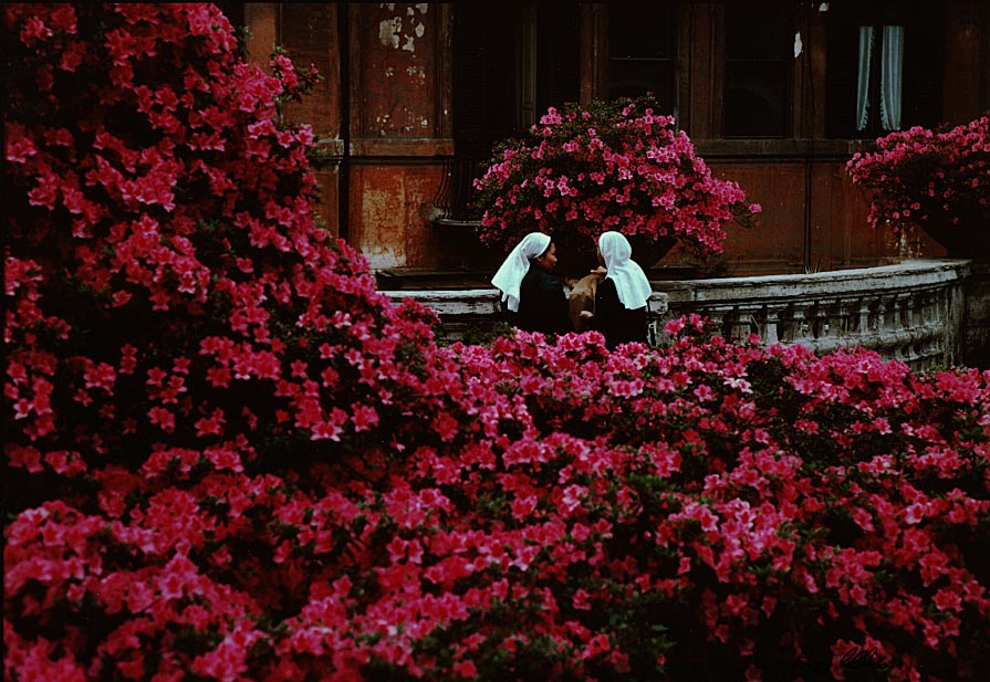
Assignment Two: If your photo really has no dust spots to grab, Try cloning away an object. Print a copy with and without the cloning, to hand in. Or clone away the chipped paint in the Rome photo.
IV. Curves
Now that you know how to darken or lighten prints using Levels, I'm going to clue you in on an alternative that I think works better (There are so many ways to do things in Photoshop that we all acquire our own preferences. You will too.)
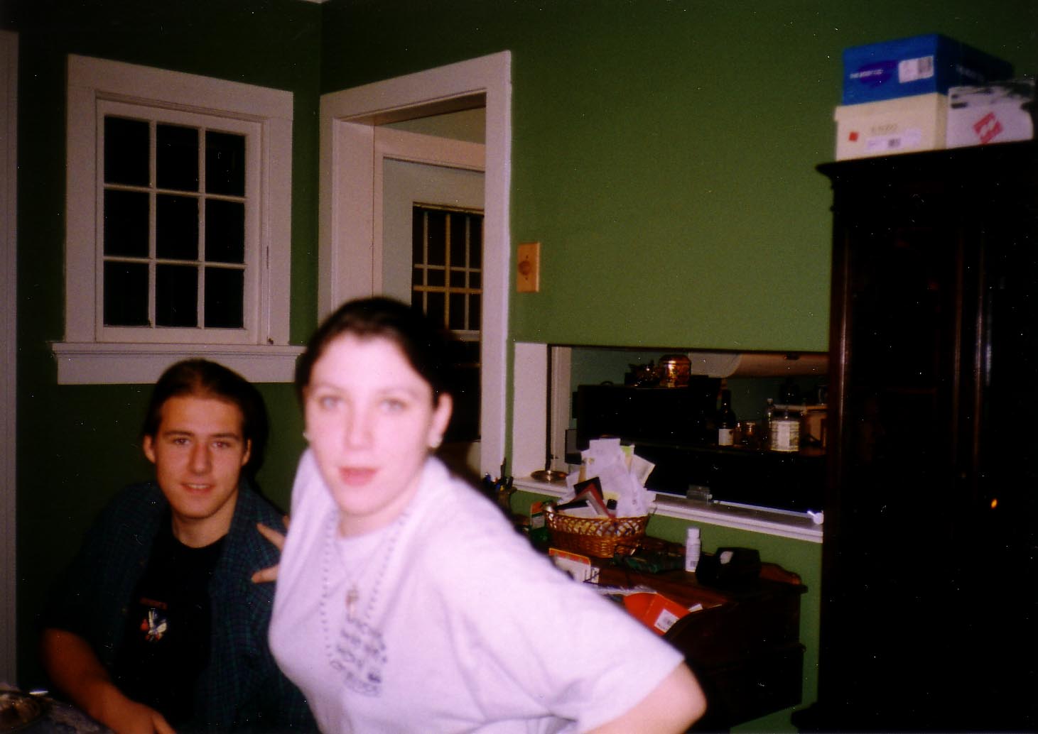
1. Open a photo that needs some exposure work; either it's too dark, too light, or both, and may need more detail somewhere (or even less detail in a background area). Use a photo of your own, or this (admittedly ugly) one for practice.
2. Under the Image menu, choose Adjustments, and Curves.
3. Do you see a curve? No. You see a diagonal line. Well, that's really a curve. Or it soon will be. Note that you can add a "control point" anywhere along the curve by clicking. Then you can drag, or use the arrow keys for a more delicate response, to move the curve up or down.
4. Moving the curve down darkens the image. Moving it up lightens the image. (In Light Mode; you can also change to ink mode.)
5. But we're just guesstimating here, no? Why not let the program help you lighten or darken specific areas? On the photo move the cursor to an area you'd like to adjust. Hold down the Apple (Command) key and click. Note a control point is added to the curve.
6. Using the arrow keys (or drag), adjust the curve until the photo looks right.
7. Should this adjustment lighten or darken other areas of the photo, just adjust them as well. Command-click on other areas, and move that control point.
8. Try Curves to add detail to flat areas by increasing contrast (or vice versa).
9. If color in your photo shifts to become too garish, choose Fade Curves from the Edit menu.
V. The Healing Brush
Photoshop 7.0 added a remarkable tool to remove wrinkles and blemishes, and generally to take a decade or more off your age without the cost of surgery or Botox. The Healing Brush works like the Clone Stamp tool, but includes calculations to blend more closely the skin tones around the wrinkle or zit you'd like to see gone. Choose the Band-Aid icon (how corny), and with the Option key pressed, draw a sample from the skin around the problem spot. Now paint the blemish or wrinkle. Wait a moment and--wow, you could be 21 again! Oh, wait, you already are? Well, you could be 1 again! (But would you want to be? Potty training all over!) Why don't you try this with one of your own images? Or do something about those annoying spreading "crow's feet" wrinkles around the eyes of this otherwise hot guy. Also get rid of those unsightly moles. And add hair, and...oh, forget it. We can't work miracles, after all.
The Spot Healing Brush, version CS2. This Photoshop version adds an automated healer that doesn't require you to define a source point. Just click or drag over spot. It seems to work best for moles and blemishes.
VI. Sharpening
So your stuck with a slightly fuzzy photo snapped by a company CEO after tee many martoonis. Well, all is not lost, just misplaced, namely your sharp image. But down there in the crypt of Photoshop's magical castle you can find what you lost! Well, at least to an extent. The Sharpness filter also helps snap up an image nearly always fuzzed while scanning, or perhaps a family snapshot from the 1970s blurred because that was the only way to disguise that orange shag carpet in the living room.
1. Open an image.
2. Under Filter, choose Sharpen, and Sharpen. Mmmmmight do the trick, if your photo only needs tweaking. Or not.
3. No banana. Try Sharpen Again under the same menu. Better, but not a very well-trained pup: sharpens into "artifacts" (little flecks) on the image some places, and not enough in others.
4. Command-z that effort, (or go back using the History palette) and unsheathe some serious knives: the Unsharp Mask. This counter-intuitively named dialogue box is really what you need to control sharpness of your image. You can change the amount of sharpening by percentage, and change the Radius value to indicate the width of edges you want sharpened. Note that a blurry photo has wide edges, so you need a higher width to make it sharp. Generally it can be left at 0.5; try 1.0 or 2.0 if you're really working with some Jello out there. What's an edge? That's set up by the Threshold option, usually set at 0 (to sharpen everything), but maybe set up to avoid sharpening low-contrast pixels (seldom necessary). Experiment to see the results of changing these levels. The Unsharp Mask is almost like cheating for shaky photographers.
Assignment Three: Print one copy of an image you improved by sharpening and/or the Healing Brush. Indicate where you made the improvements.
Finally: the general procedure
You need to consider each of the quality improvement aspects above for every photo you plan to use on a web site. Here's the general procedure I use:
Assignments to hand in checklist:
Note on submitting: Alternatively, you can email me the photos (jpgs only, please) as attachments.