Learning ![]() Software (Version CS6 for Macintosh)
Software (Version CS6 for Macintosh)
A self-guided tutorial by Ross Collins, North Dakota State University
Lesson Four: refining selection, cutting, painting, erasing, color balance, fill flash
 I. Moving and cloning/painting
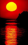
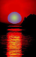
1. Download and open the sun practice photo from Class Resources, Washington State 1982, sample illustration at right.
(Yes, I know it's small. Zoom in.) Wouldn't this be even better taken exactly at sunrise? Well, I'm sorry, I didn't
get up that early. No matter.
2. Choose the sun, using Magic Wand (adjust tolerance) or Quick Selection
tool.
Note: If using the Magic Wand, change Tolerance or Grow (from Select pulldown) if necessary to select more accurately. Or add/subtract from the Magic Wand selection by clicking with shift/option key held down. Holding down the Shift or Option key also works to add or subtract using the other selection tools.
Remember: to Deselect, choose Deselect from the Select pulldown, or keystroke combination Command-d.
3. You may wish to feather or adjust the edge a little by choosing Refine Edge from the contextual menu at top, and the appropriate slider. Now choose the Move tool (small pointer at top of toolbox; shift + V keystroke).
4. Drag selected area closer to horizon. The "canvas" (background) color (usually white) replaces the sun.
5. Deselect (Command + d, or Deselect from Select pulldown). Choose Clone Stamp tool.
Shortcut: A keystroke alternative for Stepping Back: Command + Shift + z.
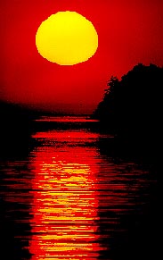
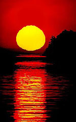 This time instead of deleting an object, we moved it. Now it's time to fill in the background. You can try the Clone Stamp, but you might find this image more challenging, because the red background is not uniform, but several shades. The Content Aware fill also might work, but in this case the background is a fairly uniform color. Let's work with that.
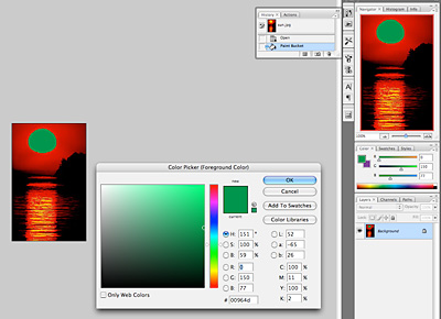
Check out the Paint Bucket tool, to fill large expanses of similar color more easily. To use this, you sample a color close to the area you want to fill, then pour that color into the area using the Paint Bucket.
If you want to save your sampled color, go to the Swatches panel, choose the flyout menu at top right, and New Swatch. The color you selected will automatically show. Choose a name, and save. It's now available for you in the Swatches panel.
7. You will have to drag or click using the Clone Stamp tool, Healing Brush tool or Smudge tool (adjust strength for a light touch) to cover and soften the boundaries and make the sunset look more natural. I think the Healing Brush works best here, but your mileage may differ. At right is my own effort, not perfect, but still looks like sunrise to me. Save in a separate file and move on to painting.
Remember the history panel: You can step back all the way to your original image through the history panel (top left of panel dock). Extremely useful if you've partially, but not completely, mucked things up, and so want to return to the time when everything still looked good. If only we had a history panel in real life.
Note: It's not hard to create your own reality in Photoshop, as you no doubt see by now. No wonder those aging models look
so good in Vanity Fair magazine! If only perfection were so easy in real
life.
Reminder: what we did above is unethical in journalism. It may be considered unethical in other areas too. For example, National Geographic contests (and many others) do not allow manipulated submissions like this. Outside of fine art photography, almost every mass medium has rules.
II. Painting continued
Now that we're already on the subject, let's talk some more about those messy paint tools.
Choosing a color.
As you already may have noticed, Photoshop can paint in two colors: the foreground color and the background color.
These default to black and white, and nestle in the lower end of the toolbox,
two overlapping boxes. The upper front box indicates foreground color; the lower back box
indicates, well, what do you think? Remember the tiny version of these overlapping boxes
right next to the bigger ones resets the default colors, should you dreadfully muck things up
and wish to turn back the clock. (Such a feature is, as ruefully noted previously, not available in
personal relationships.) The curved arrow exchanges background and foreground
colors, you may recall.
 By now you've probably already clicked a few times on one of the boxes. Did I give you permission
to do that? See what you've done now? A hideously complex Color Picker explodes
onto the screen. You may wish to pick through the options of this Picker. I
don't pick the Picker. If, on the other hand, you want to learn what I think
is an easier alternative, Cancel and forge on. (Illustration: color picker, right of image, vs. color panel, far right panel.)
By now you've probably already clicked a few times on one of the boxes. Did I give you permission
to do that? See what you've done now? A hideously complex Color Picker explodes
onto the screen. You may wish to pick through the options of this Picker. I
don't pick the Picker. If, on the other hand, you want to learn what I think
is an easier alternative, Cancel and forge on. (Illustration: color picker, right of image, vs. color panel, far right panel.)
1. Call up the Color panel from the Window pulldown, if not on the dock already (may be tabbed under Swatches panel). Note you see on upper left those same little squares we used in the toolbox. You choose these to set your foreground or background color.
2. Set the color you wish to change, foreground (for painting) or background
(to color your canvas, that is, the virtual area on which your photo reposes). To choose
the foreground/background, click on the appropriate square in the Color panel. Then choose a color from the rainbow color ramp, or chose RGB sliders.
Note: the Eraser tool also erases to the background color, unless you have the "Erase
to Memory" toggle selected. See explanation below.
3. Alternatively, Choose another color slider bar (if not defaulted) from the flyout menu at right of panel. The slider bars to find the color you want, RGB for the three additive
primary colors. (Note: additive primaries are appropriate for web pages, PowerPoint
presentations, and other projected color applications; CMYK subtractive primaries are appropriate for printing applications, but we usually begin with RGB and convert later.)
3a. Still alternatively, choose the Swatches panel and choose from there. Use defaults, or choose another color system, probably Pantone coated or matte for Pantone Matching System (PMS) spot color printing, from the flyout menu. You're in college now: you make your own choices. As the professor I merely present options. (And then grade your foolish choices, bwaa-ha!)
4. The exclamation point triangle which occasionally pops up when you use the
slider bars means you've chosen a color which won't print accurately. If that
bothers you greatly, click on it, and it will smartly (or often not so) choose
the color nearest your combination that will print.
5. You can choose a shade of gray by sliding the three bars to the same value,
or by choosing Grayscale Slider from the flyout menu, and sliding the K slider.
"K" means black in printer's terminology.
6. As we noted above, the li'l panel is an versatile tool, but it may just not have the exact
color you're looking for. If you prefer to choose a color from an image, Select
the Eyedropper tool from the toolbox and click on the color you want in your
image. This is actually a fantastic way to coordinate color matching for posters or composites with text.
7. Finally, to start over, click the small black and white boxes at lower left of the toolbox to default to black and white.
Painting a color or gradient.
This tutorial is designed for mass media photographers, webmasters, and graphic artists. Ipso facto,
you cannot draw worth a darn. (That's left to those much-admired, yet little-understood,
illustrators). Nevertheless, today we are going to draw: it's photo-karaoke
night here at the Photoshop, and you're on the pixellated stage.
Photoshop offers you four painting tools. You think this perfectly adequate,
which proves you're not an artist. But these tools still leave us an amazing
variety of ways to leave our photos looking as if they passed through a class
of kindergarteners.
These tools tryl to mimic the real art studio items. We've
all used pencils and brushes. Some of us have even used airbrushes, and usually
had to clean up for hours afterwards. No mystery here. (Note: the Pen Tool doesn't
draw lines, but draws paths, see later tutorial.)
1. Okay, let's try these tools. Either continue working with the sun, or open another photo. It can be one of your own, or one from the practice files.
2. Choose a foreground color from the Color panel, Swatch panel, or sample from another area of the photo with the Eyedropper tool.
3. Choose the Brush tool and brush presets.
Paint your image as the mood strikes you. Select Command + Shift + z to Undo, or revert
in the History panel. Change your brush size
as necessary.
Shortcuts: To change the size of a brush, use the [ or ] keys. To step backward, choose Option-Command-z.
4. For more control over your painting, choose other options from the contextual
menu bar. The Opacity (for paintbrush) or flow slider controls
the translucence and edges of your color. Other Modes are worth experimenting with, if you're the curious sort with
time to kill.
Like drawing with a potato, precisely controlling the paint tools with a mouse
demands lots of practice. More than you feel like doing right now. Tom Sawyer
had to do some fair persuading to get someone else to do his painting. Photoshop needs no persuading at all: it's always at your call, the
golden retriever of pixel-land.
(Don't
know who Tom was? Check out his website.)
5. Return to that tired old Washington (sun) practice image, which you perhaps saved. Or download again.
Geezer note: I never realized when I took this picture of Washington's Birch Bay in pre-digital days that I'd end up seeing it abused ad nauseam as a class practice photo. What a pathetic fate. Kind of like the Doors as elevator music.
a. Choose the Quick Selection tool, or your preferred selection tool. Select the sun again.
b. In the Color Panel, choose a color strikingly different from the normal yellow.
c. Choose the Airbrush or Paintbrush tool, and drag. Note your color stays within the selected boundary. Very tidy.
Other ways to fill:
The Mixer Brush tool.
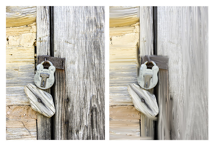 Above we said photographers and graphic artists seldom know how to draw or paint. But Photoshop gives us the ability to paint anyway, even if we have no skill. The secret: Mixer Brush tool.
The Mixer Brush blends paint you choose with paint on the underlying photo or illustration to create the look of a painting. Skilled artists can use the brush on a blank canvas. The rest of us can try it with a photo.
1. Open a photo that seems to have painterly potential. Or use this one. Select the Mixer Brush tool.
2. From the Brush Presets panel at right, consider selections for hard or soft brushes, angle, bristles, etc., to make a brush closer to what you might use with actual paint. Try the round point brush preset (sixth down from top) for starters.
3. Make a new layer. At the top contextual menu bar, toggle on Sample All Layers. That means it will pick up painterly colors from the background layer.
4. Sample a color. To do that, choose the Eyedropper tool (or the keystroke shortcut i) and click to sample.
5. Move back to the Mixer Brush tool (or choose b keystroke shortcut). You should see your sampled color in the virtual paint well at top contextual menu bar.
6. Note the menu bar includes a variety of choices regarding how the brush color interacts with the color on the (as it is going to become) painting, namely, wet, load, mix and flow. I have no idea how to choose those. Instead, I try one of the preset options from that flyout menu. "Very wet" means the underlying paint (not the brush) will behave as very wet paint when the color is applied, so, um, more smeary. The "dry" means no interaction between the paint on the brush and the paint on the picture at all--as if the picture paint were dry. "Load" is how much paint is on the brush. Every time you click and release, the brush reloads paint.
7. Try changing the brush tip to something else, such as Round Blunt Medium Stiff. Change bristles to about 50%. Move preset to Very Wet. Paint into areas of the photo. Note the color on the brush will mix with the color below it for a painting effect.
8. These choices paint with solid colors. To paint with multiple colors drawn from the painting, from the Mixer Brush tool, find an area and click on Option to sample. Note your painting well shows multiple colors. (Note if you want to clean the brush one time, and then Option-Click to reload, choose that from the painter well pulldown.)
9. Note the auto clean and auto load options at menu bar serve to clean the brush tip after each stroke so that you don't interact with paint from the last stroke, or to keep the brush loaded with paint, instead of painting with a dray brush. We usually leave both of these enabled.
Conclusion: I'm not sure how often mass media professional will want to use this new tool, but now you know it exists to nurture your inner artist without having to change into a smock. Note: for more detailed information, visit the Adobe Photoshop help site.
Gradient tool.
That rising sun may be okay enough. A bit bland, however. Many of us have seen
the rising sun, but those party days are over (or they will be soon for you
seniors). Still, how much more dramatic could it be if it weren't that, well,
blah solid color. What I'd really like is to cast a sort of inner glow of nature,
suggesting the dawn of a new day, a new century, a new millennium...and you
can help with that.
 1. Select the sun, as above.
2. Choose new foreground and background colors, as above, something really bold.
3. Choose Gradient Tool from the toolbox (under Paint Bucket). Note the Gradient Tool offers a menu
of gradients at top. Let's try the second, radial gradient.
Note: A gradient is a gradual change from one color to another.
4. Begin the cursor at the sun's center, trace out to the edge.
5. Way cool.
III. More on adjusting color balance
We noted already that photos taken outside, or with electronic flash, usually display fairly accurate color. That's because film/digital is "balanced" to that kind of light. However, photos taken under incandescent light (light bulbs) may display an orangish cast, even if you have your camera color balance set to auto. Worse, photos taken under florescent light may display some kind of sickly green cast, despite setting the camera's white balance to auto. Sometimes photos taken in deep shade will look bluish, and photos next to brightly colored walls may pick up a color cast from that wall. Auto White Balance can't guess exactly what you want, and even setting it manually doesn't always bring you the color you want. Color balance also reflects personal taste. But you can--and should-- adjust this in Photoshop (or Bridge Camera Raw, see tutorial.)
Geezer note: Color balance used to be one of the great miseries of photographers shooting color. We relied on filters over the lens, but you needed about five different kinds to match different lighting situations, and you still might not hit it right. One of the worst problems was light from multiple sources, such as daylight (5,500 degrees K, or blue cast) and lightbulbs (2,400 degrees K, or orange cast). Even with Photoshop, though, light from multiple sources is a challenge.
1. Open a photo with an objectionable color cast you want fix. Or use this practice photo with a yellowish cast; or this one with a florescent cast.
2. Under Layer, choose New Adjustment Layer, and Color Balance or Selective Color, for greater precision.
3. Choose the area you need to adjust: highlights, midtones or shadows in Color Balance, or colors in Selective Color. In the practice photo, the highlights appear to be the biggest problem.
4. Dial the sliders until the color meets your expectations. This is an art, you know, I can't tell you what's best. Often it works better to subtract a color rather than add one.
You've already probably overused the Step Backward command. Let's give those poor Cmd-Shift-z
keys a rest. The Eraser tool sits on your Toolbox exhibiting the vague shape of a
Hershey bar. Try choosing it and dragging on the background layer. As you may see, it probably
erases to the background color, generally white, unless you've chosen another. How useless is that?
 That's where some people decide they'll never use this stupid tool again. But
we smart designers know there's a lot more to the tool than that. Let's investigate.
That's where some people decide they'll never use this stupid tool again. But
we smart designers know there's a lot more to the tool than that. Let's investigate.
1. Open an image. (Or if using an image on which you've added a new Adjustment Layer, be sure to choose Background form Layers panel at right.)
2. Choose Eraser Tool.
3. Select a size of Eraser. Erase some stuff. Probably will
erase to white, the default background, unless you've chosen another background color.
4. Choose the Clone Stamp Tool. Option + click to choose an area to clone. Clone around.
5. Your image is now thoroughly messed up. Try the Undo command. All you Undo
is the last action. What if you want to Undo some other glitches? You could
use the History Panel, okay. But then you'd go back on everything. What if
you just want to take back a little bit, like after that one unwise email to your annoying
boss?
6. Try the Eraser tool. Holding down the Option key, drag over an area you'd
like to Undo. Tah-dah! It "saves to history," that is, to the original
version. If you want the Eraser to Erase to History without using the Option
key, toggle that in the top menu bar. You can more precisely control color or clone changes with this tool. Choose Opacity and Flow from contextual menu bar; to erase completely to the background these need to be set at 100%.
7. The Background Eraser will remove the color from your background.
Note: if Save to History was already selected, holding down the Option key while using the Eraser will erase to the background color.
Submit for grading: One photo of sunrise (cut and move sun), one photo showing your painting technique (Mixer Brush tool) and one photo of sunrise as gradient. Note: If you don't like the sun photo, you can choose one of your own, but give me a before and after version.