Chapter Six: You Know What You See
CBS-TV 60 Minutes editor Leslie Stahl reflected on television coverage during the Ronald Reagan years. "We just didn't get the enormity of the visual impact over the verbal," she told interviewer Bill Moyers in a PBS documentary. "No one would hear us."
"The eye wins every time," agreed Michael Deaver, the former Reagan advisor who helped to provide the images television news used. "The visual will outlast the spoken word in people's minds."
The power of visual images in news is often acknowledged, but seldom seriously studied. From first grade through Ph.D.s our teachers emphasize verbal literacy, the power of the written and spoken word. We learn to read, to extract meaning from abstract shapes of letters. We learn to discern big differences between apparently similar words, feet and feat, hear and here. We learn to discern small differences between apparently different words, poor and impecunious, metropolis and city. We even learn—sometimes—to spot those tiny, flea-sized differences in words, such as amoung for among, recieve for receive, studnet for student. (We call these misspellings. Or is it mispellings?) We debate ideas, consider proposals, shoot out a Facebook post using a verbal arsenal stocked through years of education and daily practice.
As for pictures? Seldom in twelve years of school and beyond do we have an opportunity to learn to see, to learn to "read" visual images, gain visual intelligence, become visually literate. The irony is that the world of pictures in the news media reaches deep into and beyond our conscious understanding, and thoroughly permeates our world from the moment of birth. In a picture-saturated world, we mostly focus on images generated in two ways: phosphor dots (television screens and monitors) and ink dots (printing). Television, in particular: by the time we can vote, on average, we Americans have seen 27,756 hours of television. Television technology projects images at the rate of thirty a second. So by graduation we've seen nearly three trillion images on television alone.
Fine, so what? Pictures in the news seem to accompany words, to illustrate, to help us understand, maybe to appeal to our emotions. What's to be visually literate about?
 Let's start with the eye. Our window to the world, some thirty million rods and cones sensitive to light focused on the retina by the lens, carried to the brain through the optic nerve. A marvel of natural engineering it surely is, but it's not perfect. Even those of us with 20/20 eyesight tend to see straight lines as curves. What's more, we see images projected on a retina upside down, just as a camera lens does when it's not corrected by mirrors. The image we get is just not all that great, optically.
We don't perceive the problems, however, because those inherent to normal vision are acknowledged and corrected by the brain. Lines that are supposed to be straight are made straight. Everything's turned right side up. Don't believe me? Try an experiment using the drawing below (or download a pdf version). Cover your left eye. Stare at the left-side spy character. Move the page away or toward you. At one point the spy on the right disappears. The reason is that the eye has a blind spot where it's connected to the optic nerve. But notice what does not disappear: the grid behind the cup remains because the brain corrects for the blind spot by assuming the lines must be there, and inserting them where they ought to be. The eye collects the data, but the brain does the seeing.
The significance of this has become more and more important to psychologists and others who study visual perception who began studying visual perception early in the twentieth century. The so-called gestalt psychology has become a cliché today, its point: the whole is more than the sum of its parts. That's not a roughly cylindrical object, fanning away to smaller lines at the top, on which are attached irregular ovals of a green hue. That's a tree. Well, actually that tree is the cylinder and ovals, but we don't see it that way. We perceive the whole, the gestalt, with a meaning derived from what society thinks about trees, and from our own experience with them. In fact, visual images apparently don't go through an editor of our rational, conscious mind at all. They go directly to the deepest, most primitive part of the brain. The amybdala, spinner of our emotional web, precedes by primal eons any sophisticated cortex governing conscious thought today. We react emotionally, instantly, with conscious reflection playing a role only later, if at all.
As hunter-gatherers newly evolved into a hostile world, such a response made sense. What we saw could be danger—or it could be food. Reacting instantly and emotionally ensured survival. In fact, we react even more strongly to images that move. A dog leaps after the squirrel scrambling to its treesy getaway. But the dog may ignore the ground-bound rabbit with nowhere to go, because the bunny instinctively freezes. If you always suspected dogs and people have a lot in common, you're more right than you knew—and it goes farther than just the looks.
The power of visual images on the page and screen to reach past our intellect to our emotions suggests why images dominate words when both are presented together, as the television reporter noted. A primitive human needed to assume that passing images were real, and react immediately. Pause to reflect and dinner might be gone, or danger might be looming. Today we see our basic visual assumption of truth manipulated in the amusing picture puzzles of artists such as  M.C. Escher. A staircase is assumed to be a staircase, until we see it leads nowhere. A line is assumed to go straight, until we see that it can't.
But modern humans have the capacity to consciously examine what they instinctively believe. This raises the possibility of visual intelligence. The problem is to squeeze some conscious reflection into the buzzing galaxy of unconscious. Putting what we see into words seems evanescent, a puny approximation of the reality we feel. In television news, the added action casts a powerful emotional spell—understandable, as like our pets, we respond instinctively. A movie built on an absurd plot and asinine dialogue nevertheless rivets our attention with staggering visual effects. Similarly, a police SWAT team raid or car crash on the news guarantees an attentive audience, no matter how inconsequential the words that accompany the film.
Knowing that images reach past consciousness to a primal amybdala may help us to guard against thoughtless instinct. (Or maybe not.) The way the brain actually processes visual information determines the message you perceive, and that determines what you will likely believe about a news presentation.
The famous psychologist Carl Jung once tried a visual perception experiment with a remote tribe of Africans unfamiliar with our print-based, image-saturated culture. Tribespeople were shown photos from Life, then one of the most widely-circulated black-and-white photography magazines. Asked to tell him what they saw, they replied, smudges of ink. When challenged to see a face or to see images of people, they could not. Finally someone traced the profile on the page—and everyone was amazed to see that indeed it did reflect a human figure.
Keep in mind the tribe had no problem with eyesight, hunting food with an expert's success. But they couldn't make the jump between spots of black ink on a two-dimensional page and a real person. When you think of it that way, it is a pretty big jump. So what can we conclude?
We See What We Learn to See
Newspeople rely at the most basic level on your ability to see an image in their spots of ink or in their phosphor pixels on a screen. It's the twenty-first century. There's no one left on earth without at least passing familiarity with pictures in ink or on screen. In America we're usually introduced to pictures at birth, a release from the womb to carom into an ocean of images. Soon we are driven to make our own pictures—neglect to give young children crayons and something to draw on, and they'll beg you for them. We learn to see before we learn to read, or write, or most anything else beyond saying mama.
What we learn can only be based on what's available to us, at home, in town, in school, and in the media. Generally, we learn to see based on our cultural background. Journalists know this and provide images understandable from our own cultural perspective. Sports photography, for instance, relies on our bringing a lifetime of cultural conditioning to the page. Not only do we have to figure out why people wearing peculiar uniforms are trying to tip a tan ball into an orange metal hoop tied with white strings, but also we need to know why that's significant enough to merit media coverage. That calls to a cultural conditioning emphasizing the significance of basketball. Not only do we need to bring at least rudimentary knowledge of the game, but we also need to understand the significance of athletic competition in our society. All that may be obvious to most of us, perhaps too silly to even consider—because we've learned to see athletic competition. But a member of a culture that puts its values on other human activities, and not on basketball, will look at the same photo and wonder what the heck is going on. They haven't learned to see.
Perhaps you think this cultural conditioning idea is baloney. Who needs to understand basketball or appreciate sports to understand a fine layup shot? A picture speaks for itself. A thousand words, and all that.
Okay, let's try another example. What is going on in the photograph below? Consider specifically. Jot down your explanation.
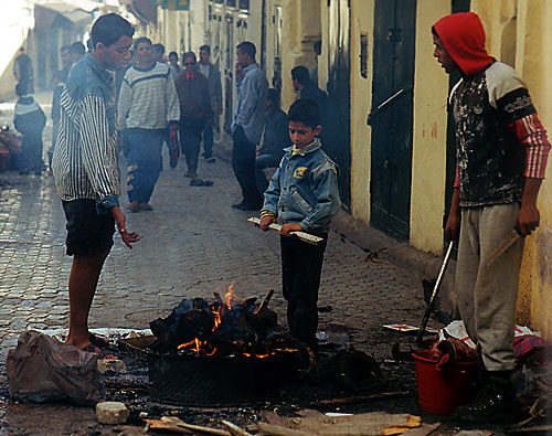
I'll guess you've written about an informal outdoor restaurant, grilling dinner, people getting warm, or, more likely, "I haven't a clue." Maybe if you looked closely you found the picture unsettling: are those blackened bones on that outside grill?
If you were raised in a Western country such as the United States or in Europe, or in some Asian nations, this photo may be absolutely incomprehensible. If you do know what's going on, either you've traveled a bit, you're an immigrant, or you come from a strong Muslim tradition.
The photo depicts the Muslim celebration of Eid Al Adha, the feast of sacrifice, on a street in Fez, Morocco. One of the greatest Muslim holidays is celebrated by each family. A live sheep is ritually slaughtered in the kitchen as a symbol of sacrifice. Blood all over, and the sheep's head often ends up charred on a street-side brazier while children play in the sun with the glistening sheep guts.
Now that you know what's happening, do you understand much more than you did before? Probably not. If someone unfamiliar with basketball learned that the photo shows a layup, it would do little to help the stranger comprehend the tradition and importance of basketball and of sports in general in America. Likewise, knowing what is depicted in the Moroccan street scene does little to help us understand what to many seems a cruel and bizarre ritual. It might even make us feel a bit queasy. But to a Moroccan, the celebration is perfectly normal and important to the devout in a religion-based culture. At least we can understand the deep significance of religion in people's lives, the basis of Eid Al Adha tradition. How would you explain the deep significance in our lives of—basketball?
News gatherers rely on cultural knowledge to make certain we see what we're expected to see. Cultural learning is part of every news image, not just the sports photos. The pancake feed, the city council meeting, the press conference, the accident, the criminal investigation, the first day of school, the graduation, the concert, the fund-raiser, the grand opening—all are images common to local news and readily understood by those of us who have learned to see them.
But if the setting is familiar, sometimes the action needs further explanation. Journalists offer verbal direction through a visual image, or else you'll misunderstand the specific content within the general backdrop. This is special to the world of the media: artists seldom include descriptive captions with their work. The need for visual cues seems to be supported by Gestalt research, however.
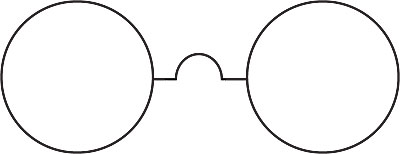
Suppose I show you the drawing belwo for a moment, then whisk it away. Inviting you to draw what you saw, I tell you one of two things:
• "It was a dumbbell."
• "It was a pair of eyeglasses."
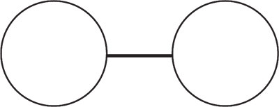
What would you remember? Such an experiment was in fact conducted using two groups, each given one of the two descriptions. Those who were told they saw a dumbbell reconstructed he image below.
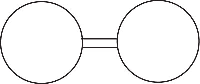
Those who were told they'd seen a pair of eyeglasses reconstructed the image this image.
From this we learn a second principle related to visual perception.
We See What We're Told We See.
A basic rule of journalism is never, never publish a photo without a cutline. Broadcast journalists almost never run video without voiceover. A visual image may tell us much, but what it says depends on our backgrounds, especially if the image is ambiguous, and images often are. Even when they aren't, we benefit from knowing more. This is, after all, news, not art.
For example, examine the photo in figure 6.6 without reading the cutline below. Explain what you think is going on.
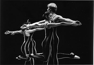
Got it?
At first glance many people would describe this photo as a couple next to a mirror. A closer look, however, would review that the couple in back is not identical: the man has darker hair, may be African-American, and the woman has longer hair. Hmm. Moreover, what could these people be doing?
The cutline makes it clear: Two couples from a professional modern dance troupe hold a dress rehearsal in front of a high school audience.
This ambiguous photo requires a cutline for understanding, but many photos do not. Local sports photography usually appears fairly straight-forward: a swimmer crossing a pool, a basketball shot, a hockey goal blocked, a football tackle, a runner rounding a base. The local Kiwanis pancake feed offers cooks at a grill, families forking cakes, a 4-year-old spilling the imitation maple syrup, the usual.
News photography captures a tiny slice of time, even if it's video footage. Journalists try to provide context through cutlines or voiceovers. We learn the swimmer's name, that it's a free-style competition, that it happened yesterday, that it happened locally, and that the swimmer came in second. We learn the name and age of the kid who spilled the syrup, and her peeved parents' names.
Context adds nothing to what we can see for ourselves in a photo. Journalism instructors tell you: "Don't explain the obvious! Add information, something readers and viewers wouldn't find out otherwise." So we're not supposed to write cutlines such as, "This photo shows Mayor Joan J. Johnson smiling at her husband John." Any moron can see that. A trained journalist writes: "Mayor Joan J. Johnson shows her delight after the city council Friday voted 6-2 in favor of a 6 percent city employee raise."
Ah! Now it's all clear.
Or is it? The mayor example is different from the dancer. The dancer photo was so ambiguous as to require an explanation. The mayor photo is pretty clear. The cutline writer has added context and detail— and what else? If you remember the discussion from Chapter 4, the writer has added an interpretation. Is it safe to assume the mayor's delight by observing a glance toward her spouse?
Mmmmmaybe. But maybe Joan was thinking of last week's dinner out, or approving a new spousal tie, or whatever wild but plausible possibility you can think of. Will you nevertheless assume that what's happening is what's described in the cutline? It's likely, because we see what we're told to see.
Journalists do find it tempting to add interpretations to cutlines that otherwise would appear meager and gratuitous. Sorting out a writer's guess from the facts is easy enough, though, once you're aware of the process. Less simple is sorting out facts when the image is ambiguous, yet the explanation is inadequate, even suspect.
You're watching video of a governor's task force on secondary education. The task force has scheduled several public forums, including one in your town. The local Action News at 11! team is on hand, its cameraman recording speakers and public responses.
Voiceover: "The public forum in Our Town included lively debate over teaching standards. Participants last night showed strong interest in the kind of educational reform the task force is examining."
Video: shot of the school superintendent and one teacher speaking. Brief shot of the room, showing perhaps a dozen rather sleepy-looking people and a number of empty folding chairs.
A dozen listless onlookers, a teacher, and the superintendent speaking really doesn't present a lively scene. The educators are expected to show lively bias about the importance of their own profession, after all. If the public is so interested in all this talk, why were only a dozen of them on hand, and even those looking drowsy? The scene and description don't seem to jibe. We might call that visual dissonance. In this case, will you believe the announcer, or your own eyes?
Generally, you'll see what you're told you'll see, but the more seemingly incongruous the description, the more likely you are to draw your own conclusions.
Consider the drawing below. What do you see?
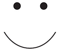
Most of us would see a smiley face. But it's not a smiley face. It's my drawing of two dots and a curved line. Why do we see a face?
What about:
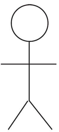
Why do we see a stick man? It's only a circle and five short lines.
We try to make sense of visual ambiguity. Given the tiniest visual hints, we plunge into the richness of our own experience and memories to extract our best sense from what we see. Because we're all (probably) human, the visual importance of the human face goes back to our cribs. We tend to see faces in images that even faintly suggest eyes, nose, or mouth. Because we know body shapes, we tend to make humans out of stick drawings. The "man in the moon" really is the man of our mind. And the principle is:
Given few visual cues, the brain adds to (or sometimes subtracts from) an image to form a meaningful whole.
Our brain's insistence on making something out of nothing is built upon learning and culture, to be sure, but its basis dives deeper than that. Deeper than our consciousness. Deeper than our nurture. As deep as our instinct. We react instantly and emotionally to recognize patterns and relationships in pictures, bypassing any rational editor that might tell us, "Whoa! Stop! This makes no sense at all!" The result is critical for image-makers in the news business.
Study the drawing below, and tell me what you see.

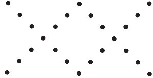
Many people would respond that they see two triangles. You, being a more savvy consumer of images—you did read the paragraphs above, right?—realize, of course, that it's really two groups of three dots. Well, Great Savvy One, why then do we associate them at all? They are, after all, six random dots on a space, are they not?
Your primal brain makes a relationship between those two groups. This response cannot be Pavlovian—learned from familiar habit. No teacher or parent tells us to associate things that happen to be visually close to each other. We seem to be compelled by a force we understand not. The gestalt psychologists behind this research into visual perception say, never mind, just understand it as the visual principle of proximity:
The closer an object is to another object, the more it will be perceived as one.
Drawings of objects equidistant from each other do not seem have any relationship.
Move two of those rows and you now have what appears to be two vertical lines.
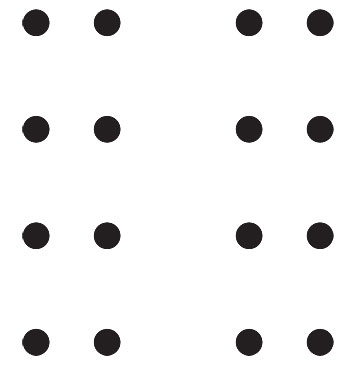
Sometimes the force of proximity is amusing. Are they numbers or letters? It depends on proximity. Close together, they might even look like "Bob."
![]()
You've probably noticed the effect in your own photos, at least the bad ones. You snap your best friends outside Starbucks Coffee, paying no attention to the background cityscape. Download to your computer and—what th'? Forming a distinctly awkward hat growing from one of your subjects is a light pole in the background. In three-dimensioned reality you could easily separate the pole from your center of interest. But in a two-dimensional image, the two seem closer together, and so are perceived as related. Someone you thought was a friend turns out to be a creepy alien growing a wooden beam from his skull. Of course, you rely on the common sense of your conscious brain to know the truth.
Let's build on that.
In the news manufacturing business, proximity of visual elements can easily lead you to unwarranted interpretations unless you rely on that same editor of your conscious mind to filter what you see. A photo shows a local politician speaking behind a flag-draped lectern. Do you see a patriotic American? Check your editor. Television footage follows a hockey player past signs advertising beer. Your goal to get that brew? Edit. A television documentary features a business tycoon reading his statement in front of working grunts on a shop floor. Just a regular guy? Only by proximity.
Watch out, dude! Or not.
This principle can be taken further to suggest that seemingly random actions are related. Called temporal proximity, it's a helpful tool for film makers who may shoot a variety of scenes out of order: first the final fist fight, then the escape, then the love interest, then the birth, then the opening sunrise, etc. No matter. In the editing room, scenes will be spliced side by side in order. We view them seamlessly, unless some careless director neglected to make certain that the actors wear exactly the same clothes from scene to scene, or move in the same backgrounds, and in the same directions. Actually, mistakes of temporal proximity pop up fairly often, as observant movie buffs know.
Most people realize this about movie-making, which, after all, is usually fiction. But they assume news photographers shoot the story just as they might with the family camcorder: one scene after another, shown exactly as it was collected. Not likely. That might be the dream of the photographer anxious to avoid editing, but usually scenes from a news event are collected and edited into a sequence. A photojournalist may begin with an interview, then shoot a scene-setting segment, then a 2-year-old's cute pout, then children arriving, then detail shots of toys and hands, then a standup of the reporter. All that goes back to be electronically cut and cemented into a 90-second story on the town's day-care center funding initiatives. We begin with a scene setter, then children arriving, then the interview, then children playing, then toys and hands, then more interview, then the pout, then the reporter's standup. We assume they happened one event after another, as we viewed them.
It's easy to see how an unscrupulous journalist or public relations practitioner can manipulate this principle of proximity to suggest false relationships. Ham-handed attempts—students walking past a liquor store—usually get flagged into our conscious denial as fast as that pole growing out of a head. We call that sort of treatment "a hatchet job." Less obvious efforts may smoothly bypass our conscious editing brain. A dark background or slant lighting may make sinister the assertions of the local bank president. A leafy forest mural may improve the credibility of a local logging manager.
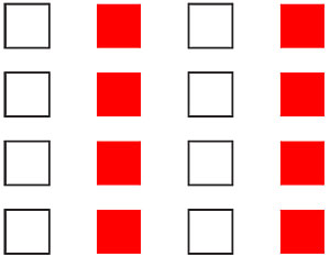
The effect is enhanced with the addition of a second gestalt principle, similarity:
Similar visual elements appear to be related as a pattern.
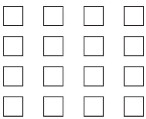
The drawing in above suggests no particular relationship. The squares are the same size and same distance from each other. We could suggest a relationship by moving rows of squares into closer proximity.
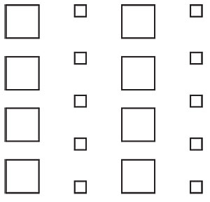
Or we could suggest a grouping by making certain squares similar. For instance, by size or color.
The principle of similarity at its most powerful combines symbols and situations into a larger whole. For instance, a man gestures to show the big fish that got away—"It must have been thiiiiis big!"—by stretching his arms to exaggerate. Behind his head in the living room a Christian cross hangs on the wall. The similar shapes suggest a poignant relationship between a humble angler and Christianity, symbolized by the familiar cross. Some people well-schooled in Christian teachings might even think of the biblical "fisher of men." Never mind that the actual photo has nothing to do with any of this. The power of the image is in the similarity that in a picture suggests a relationship.
Similarity in nature may be copied by an artist into a pattern of rhythm and repetition. Palm fronds reaching to the sky, tumbled stones on the beach, blades of  grass whistling in the wind—these repeating shapes and colors reach beyond reason to speak to our emotions. Humankind only recently (several thousand years ago, but that's recent for a planet) left its shelter under the open sky to live in houses. It's no wonder similarity in a visual image tugs so strongly and so deeply.
Probably you find it no big stretch to see how news people can borrow this principle to manufacture editorial commentary. The example above promotes a humble angler to a figure perhaps worthy of worship. Maybe you think that's the way it should be, you fisherfolk out there. For the rest of us, it's a bit much. Similarity of color pulls elements even more strongly toward a meaningful group. Color is able to blow past most other visual elements in its power to move emotions. A women's rights speaker wearing a red scarf and blue blouse with white buttons may be associated with patriotism because she is wearing the colors of the flag draped behind her. A homeless person wearing the pale gray of the pavement he begs from suggests a larger message of hopelessness to our inner cities.
Perhaps those buttons on the woman's blouse form a straight line leading you right back to the flag behind her shoulder. Your eye likely follows that line, just as we follow that long lonesome highway into a sunset photo. The line is a powerful attraction even when it's not really an actual straight mark. A grouping of beans might form a line, or light bulbs, or chocolate chips.
Would you follow a line of chocolate chips? Visually we'll do the same thing—follow a pattern grouped into continuous straight or curved lines. This is the principle of continuity.
Lines direct your eyes to elements in a photo, or away from them. Lines moving in the direction of a person or object seem to add importance to it. The photo of several people at a meeting may seem to call more importance those who happen to be sitting at converging lines formed by ceiling or floor tiles. Conversely, telephone lines snaking away from behind a speaker's head may direct us away out of the picture, subtracting significance from the subject. In video, lines leading your eyes through a scene may be overpowered by movement of subjects. But moving subjects themselves form imaginary lines directing viewers.
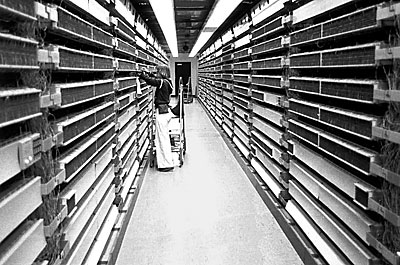
It's obvious that clever news photographers can use lines to lead you to an area they want to emphasize, or away from an area they want to play down. Remember, this is a gestalt principle based on how the brain perceives information; that is, you won't consciously realize you're being led around a picture by the nose, er, eye. We perceive images as a whole. Continuity adds or subtracts emphasis in one swoop to associate disparate elements of a scene. In the photo below, the machinery forms two lines strongly drawing us to the figure, suggesting a relationship between them: A telephone worker trobleshooting phone exchange equipment.
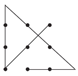
Our brains assume lines going straight will continue going straight. Consider the drawing below:
Most of us would see two Xs, based on the principle of continuity. But we could also see a W above and an M below. The reason we don't see that as readily can be attributed to the principle of continuity.
Another example.
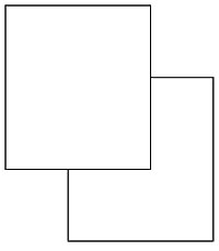
Most of us would see two rectangles, one apparently on top of the other. That's not what it is, however. It's really this image.
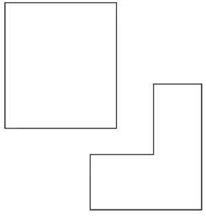
We don't see this because our expectation of straight-line continuity leads us to assume that one box overlaps the other even though this is a two-dimensional piece of paper.
Gestalt researchers tried an interesting experiment using the image below.
.jpg)
This bullet or lozenge shape was shown over and over to participants to guarantee their familiarity with it. Then they were shown this image.
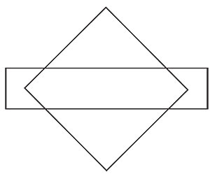
Inevitably they described it as a diamond and a rectangle. Do you see anything else in that image? Look closely: the center points of the diamond in the rectangle form the exact bullet shape above.
The reason we don't see the bullet, or even the dotted M and W, relate again to unconscious visual perception: Given a level of visual complexity, we see the least complicated image possible that still makes sense to us.
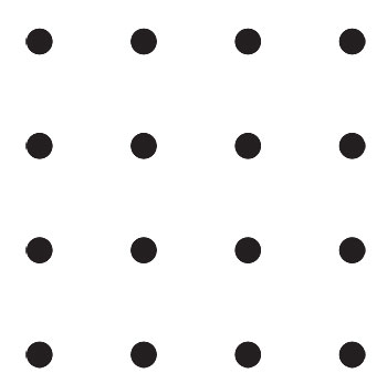
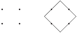
Seeing two Xs requires fewer changes in line direction. The basic diamond and rectangle shape asks less of a viewer than the bullet. Below we tend to see the four dots as a square. Why not the diamond, as illustrated in the second drawing? Or even the canoe paddle? Because, of course, the square is least complicated, given the teeny amount of visual information (four dots) we have to work with.
These images seem obvious. What about more ambiguous ones?
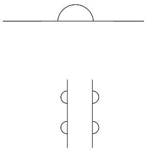
What do you see in the top illustration? Many people would interpret the first as a sunset or sunrise over the horizon, though that is a bit of a stretch. The second one stumps lots of people: it's so ambiguous as to defy our attempts to add our own information.
Possibly your subconscious surrenders, and lets your conscious mind tussle with this one. Logic takes over, and you simply describe it as two vertical lines with half disks attached to them. Or perhaps the strength of proximity tells you the two lines are an open rectangle or cylinder. Continuity kicks in to tell you the half circles are really disks on a third dimension behind the cylinder.
Only if you know these designs to be from an old children's game will you see beyond that. Well, I'll tell you that the first is a bald man walking behind a wall. The second is a bear climbing the back of a tree.
Heh, heh! Why do we find this game amusing? Because all the subconscious tricks the brain uses to build an image could not match the ambiguity of the design. People often react with amusement to visual games designed to fool the senses. Or annoyance, sometimes. But seldom with disinterest. We actually seem to find deep-down satisfaction in a visual conversation with an ambiguous image. Not a really ambiguous one, which can be unsettling, but a mildly ambiguous one that lets us play a more active role in the dialogue, the basis of the principle of closure: nearly complete familiar images are seen as complete.
In the illustration below, who doesn't see a circle or triangle?
Of course, by now you realize that these are merely lines and dots. But we complete them mentally to see the patterns. Closure in visual imagery really is a combination of gestalt principles. Proximity encourages us to see lines or dots as related. Similarity encourages us to see the similar shapes as related. Continuity sees the lines as continuing. Simplicity suggests the most familiar shapes.
Closure suggests that we prefer images we can finish ourselves, to make the image a little bit our own creation. Artists for centuries have known that what they don't show can be more intriguing than what they do. Faint detail gives meaning to shadows. Gestures suggest a future; expressions suggest a past. Clothing suggests possibilities or boundaries. The more abstract or non-representational, the more of ourselves we're expected to bring to the work. Unless you're an educated critic, though, you quickly reach a point of frustration viewing art so non-representational that you need to really work to give meaning to the image.
 That's when you scream, "Who painted these paint blobs, a set of 5-year-olds hyped on Frosted Flakes?" We like to work a little, but not a lot.
Images in the news often suggest something we may be able to close for ourselves. A video break from the speaker to several crowded rows suggests the entire auditorium is filled. We see as complete the partial figures cut off by the photo border. Photo of the local flood may suggest an importance far beyond reality, especially if the photographer chooses a telephoto lens to "stack" an image. Closure may mislead us. So we come full circle, seeing again why journalists include cutlines and voiceovers, which can also mislead us, but aren't supposed to.
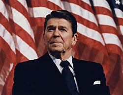 The human biology of image digestion that strikes emotions but ignores reason helps to explain reporter Leslie Stahl's chagrin and her claim that no one heard her words. The "wallpaper" behind that voiceover included the American flag, blue sky, the sun, the president, and children in the background. It's easy to see why that image outlasted the words, as Michael Deaver observed. Most Americans have learned in a culture honoring the flag to see the stars and stripes as image of American rights and freedoms. Many people also react positively to a bright sun, a blue sky, and children. It's easy to relate these visually to the president: he's shown in close proximity to the flags and the children, and in temporal proximity (one scene after another) to the sun and sky.
Perhaps not as easy is connecting an older gent like Ronald Reagan to those other images. But think of this visually: bright face, shock of hair shining as the sun in a blue sky, friendly but determined smile. Continuity's contribution to the scene directs our attention through the children's faces and flapping flags; closure extends the details to the whole visual story of the politician. Reagan has become for some a symbol of patriotism, strength, pride, love, and what's good about America. Similar images were staged many times during Reagan's eight years in office.
This is the Ronald Reagan many adult Americans remember, though he left politics in 1989, and died in 2004. Probably no amount of arguing will persuade these fans that the Reagan in their hearts bases itself on a visual image carefully created by media-savvy advisors like Deaver, even when Deaver himself admitted it. By now you ought to know why that's true: emotional appeal of the news image trumps rational appeal of the words.
Here is one more example to show how the power of the picture in television can reach through decades to become part of what we believe to be true—even if it isn't. The 1968 Tet Offensive during the Vietnam War shocked Americans with its unexpected speed and brutality. The North Vietnamese staged an attack that appeared to reach nearly to the gates of the capital, Saigon, just as U.S. authorities were trying to persuade people at home that the war was being won. Historians often credit the offensive as the real turning point in U.S. support of the war: from general support to general protest.
The truth is that the Tet Offensive was a massive failure. The North Vietnamese suffered huge losses and gained no objectives. Subsequent examinations of television news scripts from such influential news programs as the "CBS Evening News with Walter Cronkite" show that television did accurately describe those losses. But what people saw— the savage attacks and street fighting—spoke more loudly. Even today, most people who remember that era will tell you the United States "almost lost" the war during the Tet Offensive.
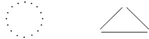
As news consumers who are more discerning than the average, then, we ought to realize the danger and compensate for it. That is devilishly difficult to do, given the primal power of the picture. We don't analyze images like verbal debates or written editorials; we experience them. To see just how powerful a force this is, connect the dots below with four straight lines. Don't lift your pencil from the paper.
Give up? Unless you already know this puzzle, you probably won't be able to do it. The reason is that the visual principle of similarity tells us those nine dots are a box. We can't draw outside the box. But if you don't draw outside the box, you can't solve this puzzle. The solution is at the end of this chapter.
Television news images glide past so quickly that it's just about impossible to analyze them on the fly. In considering the Reagan images, I watched the news clip several times, turned off the television, and recreated mentally what I'd seen, to stop its flight past the verbal firewall.
Published images stick around, though, and may be easier to dissect. To help you recall the visual principles, try thinking of drawing a SImPle COnCLusion—simplicity, proximity, continuity, closure.
More to Read
Gestalt Experiments
• Rudolf Arnheim, Art and Visual Perception. A Psychology of the Creative Eye. New Version. Berkeley: University of California Press, 1974.
What You See and What Is There
• Richard L. Gregory, Even Odder Perceptions. London: Routledge, 1994, 246-262.
How We See, Theories of Visual Perception
• Paul Martin Lester, Visual Communication. Images with Messages, 2d ed. Belmont, CA: Wadsworth, 2000,1-55.
• Jessica Evans and Stuart Hall, eds., Visual Culture: The Reader. London: Sage, 1999.