Go to COMM 362 resources.
COMM 362: Design for Print
Instructor: Ross Collins
Magazine design exercise
Note: if we don't have time to work as teams we'll design just the cover, but please read the entire tutorial for background on magazine design. See Blackboard assignment folder for instructions on cover-only project.
In this advanced design exercise, you'll learn:
a. How to create a standard magazine; 4-6 pages required for this assignment (working as a design team; two as individual), plus cover.
b. How to set up bleeds and page numbers.
 Magazine theme
You may choose to produce the "university" magazine
as described below, or you may produce a magazine for another on-campus club,
organization, church, workplace, or local group. Should you choose your own
theme, however, your magazine must contain at least those elements described
below, or their equivalents. This means you'll need to obtain photos, and obtain articles and keyboard them if not already in digital form.
Grading will be a bit more liberal for those who choose to collect material
from scratch. Otherwise, you can choose from this resource.
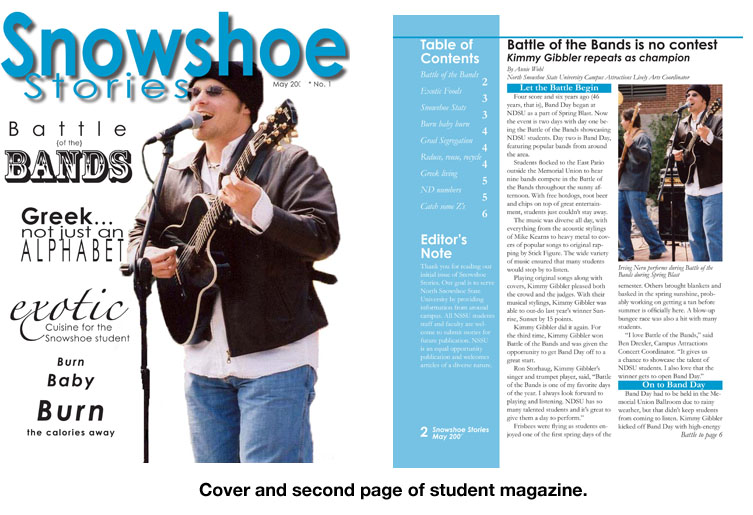
University magazine option
As director of public relations for North Snowshoe State U., you've been asked to
produce a new quarterly magazine. You've set up an editorial board, and after
several long discussions have settled on this version of the 4Fs, as described
below.
Function: This magazine is designed primarily for the university's underclassmen,
but also could be mailed to some high school seniors. Administrators hope it
will serve as a way to encourage students to join and stay at North Snowshoe State
U., by informally featuring issues students don't normally find out about. Sort
of an "insider's guide" to the university, it is hoped the magazine
will put a friendly, approachable face on what many young people feel is a distant,
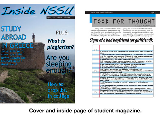
impersonal campus. The name of the publication for your nameplate: "Inside
NSSU."
 Formula: Your senior writer has worked with you to come up with story
ideas. You won't be stuffy--no predictable "President's corner," "Academic
calendar," etc. Features will be light and readable, nothing preachy, but
might sneak in a wee bit of learning. Topics are eclectic: whatever you think
sounds like "insider info" to the younger student.
Formula: Your senior writer has worked with you to come up with story
ideas. You won't be stuffy--no predictable "President's corner," "Academic
calendar," etc. Features will be light and readable, nothing preachy, but
might sneak in a wee bit of learning. Topics are eclectic: whatever you think
sounds like "insider info" to the younger student.
Format: You've decided on the basic format (8 1/2 inches by 11 inches
vertical), photo on the cover, and full color throughout. You'll also need to choose a spot color to match your theme, and bleeds.
Frame (margins): You need to decide this as a graphic design team. Also you need to decide grid, type,
leading, headlines, etc.
Quite a responsibility. Well, Diet Coke break's over,
time to get started. Using the standard graphic artist's approach to a new project,
you proceed thusly:
1. Log off Snapchat; put away the smartphone. (Just kidding. Maybe.)
2. Gather with the rest of your design team (if working as team), as assigned by the instructor.
How to choose duties for design teams (if assigned)
If you are assigned to work as a design team, you may wish to designate one person for each of the roles:
- Layout/InDesign technician.
- Visuals and photography/Photoshop technician.
- Art director/team coordinator.
Obviously, you'll find some overlap in your design team, as roles might be swapped given time constraints. The team works together to make style sheet choices, as described below.
3. Each team member: On your own outside of class, cast about for good ideas. Try the library student union or publications piling up in your room for ideas. Look
at grids, look at covers, look at type, look at illustrations. Find something
you think fits the audience, and take notes. You might not be able to afford
a splashy full-color mag at this point, but you certainly can borrow ideas!
You can take possibilities to class to discuss with the rest of your
team. In fact, at this point, it is strongly recommended that you base this
mag on borrowed design ideas your team agrees could be adapted to this audience.
Reinvent your wheel when you're a professional and experienced graphic artist.
4. Sketch some thumbnails. Lots of designers
begin with scratch paper and pencils--why not try it yourself? Just make simple
sketches to overcome artist's block, get revved up for the computer. These thumbnails should be detailed enough to include possible designations of typefaces, colors, pictures, grid and layout.
5. Fire up InDesign, and produce a few roughs. A "rough" is a sample design, with placeholding test (lorem ipsum file) and placeholding art or photo boxes. Experiment with column sizes, margin
size (progressive or regular? How many picas?) See how your thumbnails match
up to a full-sized practice design.
Try out headline typefaces. Substitute actual stories for lorem ipsum type, if you have them. Use a few of your photos (see link above, or
class web site) and print out to see what it might look like. Note: for a magazine,
facing pages should be toggled ON so you can see how the spreads look.
6. Think about an appropriate spot color, where you want it, and how it will
affect the "mood" of your publication (check out discussion of this in the Graham text). When choosing a color, keep
in mind our discussion about color models: the additive (RGB) model begins with
black (absence of color in projected applications) and adds Red, Green or Blue
to make all colors. It's used for websites, televisions, computer monitors,
slide shows, etc. The subtractive (CMYK) model begins with all colors (a white
page) and subtracts using inks to "filter" colors from the white and
make all colors. Inks used are cyan (Green-Blue), magenta (red-blue), yellow
(red-green) and "K," black, to give more snap to the printed image. Note: you must use a spot color in this exercise (black is not a spot color). Choose a color based on instructions from previous exercises.
A reminder about spot colors.
Pantone is the country's largest company
offering spot color mixing systems, and most printers rely on PMS (Pantone Matching
System) numbers provided by the graphic artist. Be sure to write down the
PMS number you've chosen: I'll expect you to indicate your spot colors by
PMS number on your comp. A comprehensive ("comp") is a final version of the design ready for the client's approval. If you use the Kuler panel instead (CS6), make note of the color formulas. (Note: see broadsheet design tutorial for a new way in CC 2020 to build color harmony in Indesign.)
7. If working as a team, settle on at least two versions of your magazine to use as comps
(comprehensives) as if you needed to show them to a client. These comps should
be two pages each, and the cover, and be substantially different from
each other, to offer a clear choice. They'll need to be handed in with your
final magazine exercise, or before. I recommend that each team member do one
comp on their own, for experience and variety of choice.
8. With your design team review your comps. Choose the final design, and, if working in teams, write a little style
guide (one or two pages) for the publication.
Here's what you need in your
style guide.
a. Grid size (1, wide 1, 1+1, 2, 2+1, 3, etc.); rationale for choosing this
grid. Number of picas between columns.
b. Typeface chosen for headlines; rationale for choosing this type face.
("Because it looks nice" isn't good enough. Look back to your text
and online notes for ideas.)
c. Typeface chosen for body text; rationale for choosing this type face.
Note: avoid choosing Times or InDesign's default Minion. Sheesh, let's be a li'l creative,
here....
d. Body text size, leading. Note: default leading is not always most attractive. Generally body text is no larger than 10 pt, or smaller than 9 pt. Take a look at what the professionally designed magazines are using.
e. Margins: progressive or regular, size.
f. Cover nameplate: style, size, borders, reverses, screens, angles, etc.
g. Standard spacing: number of picas/points between headlines and beginning
of stories, between end of story and beginning of another story, between photos
and cutlines, etc. Again, take a look at other magazines for guidance.
h. Typeface for pullout quotes, if you use them. You'll be using pullout quotes, I confidently
predict....
i. Typeface for folio. Note: need to have running folio on each page
except the cover, saying, something such as "SU Inside, Issue 1, May 2018." Look at other magazines for ideas.
A note on page numbering.
You could manually type and style page numbers into each folio, but it's such
a pain. Worse, if you add or delete pages, you have to change all the numbers.
Why not let your ever-obedient slave InDesign do it for you?
1. First, double click on the A-Master on the Pages panel to bring up the master page (see Exercise Three).
2. On the left side of the spread draw a small text frame in the area you want the folio to appear, usually
upper corner or center just above the margin lines. You can adjust this later, if necessary.
3. Now go to Type pulldown. Choose Insert Special Character, Markers, and Current Page Number. A small "A" will appear.
3. Style the "A" and add other text as you wish it to appear on folio. Now go to the right side and do the same thing.
4. Go back to page one. Note folio has obediently appeared, and will automatically
be renumbered should you add or subtract pages.
j. Any other standard elements from your design, including size of rules, use
of screens, use of story-end characters such as bullets, use of decks, use of
subheads, etc. To get ideas, once again, look at other magazine designs. One often-used feature in contemporary magazine design is to add text in front of a photo. You can do this directly, but the text may not show up very well against some photos. You also can do it in Photoshop of course; review Photoshop tutorial five.
Alternatively, why not put the text in a screened box above the photo, so that it's transparent, but lighter? It's easy! Here's how:
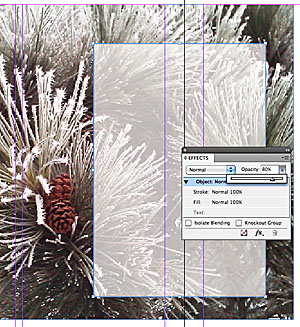 Screened text box in front of a photo.
1. Draw a border (box; not a text frame) as necessary on your photo. Fill with white or black, or another color, as you wish.
2. Go to Effects from the Window Pulldown.
3. In the panel, slide the opacity down as desired, see right. Add text.
k. For spot color: indicate PMS numbers, where used.
Hand in this style guide for grading (5 pts; required only for groups).
9. Time to begin setting up that first issue. If you choose to the
university magazine theme (as I recommend), you'll find a variety of stories and photos in this link. Download and save stories and art into a
single folder on the hard drive, your flash drive, or cloud-based storage (NDSU gives you a gmail drive account; why not use it?). In addition
you can use clip art, but only royalty- or free-use photos or other art that will print as a high-quality
image. (No pixillated images, that is, at 72 ppi; should be at least 150 ppi, and many high-quality pubs require 300ppi.) Another alternative: use your own photos. Illustrations with the Creative Commons designation are okay if quality is sufficient. Draw something yourself if you have illustration background.
Edit all images you'll use in Photoshop: crop, dark/light/contrast
(Levels), burn, dodge, color, dustspot, sharpness. Choose quality
images; I will deduct points for out-of-focus, poorly-exposed or poorly-cropped
photos, or photos clearly not cleaned up in Photoshop! Usually graphic artists save as TIF files, the standard graphic arts format, but you can save a jpgs. Remember: must be saved at a minimum 150 ppi. Use Image size in Photoshop to adjust.
10. You may use the headlines as indicated on the stories, or write your own.
Remember to clean up "rabbit-ear"
quotes, double hyphens for em-dashes, single hyphens for en-dashes, two spaces after each sentence, bullets changed
to asterisks, etc., if necessary. (Check the 10 typographic pitfalls for review
of this.) One way to clean up problems is to open the copy inn Word, us
the Replace command to find and change problems, save as Word File, and THEN
Place into InDesign. However, InDesign also offers a Find/Replace option under
Edit menu.
Spell check all headlines! While graphic artist aren't editors, they still need to do some common-sense proofreading.
You may jump stories (move parts of them to other pages), but you'll have to
set up jump pages (jump lines say something like "go to page..." and
jump heads say "from page...").
Probably you ought to put teaser headlines on the cover to bring people into
the magazine. Most definitely you'll need cutlines for the photos, and need
to use several photos. Probably you'll want to try screened borders, rules, gradients, or other interesting effects we've
tried this semester, as appropriate.
11. If working with a group design at least four to six pages (if you need space for jumps), plus front and back cover, no
advertisements. Don't put more than one story on your lead page--make it a showpiece,
even if you have to jump. Think about the ATSI (Art, Title, Subhead, Initial
cap) checklist to get started. Use a bleed on at least one inside page, either
the spot color or photos. (Reminder: a "bleed" is art or color going
off the trim line, or edge of page.) You may leave the back cover blank, if you wish, or lay the spot color on the back.
To indicate a bleed:
Drag the photo or other element until
it lays about 2 picas beyond the edges of the page (trim lines). By the way, a laser printer
can't do bleeds, so the photo will look cut off, but that's okay as these are
FPO (For Placement Only) photos anyway. a professional printer would get the bleeds right.
12. Likely you'll want to bleed the cover photo, and overprint the nameplate, teasers,
and other material.
13. You may decide to print proof versions of your magazine. This should include colors as overlays, that is, separate
pages for each color. This, as you know, is what a printer would need to run
each spot color onto a separate plate.
Overlay Instructions:
a. Choose Print, and Color from the Advanced menu to bring up the color dialogue
box. Toggle on Separations. You see you have some option on printing colors.
Under Inks, The CMYK process colors would be needed to print color photos. The
spot color would be needed to print your spot color, unless you toggle the "All
to Process" button, which converts the PMS color to process. Usually you
don't want to do this. You can choose Print All Inks, or Print No Inks, and
then choose just the spot color and toggle on Print This Ink.
b. If you choose Print No Inks, then choose the PMS color and black process
color only, you'll just get separations for the spot colors, and black (black
is not considered a spot color). Some graphic artists do this, and let the printer
take care of the complex work of preparing color photos. With the process inks
turned off, the color photos won't print, but the printer will add them later.
Try this method to save paper--otherwise you'll get five separate pages for
each magazine page, kind of a waste for our class project.
If you want to get a feeling for what the colors look like, you can print to
a color laser printer in the cluster. Ask the cluster manager how to do that
nowadays (it seems to change each year I teach the class).
15. For grading, however, you only need export to a PDF file, as we've done for previous assignments.
Reminder: PDF (Portable Document Format) is an Adobe development based on PostScript
language that offers a complete "snapshot" of your document. Printers
often use PDF files. Even more handy, they can be added to web pages for download.
Adobe Acrobat Reader is generally necessary to read these files, but it's a free download,
or bundled with web browsers.
16. Submit pdf to the class Blackboard page. Be sure to proofread your work carefully before submitting! I recommend you review a laser printed proof copy, in addition to the on-screen version. Graphic artists tend to be perfectionists, for good reason: readers notice the itsy-bitsiest of mistakes in design. (But they take perfection for granted. So annoying.)
17. Based on this assignment, consider formulating one question that could become
part of the final exam (1 pt extra credit). I'll answer all questions submitted, and add the best
ones to the final. Email the question or include with the pdf.
18. Checklist before submitting (group).
a. At least two comps (using InDesign) indicating cover or interior possibility. You'd show the comps to your clients. (2 pts). Submit each as pdf.
b. Pdf of your magazine (70 pts). Be sure to include somewhere on the document the names of your design team members.
c. Style sheet as indicated above. Must be at least a page. Send as email attachment. (3 pts).
d. Recommended: One possible exam question based on this exercise (1 pt extra credit).
Checklist before submitting (individual work).
a. One "comp" with magazine cover and two inside pages. Submit as pdf.
b. Recommended: possible exam question based on this exercise (1 pt extra credit).
Participation points for groups.
You'll have several lab days in class to work as a team on this assignment. Each day you'll need to hand in a page indicating what you did, and which of your team members did it. Each team member needs to sign the page. Grade: 5 pts. per participation day, in addition to the total points indicated above.