Learning ![]() Software (Version 2020 for Macintosh)
Software (Version 2020 for Macintosh)
A self-guided tutorial by Ross Collins, professor of communication, North Dakota State University.
Levels/Curves, Dodging, Burning, Dust and Scratches, Sharpening
In the introductory tutorial we glanced at the tool box and panels, experimented with image size,
cropping, resolution, file formats and selection tools. Now we begin working to make our pathetically inadequate
images snap to attention and help us win awards.
Generally after cropping your photo, one common workflow procedure is to run every picture through the tools described below in this order:
Save as to a new filename, in the file format you'll need for publication or web.
I. Levels
1. Download (or upload) your photo. Open your image from Adobe Bridge (or choose Open directly from Photoshop). Alternatively, download one of my own precious images I dumped
on either the design class website resources page or the photo class resources page. Hmm. Not so bad, but it could use a little work. (Couldn't we all?)
For those of us using InDesign for editing and preparing to work on the broadsheet exercise, download one of those photos to work on.
2. Crop as necessary (see tutorial one). If you end up cropping so radically that
you're left with a teensy-weensy photo, consider that you'll be saving this to about 150 ppi, and it has to fit into a space larger than a postage stamp. Unrestrained cropping will reduce image quality, leaving the photo fuzzy, pixellated, or both.
3. Your photo is likely too light or too dark, too contrasty or too flat. If a consideration, normally
a slightly more contrasty photo will print better on low-quality paper, especially if it will be
run in black and white. Yes, print still exists. Yes, they still hire journalists.
Note: Contrast is a lighting quality of "hardness" or "softness" in an image, based on the directional strength of light and shadow. Sunlit scenes are normally more contrasty. Cloudy scenes are normally less contrasty, that is, more flat. To learn more about the qualities of light, check out Ross's qualities of light tutorial.
Bean-counter's note: Considering the wonderful color printing we enjoy nowadays, why would anyone want to run black and white? One word: cheapandeasy. Process color (CMYK in printer's shorthand) is costly for larger print runs and relies on careful prepress and printer staff for respectable results. Black-and-white can be bungled too, but not as easily, and your client won't dig so deeply into a budget on the way to the page. Check out your student newspaper--if it's still printed.
Many publications publish color only on pages also containing color advertising. The advertiser pays for color anyway, so the editor tags along to use it for photographs or illustrations also. Otherwise, graphic artists working in print often still rely on black-and-white photo reproduction, even if the original was in color.
Note: Black-and-white images contain only one channel of color (black), and are therefore only one-third as large, another advantage working in Photoshop.
Channels? What the heck is that? Okay, time out for a surf through Photoshop's channels. Projected color (such as that of your computer monitor) begins with black (absence of color) and adds Red, Green and Blue (RGB) in various intensities to make all colors. Full intensity of all colors makes white (I know this is not at all what you learned in art class, but there you're talking paint on paper, or reflected color). You can check this out in Photoshop by tapping into the channels panel:
a. From the Image pulldown, choose Mode, and RGB color, if it's not chosen already.
b. If the Channels panel is not showing, choose Channels from the Window pulldown.
c. Note RGB, plus each color is shown. Click on a color to see only that channel, and observe the result.Note: if channels aren't shown in color, Choose Preferences from the Photoshop pulldown (Macintosh), Interface, and toggle on Show Channels in Color.
Hey, who needs hallucinogenic drugs when you have Photoshop? Of course, on those woefully inadequate university laser printers you won't get those colors out at all, but a black-and-white facsimile thereof. To see what your photo will look like in black and white, under the Image menu choose Mode and Gray Scale. Accept the Discard Color warning. The color you lose runs down the drain forever! What, you say, what about that History panel, to get those colors back? Oh, okay, then, choose History panel from the Window pulldown, or choose to go back to wherever you want to be. (I just kinda liked the idea of FOREVER, MAN, in the original versions of Photoshop.) Alternatively, you can take one step backward by choosing that from the Edit pulldown or keystroke combination.
Warning: Mode is not the best way to actually turn your color photo into black and white. To control how the colors render as shades of gray, go to the Image pulldown, choose Adjustments, and Black & White. Photoshop will do its best to guess default tonal values, but you can change that with the sliders.
4. Back to business at hand. You want to control contrast. Lighten. Darken. Quicken. (Wait,
that's accounting software.)
5. Simpleton way: Under Image choose Adjustments, Levels and in the dialogue box choose Auto. Ta-dahhh, maybe. Sometimes (more often than
I'd like to admit, anyway) Photoshop really is smarter than we are and just
knows what we need. You're looking for snappy shadows and strong
highlights, with detail (ability to see textures and objects) in almost every area
of the scene. To understand what this means takes practice, but you've got to
start somewhere. You can also choose Options from the Levels dialogue box, and try one of the preset algorithms. OR (sigh! blotation-of-choice warning) choose a more professional method described below, working on a separate layer.
Note that these dialogue boxes usually offer a Preview check box. Toggle that on and off for a comparison of before and after.
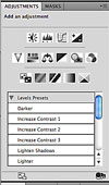 Beginning with CC 2017 (I think) a shortcut for Auto Levels (and many other adjustments) became available through the Adjustments panel. If the panel is not showing, go to the Window pulldown, and Adjustments. Click on the second icon, Levels (Hover cursor over icons to identify). A new adjustment layer will be generated.
Note the Levels Presets here also give you several options. This might prove handy. If you're persnickety about your images, though, you'll just have to do it yourself, as noted below.
 6. You may also generate an adjustment layer from the pulldown; from the Layer pulldown choose New Adjustment Layer and Levels. OK on the dialogue box, or change the name as you wish.
It's usually recommended to do your work on separate layers rather than alter the pixels of the actual image. A layer is the metaphorical equivalent of slapping a sheet of acetate over your work, and mucking about on that. If you save as a Photoshop document, the layers remain, so if you're mood changes you can still throw them away later and reclaim the unadulterated image.
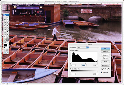
7. Aaak! What's that lump of sludge on the panel at right--a snowpile on T Lot? More wondrous: it's the Levels menu with a histogram (not a medical term) of tones as they are distributed in your image, from highlight to shadow. (If not showing, find in Properties panel.) Under the histogram the sliders to the left make the darkest shades black, and to the right, the lightest shades white. Check it out: it's the best way to understand what Levels does to your image. More important than these, however, is that middle slider, the "gamma point." Slide it to lighten or darken the middle tones of your image. Slide as you like, and OK it. Or again, if you think Photoshop is smarter than you are (grrrr!), choose the Preset option at the top and see how they do.
Note: If you don't like your adjustments, you can choose the revert icon at the bottom of the box (looks like a curved arrow) to return to defaults.
Geezer note: Using Levels on color photos sometimes de-saturates those wonderful colors you need to make your page stand out. One way I used to adjust them was under the Image menu by choosing Variations. This gives you previews of your photo adjusted for color cast. I used to describe this in detail, but unfortunately CS6 and later running on a Macintosh in 64-bit mode no longer shows Variations. You can change this to 32-bit mode, but because this feature apparently no longer runs uniformly well on all computers without adjustment, I'm going to drop it as a feature worth describing. Okay. There are workarounds. But I loved this feature!
8. In the Layers panel, move from your Levels adjustment layer back to the Background layer by clicking on that icon. Move to Adjustments panel (or Image pulldown and Adjustments). You can adjust color balance from that dialogue box. Choose Color Balance icon (Little balance scale. How kawaii.) from Adjustments, and move sliders to see the effect. On the other hand, maybe you just want Photoshop to do its thing for you, automatically:
Note: Color balance is a shift away from natural color based on the color cast of the light, or the settings in a digital camera. For example, a photo taken on a cloudy day or in the shade using the camera's Auto White Balance mode may look a little blue. You may even feel a little blue. We need to adjust that. (For more information, yet again, check out my splendid qualities of light tutorial.)
Geezer alert: One of the most difficult jobs of the old color darkroom technician was to precisely adjust color casts under the enlarger using acetate filters. It takes a trained eye to notice a subtle color cast, so look carefully at your original image, and click to try some options. Don't be surprised if a printed version looks different from the screen.
9. An alternative to Levels and Color Balance: Curves. See below for tutorial.
Deleting a layer: If you've made a dreadful muckup and just want to start over, from the Layers panel drag the offending layer to the little trashcan icon to delete. Handier than laboring through the History panel.
II.Lightening or darkening portions of an image.
Method A. Dodging and burning.
Nearly always graphic artists and photographers also find
areas of an image which are too light or too dark. "Too" means:
no detail. For instance, a "bald" sky, that is, pure white so it blends
into the screen, pdf, or paper when printed. Or a back-lit face in deep shadow. Your goal is to lighten or darken these areas to bring "detail"
into nearly every area, if possible. In Photoshop one intuitive way to
do that relies on the burn/dodge tools. These tools used to be clumsy, and so hard to make the work look natural. Beginning with CS5, however, we now seem to have a tool refined enough to provide a reasonable choice you can use without too much swearing. Let's try 'em.
Geezer note: "Dodge" and "burn" are words that date back to nearly obsolete techniques we used to do in an old-fashioned darkroom. You'd make a little paddle out of a piece of cardboard taped to a wire to hold back light from the enlarger, moving it around to "dodge" areas you wanted lighter. To darken areas, you'd hold back light with your hands shaped to focus more light on one area, hence "burn in" that area. The arthritic-looking hand in Photoshop is the burn metaphor; the paddle, dodge. Ah! The olden days when fine motor skills still had value.
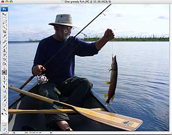
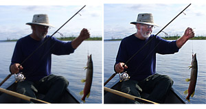
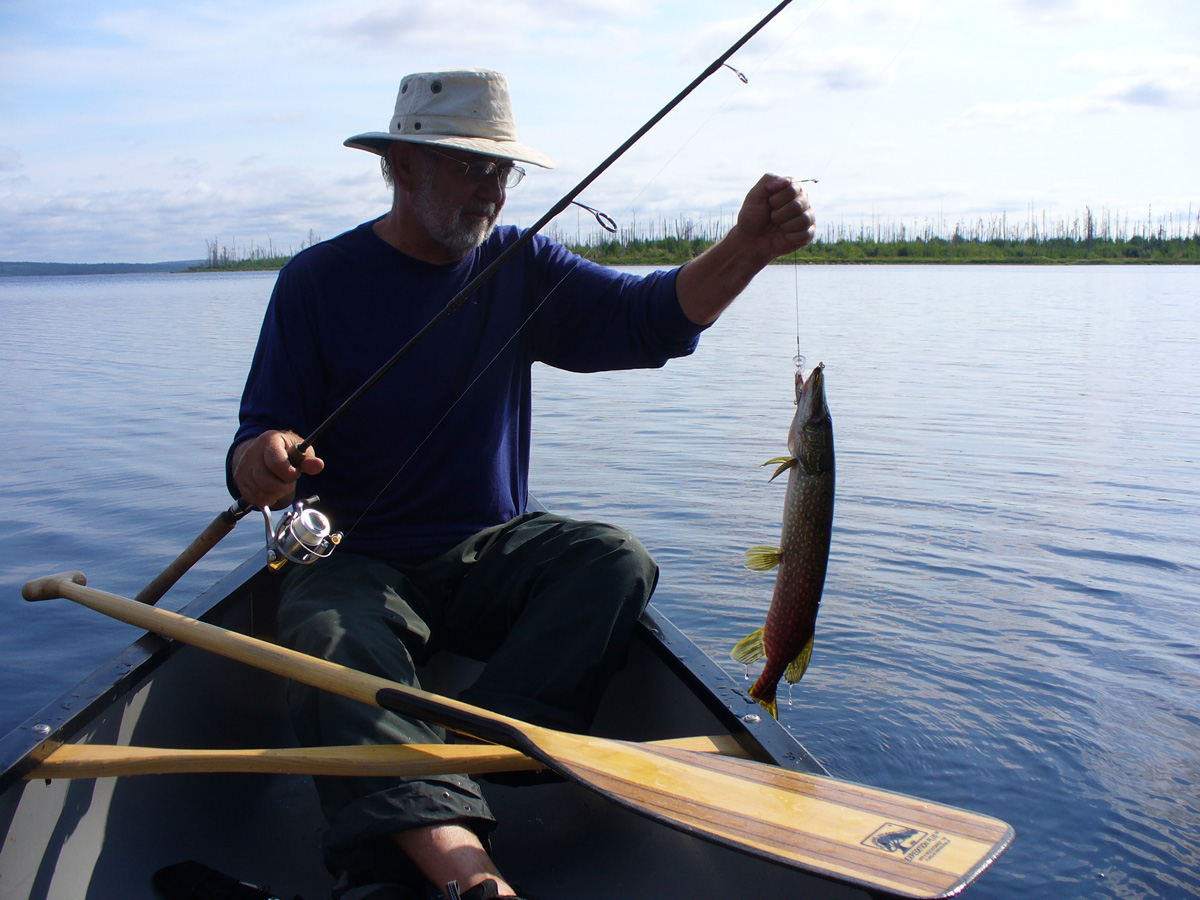
1. Download and open in Photoshop this dreadful fishing picture, or a photo of your own.
2. Click on the Dodge tool (the little paddle; it may be behind another tool) in the Toolbox. If you don't see it, from the Windows pulldown, change Workspace from Essentials to Photography.
Geezer note: I don't know why the workspace option was added a couple years ago. Just throws in a whole 'nuther layer of confusion for those who desperately look for familiar tools while not realizing they are laboring in the wrong workspace.
Wait! Don't start dragging it around your image yet. Choose the brush from the contextual menu bar at top, and the size you want. (No, I don't know what all those options are. Choose a fuzzy or sharp circle, the standard). Try adjusting Exposure to about 50% and Range to tone areas you wan't to dodge (normally shadows). Adjust brush size from contextual panel or look really professional and use the bracket ([ or ]) keys.
3. Check the Layers panel to make sure you are working on the Background layer (click to choose). You could dodge this layer, but better yet, duplicate the background layer (Background Copy) from the Layer pulldown. Usually it's better to work on a separate layer. We can always dump this layer if things don't work out, and still have our pristine image available.
4. If using the practice image, try shadows for range of tones to concentrate on, and about 25%. Either click or drag around area you want to lighten. Note Photoshop will lighten area one level at a time. Click on the History panel level to see the effect.
In the illustration I'm using the Dodge tool to lighten the face.
5. Same method for the Burn tool, the hand.
Geezer alert: I realize these metaphors only make sense, really, if you have darkroom background. But like typographer's terms, we keep the terminology long after we quit using the technology that created them. I mean, who "types" nowadays? Hm. There's a graduate thesis in that, somewhere....
4. The third tool in that drawer, the Sponge tool, only works correctly on color
images, to decrease or increase color saturation. Select Options from the menu bar
to set it up.
 5. It's not so easy to get the edges of burns and dodges just right, without
that annoying line, especially when you're trying to have a delicate touch
while manipulating a potato. That's what using a mouse as an art tool feels
like to me. Well, Photoshop gives you some options here. First you can try to Fade a tool from the Edit pulldown, to soften the transition. Helps a little. Or use the Smudge tool (index finger) or Blur tool (water droplet). The Smudge
tool is harder to control, just like a 5-year-old finger painter on your kitchen
table. The Blur tool will give you a more precise transition. By the way, the
Sharpen tool (elongated triangle) does the opposite, but can add a grainy edge
if you use it too much.
5. It's not so easy to get the edges of burns and dodges just right, without
that annoying line, especially when you're trying to have a delicate touch
while manipulating a potato. That's what using a mouse as an art tool feels
like to me. Well, Photoshop gives you some options here. First you can try to Fade a tool from the Edit pulldown, to soften the transition. Helps a little. Or use the Smudge tool (index finger) or Blur tool (water droplet). The Smudge
tool is harder to control, just like a 5-year-old finger painter on your kitchen
table. The Blur tool will give you a more precise transition. By the way, the
Sharpen tool (elongated triangle) does the opposite, but can add a grainy edge
if you use it too much.
Hint: You can use the Fade after nearly all adjustments you make to image, to soften the transition.
Method B. Choosing and adjusting.
This takes a little more time than dodging or burning, but I think does a better job on uncluttered areas easy to choose.
a. Copy the background layer. Carefully choose the area you want to lighten or darken (See Tutorial One).
b. From the Image pulldown, choose Adjustments and Brightness/Contrast. (Or choose New Adjustment Layer.)
c. Adjust the Brightness slider in the panel as desired.
d. Choose Fade from the Edit pulldown to soften edges. Deselect from the Select pulldown, or Command-d keystroke combo.
Note you can use any adjustment on a chosen area. This gives you a lot of control over precise areas of an image you wish to adjust.
Quick tip! Improving the flash-on-camera photo.
III. Dust and scratches (cloning)
Supposedly your picture is perfectly clean and carefully kept
in its own crisp digital envelope. So where did all those ugly dust spots come from?
Well, it might be from a dirty scan from a real photo. But digital cameras themselves attract dust to sensors, so spots can actually be recorded digitally. Lens flare or a dirty lens also sometimes comes up looking like dust blobs.
Geezer alert: Back in the old days I had to learn to spot them out using a tiny brush and an inky substance called Spotone, which never failed to spill and stain your clothes. Ha! You oughta' pay those dues, dude. Okay, I'll let you off, but I'll always know something you don't, heh-heh.
1. First try this. Under the Filter pulldown, choose Noise, and Dust and Scratches. In the upcoming
dialogue box, choose a pixel radius (size of dust speck) of, say, 1, and a threshold
color difference (what constitutes a speck) of 10. Note result in preview box.
2. Hmm. Not wonderful. I don't use this feature very often. It's fast, but it nearly always
seems to filter detail out of your image, and may blur it as well. Better to take the initiative and remove the dust spot by spot with our handy digital spotting brush. (Never needs cleaning!)
3. I spot the dust using the wondrous Clone Stamp tool (stamp icon in toolbox), Healing Brush or Spot Healing Brush (Band-Aid icon in toolbox...how corny!). This takes longer,
but works oh-so-much better. Choose
a smallish brush size from the menu bar.
4. Using the Healing Brush, find an area roughly near the dust speck that matches its color. Holding
down the Option key, click there to sample a clone point. Move to the speck,
and click. All gone now. To quickly remove a scratch, Option-click to select
the clone site, click at one end of the scratch, and shift-click at the other.
You may have to zoom in to catch these details.
The Spot Healing Brush guesses what you want (Content Aware), so no need to sample. Just click on dustspots, and see if Photoshop is smarter than you are. It often is. Quite irritating, that. If you want to remove a hair or line, drag over it with the tool.
5. If you have any lick of imagination, you've probably figured out that this
is no simple rubber stamp--this is an amazing tool that can "clone"
away anything, or clone anything onto anything else, even between two photos.
Never liked that ugly birthmark on your arm? Oops--it's gone. Kid brother giving
you a hard time? Oops--he must have been in the bathroom during that family
picture. In five minutes, I did to my head what no Minoxidil could ever touch!
(Check out this l'il charmer: Ross
with hair.) Now you know one reason those famous fashion models always look
so perfect.
Warning: ethical graphic artists and photojournalists working in the journalism business do NOT remove or add items not in the original scene. It is the photographic equivalent of making up quotes. That is to say, lying. In advertising, however, eh, whatever works, probably, and let the communication graduate students analyze the results in those critical/cultural studies.
Note: If you'd like to jump ahead and learn how to do some major nipping and tucking, check out tutorial eight. Just don't say it was your photo/design instructor who spilled the beans on this secret.
IV. Curves
Now that you know how to adjust using Levels, I'm going
to clue you in on an alternative that perhaps works better--and it's popular among Photoshop professionals. Don't we all want to look more professional? ("Fake it 'til you make it."--Ross Collins, c. 1997.) I use this now and then, but it requires more time, and so it's probably not something you're going to call up every day. We won't cover this in class, but try on your own, if you want.
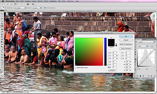
1. Open a photo that needs some exposure and color correction work; either it's too dark, too light, or both, has a color cast that's annoying, needs contrast, and may need more detail somewhere (or even less detail in a background area). Use a photo of your own, or try this photo taken on the banks of the Ganges, Varanasi, India, for practice.
2. Under the Layers menu, choose New Adjustment Layer, and Curves. (Or just choose the third icon from the Adjustments panel.)
 3. Try a Preset, or Auto, if you want. Probably it won't be optimum, so let's take control of our own adjustments.
a. Double-click the top icon, shadow eyedropper ("Set black point") in the Curves Adjustment panel. The Color Picker dialogue box asks you to choose your target shadow color. In the RGB areas toggled on, enter about 7 for each (illustration at left). OK. When asked if you want to save new colors as defaults, say yes.
Note you've chosen the same number for each color. This balances the Red, Green and Blue in your photo. That's what we want, because the problem in your photo is the color is not balanced. When you save this as a default, the color balance you've chosen will always be the same for all images you work on.
b. Double-click the midtone eyedropper. In the RGB areas enter about 133, 133, and 133. OK.
c. Double-click the highlight dropper. In the RGB areas enter about 245, 245 and 245. OK.
4. Back to your image. Let's color correct.
a. Find something black or nearly so on your image. Click on it with the shadow eyedropper.
b. Find something white or nearly so. Click with highlight eyedropper.
c. Find something a sort of middle gray (this is the hardest, I know.). Click with the midtone eyedropper.
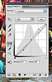 5. Lastly, fine-tune contrast if you wish using the histogram in the Adjustments panel. Add points to the histogram by choosing the Adjust Points icon, clicking to add points to the line. Then drag (or use arrow keys), note changes to your image. And, if you've hopelessly mucked it up, click on the little trash icon and start over.
6. Okay, I realize using Curves is a bit of a, ahem, learning curve, but it does give you more precise control over your image. I also admit I seldom use it myself, opting usually for Levels.
V. Sharpen
Most digital photos need a bit of sharpening. The process adds fuzziness, but this is a kind of warm fuzzy you don't want. Generally you sharpen last, just before saving to a new file.
Geezer alert: Photoshop sharpen doesn't really sharpen, you know. It just increases contrast between adjoining pixels of different colors. This works okay to pull out digitally induced fuzziness, but it is not much of an answer for people who can't hold cameras steady. In the old days we steadied a camera by bracing the eyepiece against our forehead and our elbows against our body. Nowadays people hold a typical LCD-based camera out in their shaking fingers, peer mouth-agape into the display, and think they're getting a gosh-darn sharp photo. And how's that working out for you, then?
1. Working from your background or background copy layer, Under Filter pulldown, choose Sharpen, and again, Sharpen. Mmmmmight do the trick, if your photo only needs tweaking. Or not.
3. If this doesn't do what you want, Try Sharpen More under the same menu. Better, but not a very well-trained pup: it might sharpen into "artifacts" (little flecks) on the image some places, and not enough in others.
4. I usually don't bother with the auto sharpen tools, and instead unsheath some serious knives: the Unsharp Mask. (See illustration at right.) This counter-intuitively named dialogue box is really what you need to control sharpness of your image. You can change the amount of sharpening by percentage, and change the Radius value to indicate the width of edges you want sharpened. Note a blurry photo has wide edges (diffuse circles of confusion), so you need a higher width to make it sharp. What's an edge? That's set up by the Threshold option, defaulting at 0 (to sharpen everything). Set it at about 10 for a smoother line. Experiment to see the results of changing these levels. Try Smart Sharpen for even more control.
Note: I usually leave the percentage at about 130%, Radius at 1.4, and Threshold at 1. Your mileage may vary.
Note of compassion: We usually don't sharpen portraits, as most people really don't want to see any slight blemish or wrinkle look more pronounced. Sometimes we actually used the Blur filter a bit (choose Filter, Blur, and Gaussian Blur for most control. We'll cover this in more detail later.)
So now you have a standard routine for dealing with photos:
1. Crop.
2. Adjust exposure/contrast/color balance using Levels or Curves.
3. Dodge or burn small areas to enhance detail, if necessary.
4. Digitally flick dust spots and blemishes using Clone Stamp or Spot Healing Brush, if necessary.
5. Sharpen.
6. Adjust to required resolution using Image Size dialogue box, reduce or enlarge to fit space, if known.
7. Save As to required format.
Photoshop Exercise for grading:
Use the above routine on two photos, either your own or from the class website. Save each to 150 ppi, in jpg format; submit to Blackboard for grading, along with the original photos before your Photoshop work (so submit four photos total).