

Much has been unclear since the start of the pandemic. How has the data reflected past and ongoing efforts to slow the spread of COVID-19 in the region?
Click here to see the latest data visualizations.
I am not an epidemiologist or a biologist. I am an economist. I cannot comment on how the virus spreads. I have no idea if warmer or cooler climates impact the likelihood of contracting the virus. I can bring no epidemiological model to the discussion, though as an agent-based modeler I am concerned that model builders can generate a wide range of outcomes with a small number of changes to the model much as your favorite MMO computer game can change significantly with only one or a small number of updates. Instead of trying to predict the future, I will be considering the recent past.
As an economist, I can comment on interpreting time series data. The appropriate way to gauge the status of the spread in one area relative to other areas is not by considering the number of cases or number of deaths in the area. Areas with more people will more than likely have more cases and more deaths, just as those places are likely to have more individuals whose first name starts with a “J”. Whatever statistic is used to judge the severity of spread must account for the size of the population in the area.
Other considerations are important as well. Some argue that the reliability of data is suspect. Concerning recorded cases, not all cases are reported. In fact, most are not. Studies suggest that cases of COVID-19 cases are underreported by at least a factor of two or even by factors of greater than 10. The other data to indicate spread is the reporting of deaths related to COVID-19. Some have been concerned that the CARES Act has incentivized doctors to report the cause of deaths for patients as COVID-19, thereby artificially inflating numbers. Others are concerned about underreporting of COVID-19 deaths by nursing homes. I take no strong stance here on these issues as any of these problems can bias the data in one direction or another. I’m only concerned about drawing straightforward inferences from the data.
Even if all of these problems do exist, data is still useful to us if we can make some assumptions that are not especially unlikely. If we presume that misreporting occurs at about the same rate across time within a given region, than that region’s data will be consistently biased, allowing the rates of change in the data to reflect proportional changes in spread and deaths resulting from spread. Second, if misreporting occurs at about the same rate between states, then differences in the levels of cases and deaths, as a proportion of population, are meaningful as relative indicators. Even if misreporting is not occurring at the same rate between states, if the rate of occurrence of misreporting is stable within each state, then comparison of rates of change will yield valid inferences.
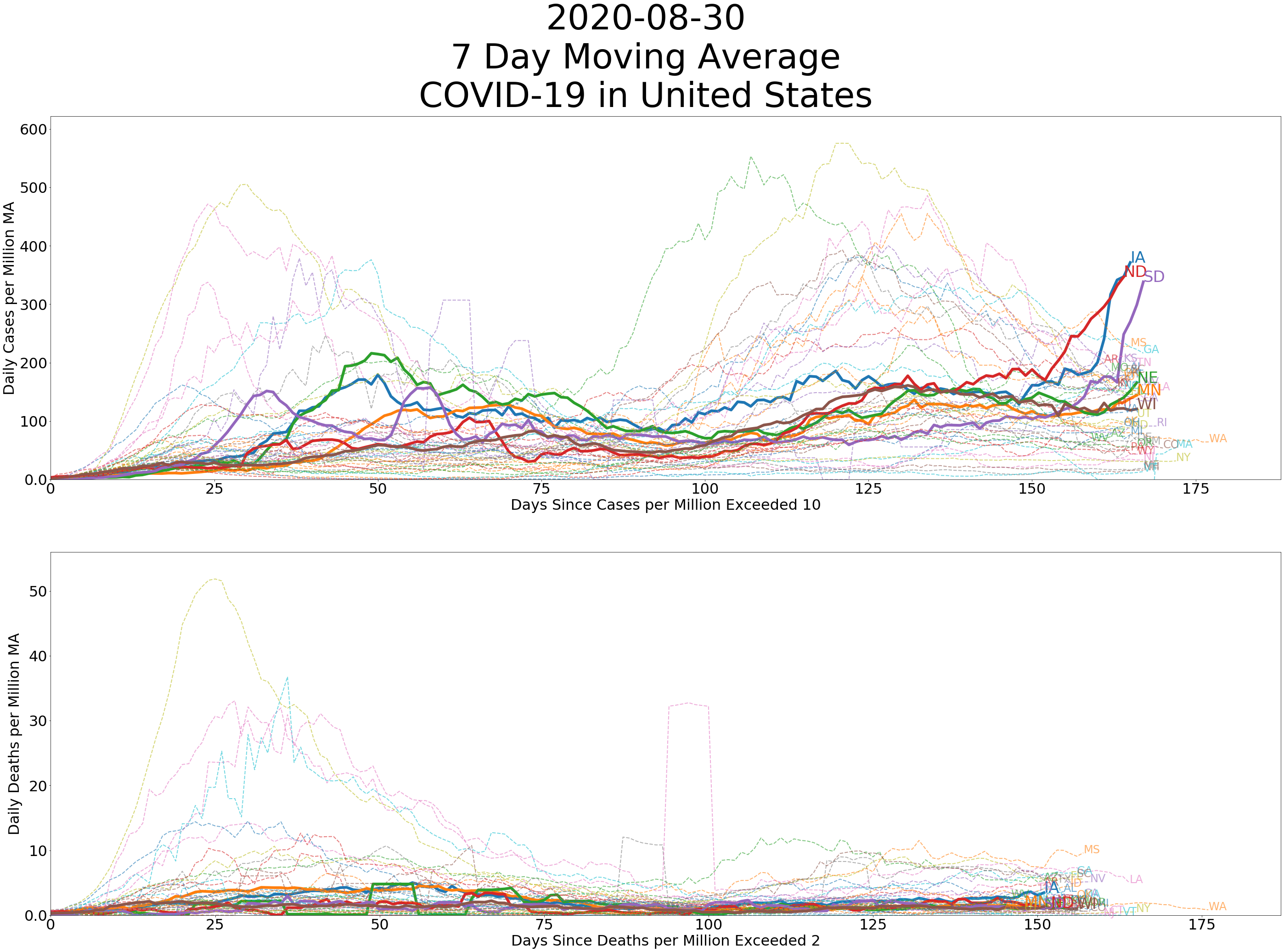
Since spread happens across time, it is also helpful for comparing data if we use a common anchor. When comparing estimates of deaths per million between counties, I have been selecting the first day where deaths per million and cases per million are above 1 or greater as the value defining day zero.
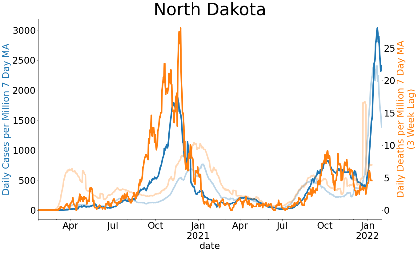
This will allow us to compare curves if the curves are given a common anchor. In New York, for example, many counties reached a level of deaths per capita of 0.03% within 12-15 days. In Cass County, North Dakota, which has so far experienced the greatest impact in the state by this measure, we are around the 0.015% mark. Given the day zero criterion I have described, it has taken 35 days to reach this mark. Cass County has taken more than twice as long as New York to reach half the level of deaths per capita.
Open chart showing spread in U.S. States
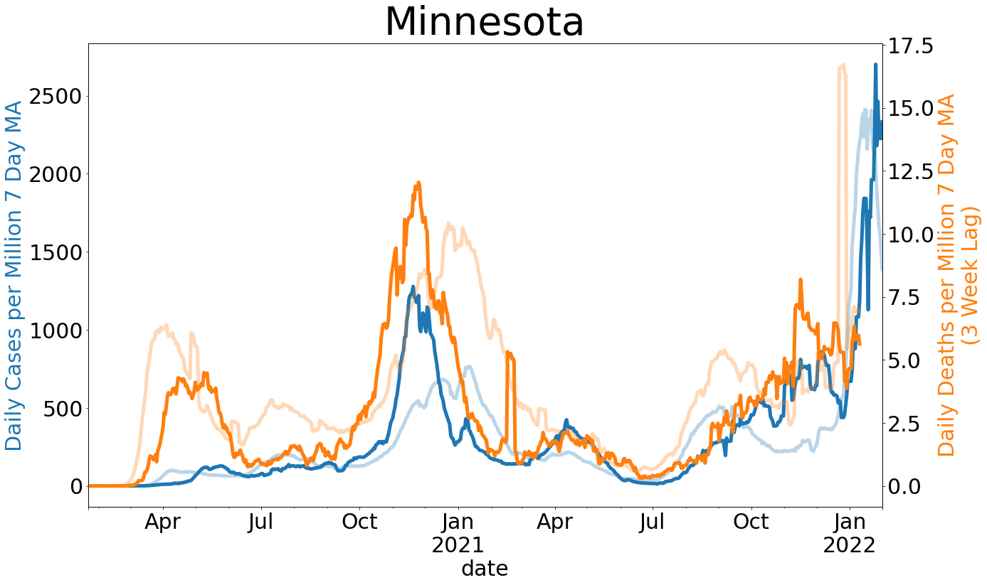
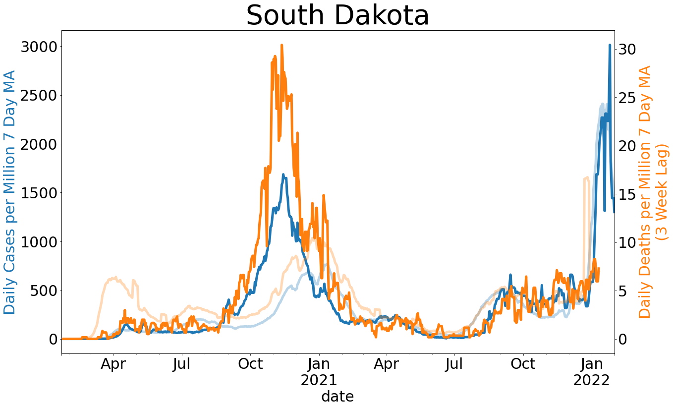
We know that New York and New Jersey have had a tragic experience with COVID-19, as is reflected in the chart comparing each state’s curve, presented as cases and deaths per million per day over time. Given the assumptions stated above, we can be fairly confident in our ability to draw inferences from state and county level data if deaths per million persons in our region is smaller than that of New York City by a factor of 10. So far, this is where North Dakota finds itself. This is true even for its most populous county, Cass, which also has the greatest level of COVID-19 related fatalities as a proportion of the population. So far, a little more than 0.03% of the population of Cass County has died from causes relating to COVID-19. Given that our first case was detected on St. Patrick’s Day, Cass County has fared quite well. Comparison across time is even more telling. Our neighboring state of Minnesota has fared mostly well. Clay County in particular has tended to suffer more than most other counties in Minnesota, especially in the first 10 days after day zero. Still, like Cass County, Clay County is doing relatively well if you take New York and New Jersey as the worst case scenarios.
Suppose that you do not feel confident that you can compare levels of infection and death between states. Using the same measure, we can also compare the rate of new COVID-19 related cases and deaths each day controlling for population. As the county-level data reflects, logging the axis values for graphs presenting cumulative totals over time allows us to evaluate how “flat” one curve is relative to another. Since the axes are logged, we can compare rates by comparing the slopes of lines relative to the grey lines indicating what a doubling at a particular rate from day zero would look like.
Estimates of the seven day moving average of new cases and new deaths per million per day are presented in the graph comparing states. In these plots, the height of the line at a particular point in time indicates daily increase in these values as a proportion of the state’s population. Thus, these graphs look similar to probability distributions. At either extreme, we see especially tall curves and especially flat curves, much like the graphics that accompany many of the messages urging each of us to “flatten the curve.”
In terms of deaths, northeastern states have curves that are quite steep in the first 10 days after day zero. These states failed to “flatten the curve.” States in other regions, such as Illinois, Maryland, and Indiana, have experienced a modest level of deaths per capita, but their curves are mostly flat. Daily rate of deaths controlled for population in most states remain especially low. Although cases and deaths per million in our region are tending to increase, the curve so far has remained flat, especially in regard to deaths per million per day.
My hope in providing this information is to show that states face unique circumstances. The Northeast has had a particularly difficult time. The rest of the county has significantly slowed the spread and appears to have reduced the number of preventable deaths. We are also yet to see a spike in deaths since the wave of reopenings at the beginning of May. Where there have been increases in the number of cases since reopening, like in South Dakota and North Dakota, they have been modest. And while no death should be treated as insignificant, the death toll across the Midwest, when viewed alongside spread in all other states, has tended to be a sign of good news rather than indicating a crisis.
Meet the Author
James Caton is a fellow at the Center for the Study of Public Choice and Private Enterprise (PCPE) and an assistant professor in the NDSU Department of Agribusiness and Applied Economics. Read his bio.